CONTEXT
Revamping the function-driven application.
Many government owned applications have remarkable sets of data, but contrastingly poor UX. The National Oceanic and Atmospheric Administration (NOAA) has an incredibly vast and useful database of the environment, yet an interface that is clunky and difficult to use.
Several menus are hidden inside nested navigation, and unexpected groups of function are clustered together. These qualities were downplaying the valuable capabilities of the application, so I decided to take on the challenge of designing a more compelling UI for it.

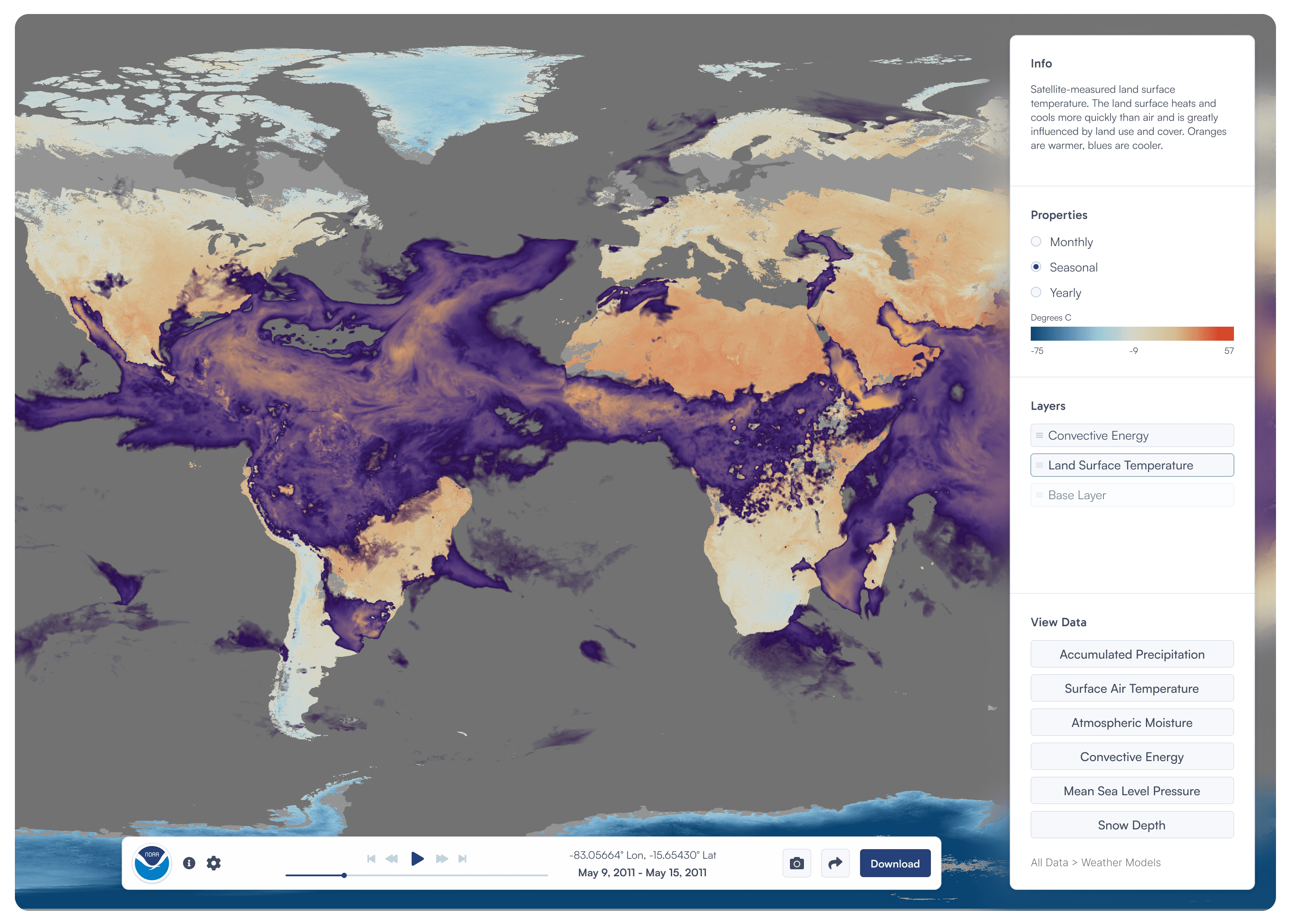
Existing NOAA View Data Exploration Tool
Image
The project goal was the following:
Improve the usability of the National Oceanic and Atmospheric Administration (NOAA) database of the environment.
UI REDESIGNS
Splash Screen
Redesigned Splash Page
Video
The introductory experience.

Existing Questions Panel
Image

Image
The Panel layout.
To brainstorm an effective composition, I referenced more ordinary applications, unrelated to government or data representation, that prioritized tool usage, like Framer, Figma, Spotify, Google Maps, and more. (Especially the ones that had "split" screens.)
The Panels
Bottom Tool Bar

Image
Identifying universality.
A key factor in keeping the bottom tool bar versatile was its universality. The tools available along the bottom edge had to be applicable in most, if not all, use cases, and had to consist of clear and concise actions.
Understanding this, the existing functionalities were dissected and regrouped into clusters of relevance:
Media controls with the date and geographic coordinate system
Sharing and saving functionalities
Information or help-related functions
Side panel
The Overall Structure

Side Panel Breakdown
Image
A space to foster data interaction.
The data collection was massive, yet manipulating and navigating through the data was incredibly difficult, as many of the functionalities were nested within each other, making tools and functions inaccessible.
The data collection was massive, yet manipulating and navigating through the data was incredibly difficult, as many of the functionalities were nested within each other, making tools and functions inaccessible.
Data Finder Flow
Video
Side panel
Focus View

Expanded information panel
Image
Compacting information.
The information button had two roles: one to provide info on the overall app, and the other was displaying respective information on the selected data. It would link to a modal that provided more information and sources, which was too much information for the existing panel to show, so I designed an expandable "focused" view, that could include all the information.
Viewing more information flow
Video
Side panel
Layer Panel

Layers panel function
Image
Data Layers.
This was a feature not in the existing NOAA application. However, when doing research, MassMapper, another government owned data collection, had a feature that allowed the user to layer and customize the data they were viewing. This ability to compare and view multiple datasets appeared to be very useful, especially for users analyzing environmental data, so I included it as a new feature in the side panel.
Viewing and organizing layers flow
Video