TEAM
Project Lead: Dillon Scott
Developers: Nicholas Mamisashvili, Devashish Sood, Venkat Pamulapati, Connie Liu, Iman Moreira
Designers: Amaan Shahpurwala, Christine Cho
Developers: Nicholas Mamisashvili, Devashish Sood, Venkat Pamulapati, Connie Liu, Iman Moreira
Designers: Amaan Shahpurwala, Christine Cho
THE PROBLEM
Receiving the task, we were introduced to a web form application called EduLaw. Its purpose was to increase accessibility to submitting legal documents regarding education.
Its purpose was to enable students and parents in the state of Massachusetts to report violations of educational rights to the appropriate government offices. Was to Allow users to easily file legally worded complaints with the Mass DOE
Parents and students who wanted to file lawsuits(?) and report against educational legal issues(? i.e. bullying, plagiarism) had to go through filling out a document
The client had an existing product that we used as a reference. There were significant issues with performance that had to be redone, and there were several parts in the UI that needed some reworking:
- There was no brand identity, and the interface lacked in interesting visual appeal.
- The navigation was severely disorganized, the application led to great confusion when trying to complete the form.
- The application was only available through a laptop, when it was catered to families that likely had lower economic status.
- The login page was confusing and buggy—such a simple part of the app being unreliable led to lower credibility.
- The lack of indication of progress; the users were oblivious to how much of the form they filled out, and how much was left.
TARGET AUDIENCE
Our target audience was parents and students,
especially those who were not knowledgeable in the area of law.
We had to make sure the information we presented was formal yet approachable to address the topic appropriately.
We had to make sure the information we presented was formal yet approachable to address the topic appropriately.
LOFI WIREFRAMING
Most of the placement of content was made in reference to the original screens.
One of the main issues we tried to solve was the disorganized navigation. Many of the sections on the side navigation was interchangeable, and they made understanding the intstructions difficult. The top navigation on the side was used to navigate between the form question categories, and the bottom navigation was
We identified two main types of content on the website: the general information of the form and form questions. Then the questions were also divided into two categories: the responsive content, and the static (instructions and additional information per question).
Starting with the lo-fis, we initially decided that we move the side nav bar to the left side, and rearranged the rest of the content accordingly.
wireframing the general placement of all the content was relatively easy, as we had the initial screens that we could use. As it was a form, we resorted to simple question and short text boxes.
We blocked out the slight rearrangements of the components, especially using correct sizing this time. I learned the important and significance of proper sizing on websites through this project. By conducting quick research on the used font sizes for websites like Google, Dribble, Curology, I was able to find the commonly used font size.
Another big change was the navigation bar: we moved it to the other side, considering the common orientations in varying websites, and also considering the user’s direction of sight when filling out the form.
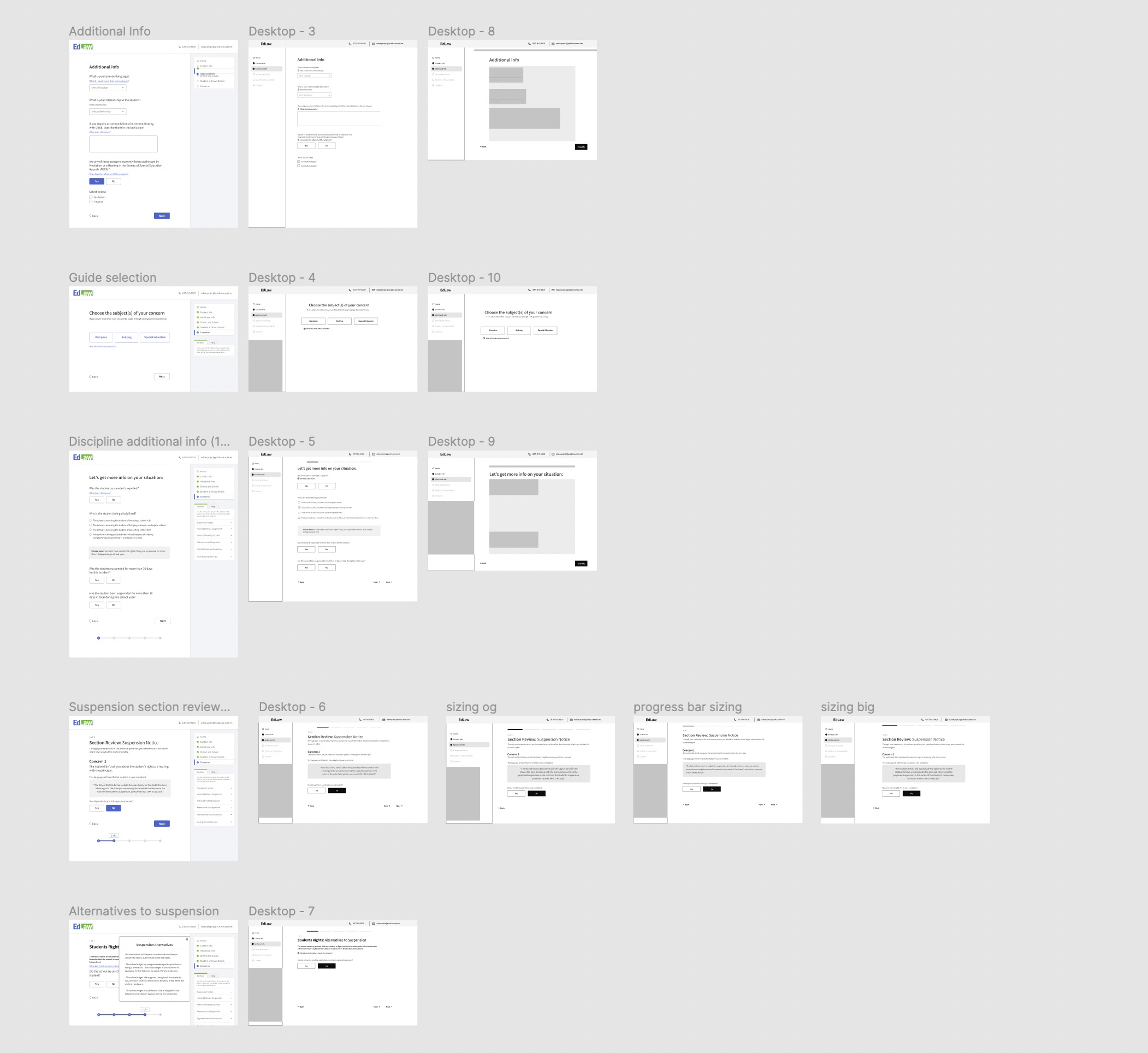
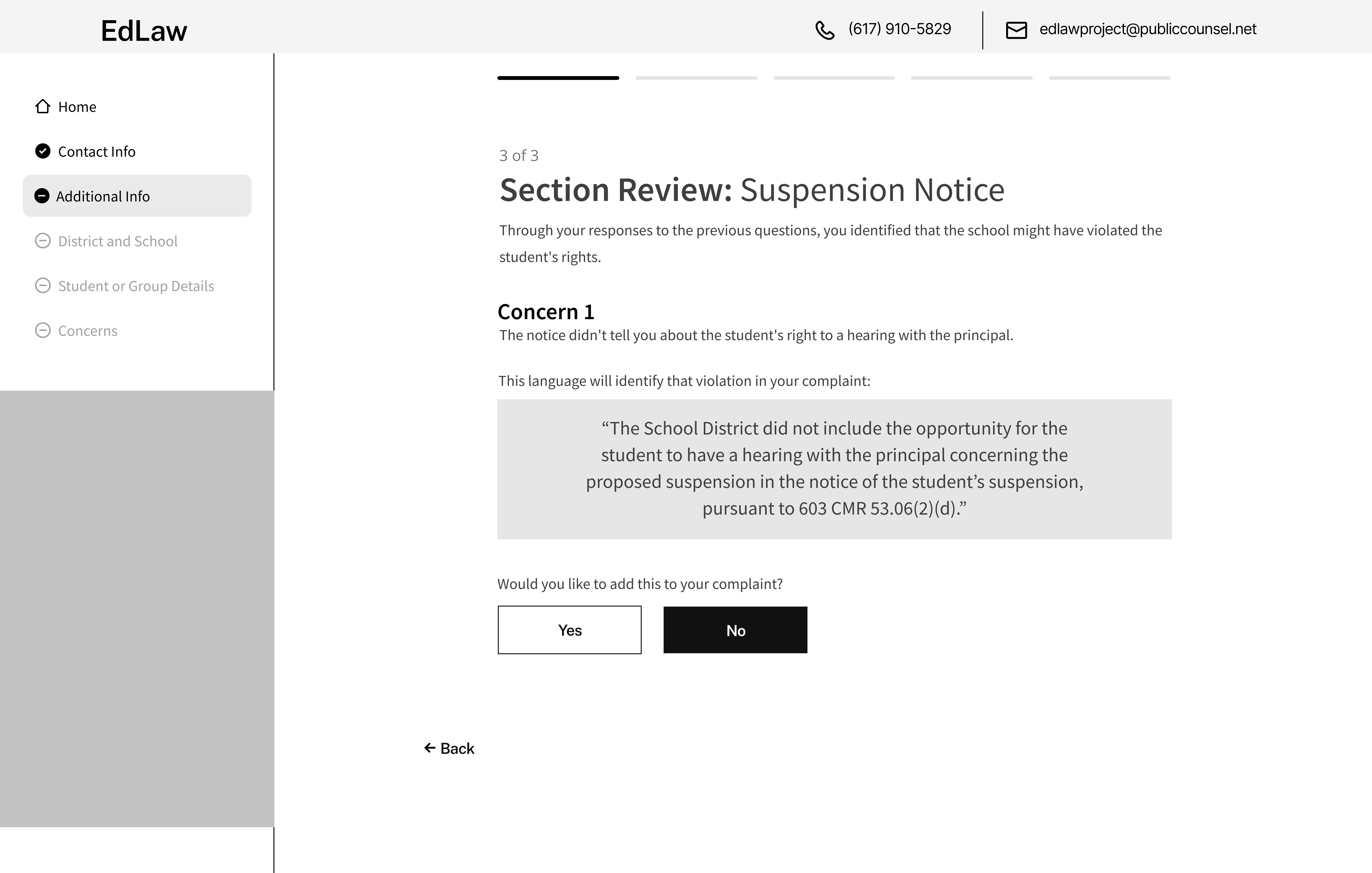
SCREEN ITERATIONS: SUSPENSION NOTICE
Some of the initial changes we made to screens consisted of resizing and organizing the content on the page.
1. Navigation bar
2. Top banner
3. Content, text
4. Components (progress bar, buttons)
Through designing these screens I learned the importance of font sizing and screen sizes
1. Navigation bar
2. Top banner
3. Content, text
4. Components (progress bar, buttons)
Through designing these screens I learned the importance of font sizing and screen sizes


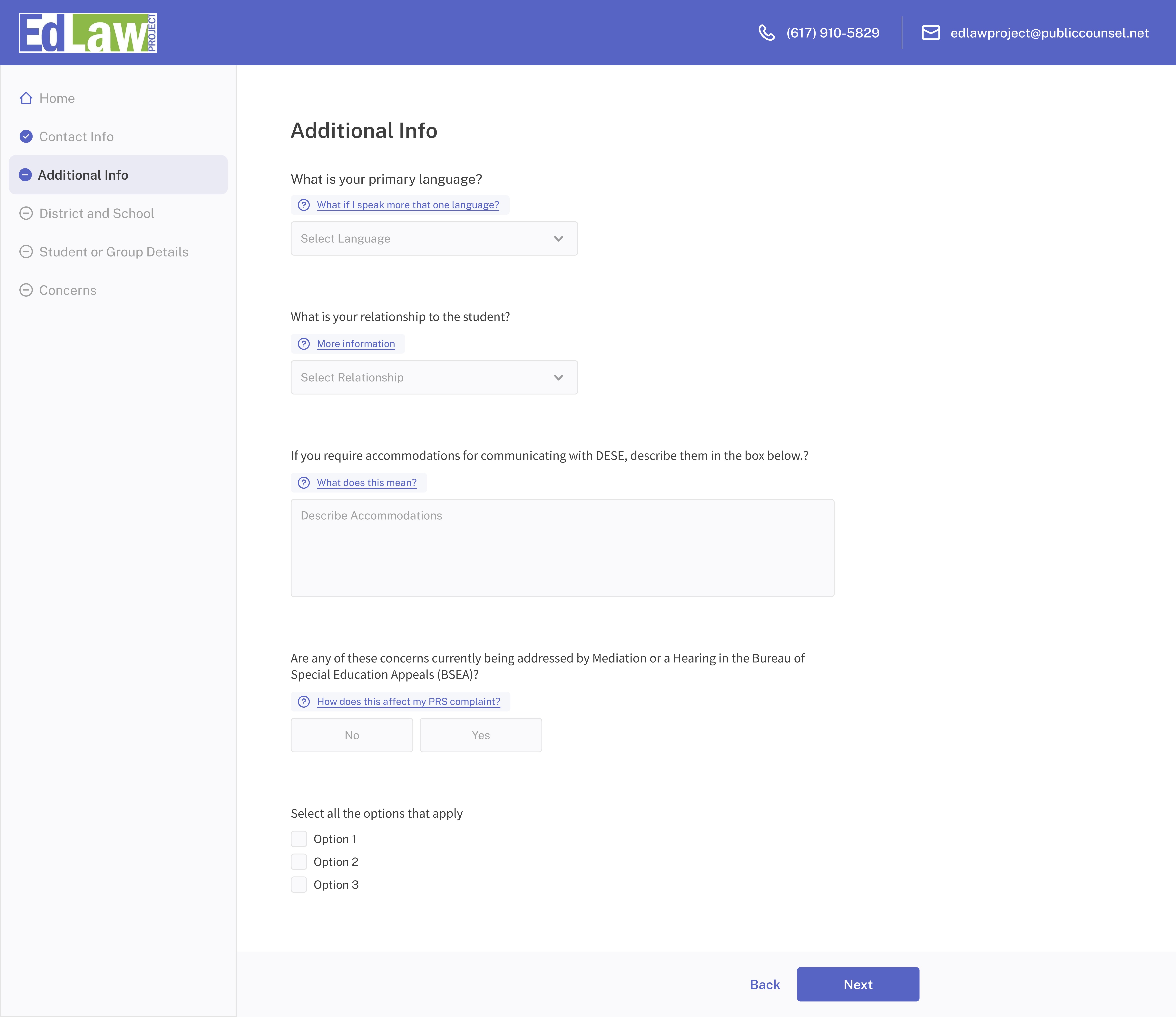
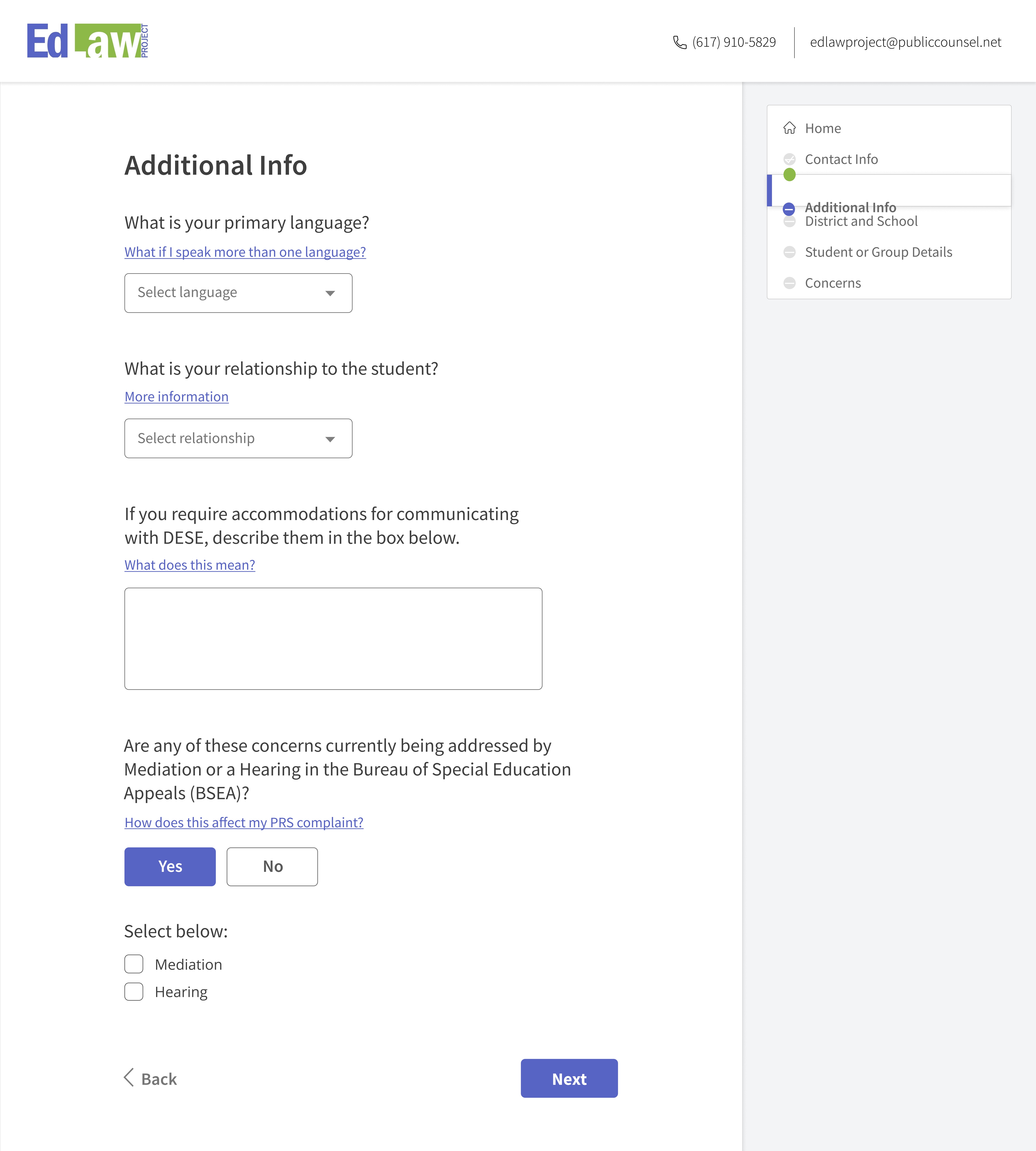
SCREEN ITERATIONS: ADDITIONAL INFO
The iterations on the side shows the process of changes that were made. Once receiving the client’s screen designs, we transferred the information onto low fidelity frames, which we continued to iterate and resolve any sizing and organization conflicts, then carried out onto high fidelity frames.
Translating the low fidelity onto high fidelity frames took the process of implementing the new brand and color identity onto the interface.
By conducting research on what the trending styles were, we designed the nav bar accordingly, with a rounded and modern design.
Translating the low fidelity onto high fidelity frames took the process of implementing the new brand and color identity onto the interface.
By conducting research on what the trending styles were, we designed the nav bar accordingly, with a rounded and modern design.


DESIGN SYSTEM
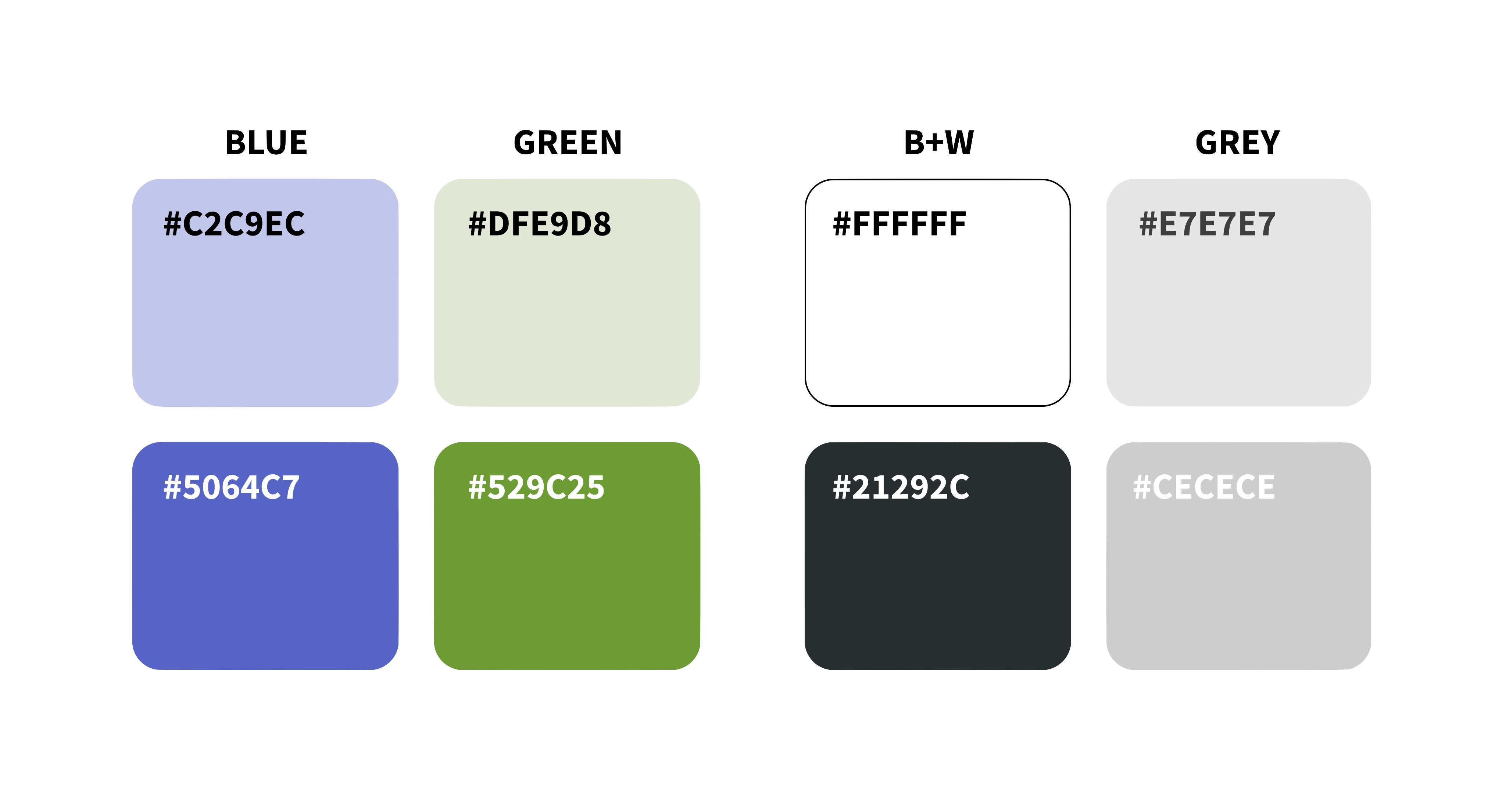
COLOR SCHEME
COLOR SCHEME
In addition to the changed orientation of the components of the website, we also made a brand identity to use for the website. Using the preexisting logo for Edulaw, we utilized the green and blue color scheme to find the two main colors. We made adjustments accordingly to make the colors compliant with the readability and each other
Designed screens for laptop, screen mobile. in addition to any missing screens
TEXT STYLES
After going through several typefaces, we decided on the font family Noto Sans. Due to the simple nature of the application, we kept the variation minimal and used one typeface create the hierarchy.
![]()

FINAL APPLICATION
The final app required making all of the potential sceens. Luckily most of the screens conveyed similar information, and allowed for the design to be unified across all pages.
![]()
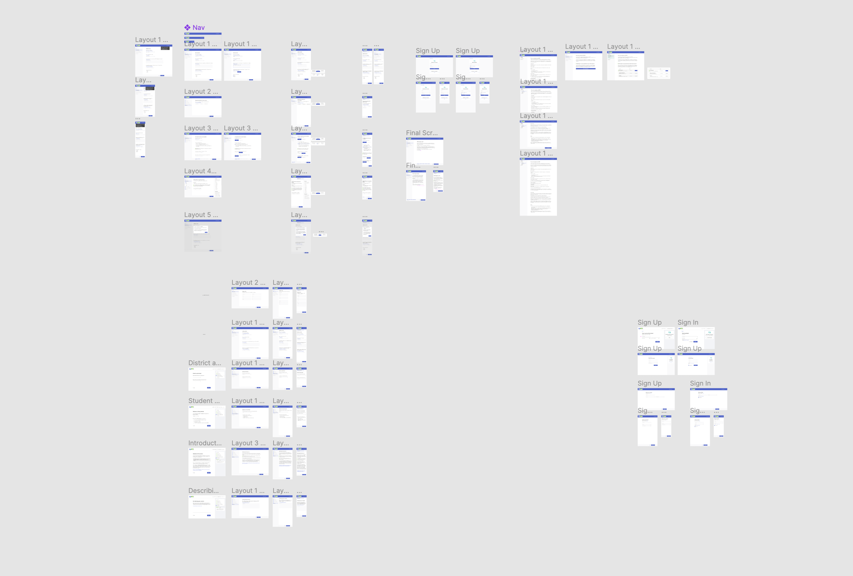
FINAL SCREENS: CONCERNS
For better accessibility, we designed the final screens for all screen sizes, and made respective changes to each screen size.
Having to include the main components:
Having to include the main components:
- Website banner
- Side navigation bar
- Bottom navigation button
- The page content


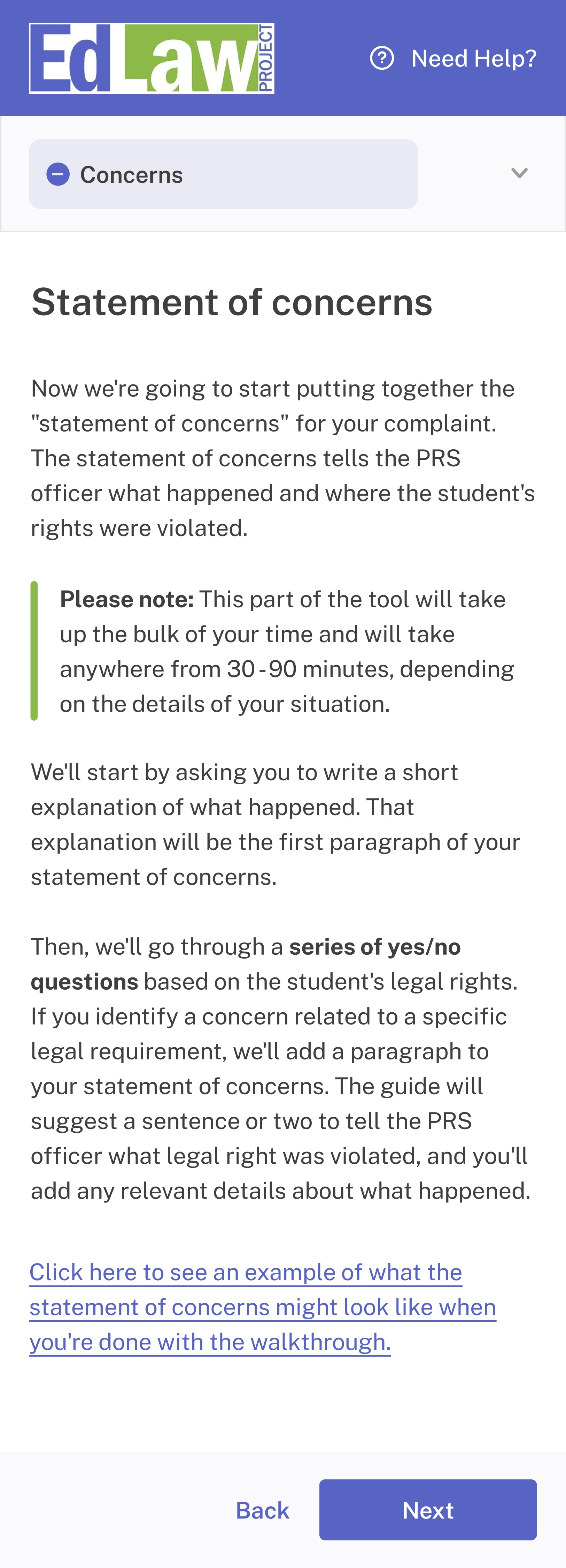
The possible orientations per screen sizes varied, and one of the biggest variation was the location of the navigation bar. As it had to be accessible to parents and students, we had to make sure it would be able to accomodate for the devices they would be likely to use. We kept it on the side for the laptop screen, and kept the continuity on a tablet, and moved it to the top for a phone. Keeping the naviagation bar on the side for wider screens like the laptop and tablet allowed for more even distribution of content on the screen, and prevented there being too much white space. On the other hand, because a phone screen was so small, it was more convenient to have the navigation as a dropdown from the top, and have the user experience the content of the page and navigation separately.