BOOK DESIGNS
︎FILM FESTIVAL BOOKLET
PARAMETERS
Using the text from the 2022 New York Film Festival, we were assigned to create a booklet that would guide the visitors with:
Using the text from the 2022 New York Film Festival, we were assigned to create a booklet that would guide the visitors with:
- An introductory page about the festival
-
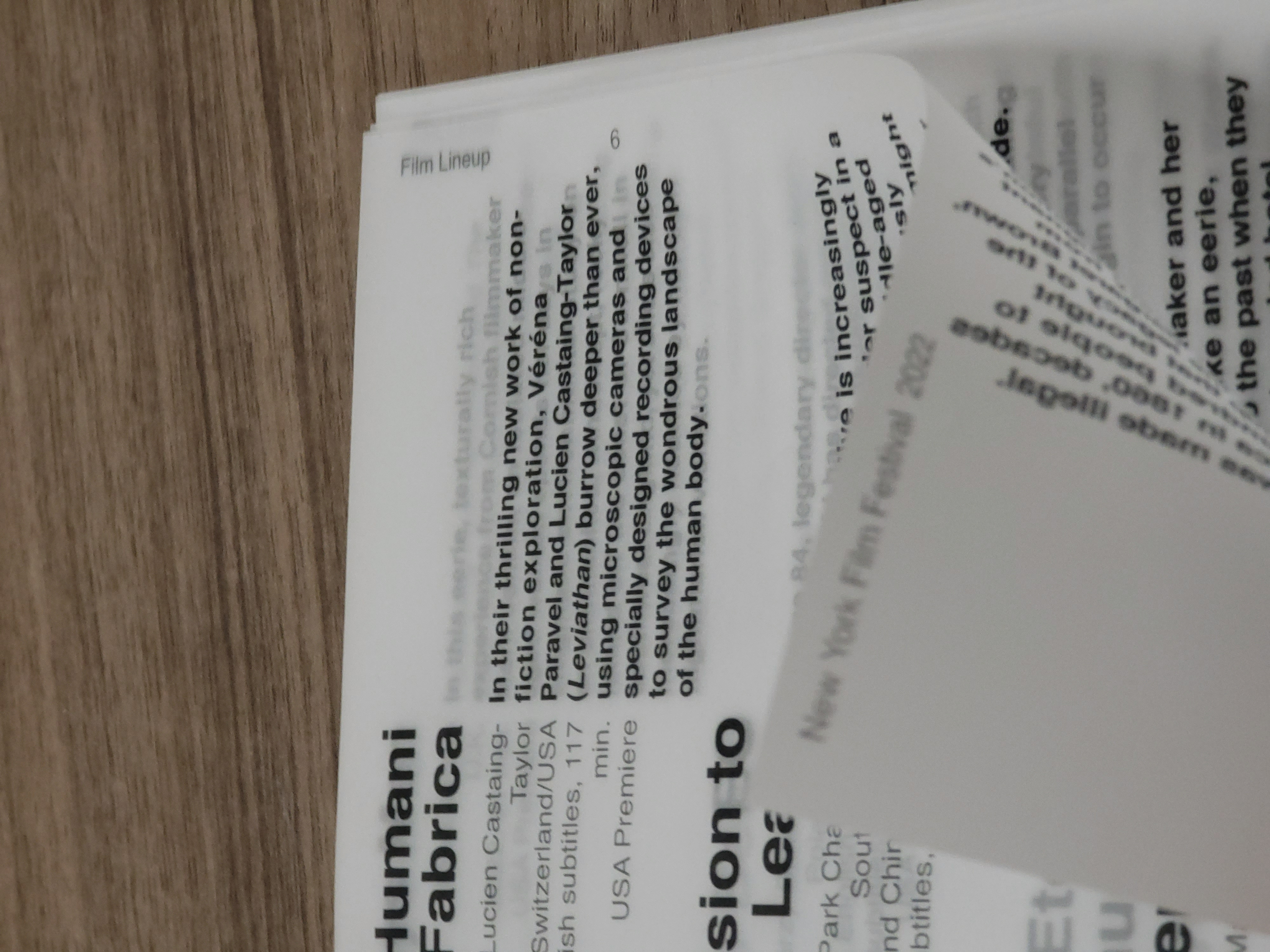
The film lineup
-
A featured spotlight article
- A calendar informing the date and time of each film

THE MATERIAL: VELLUM
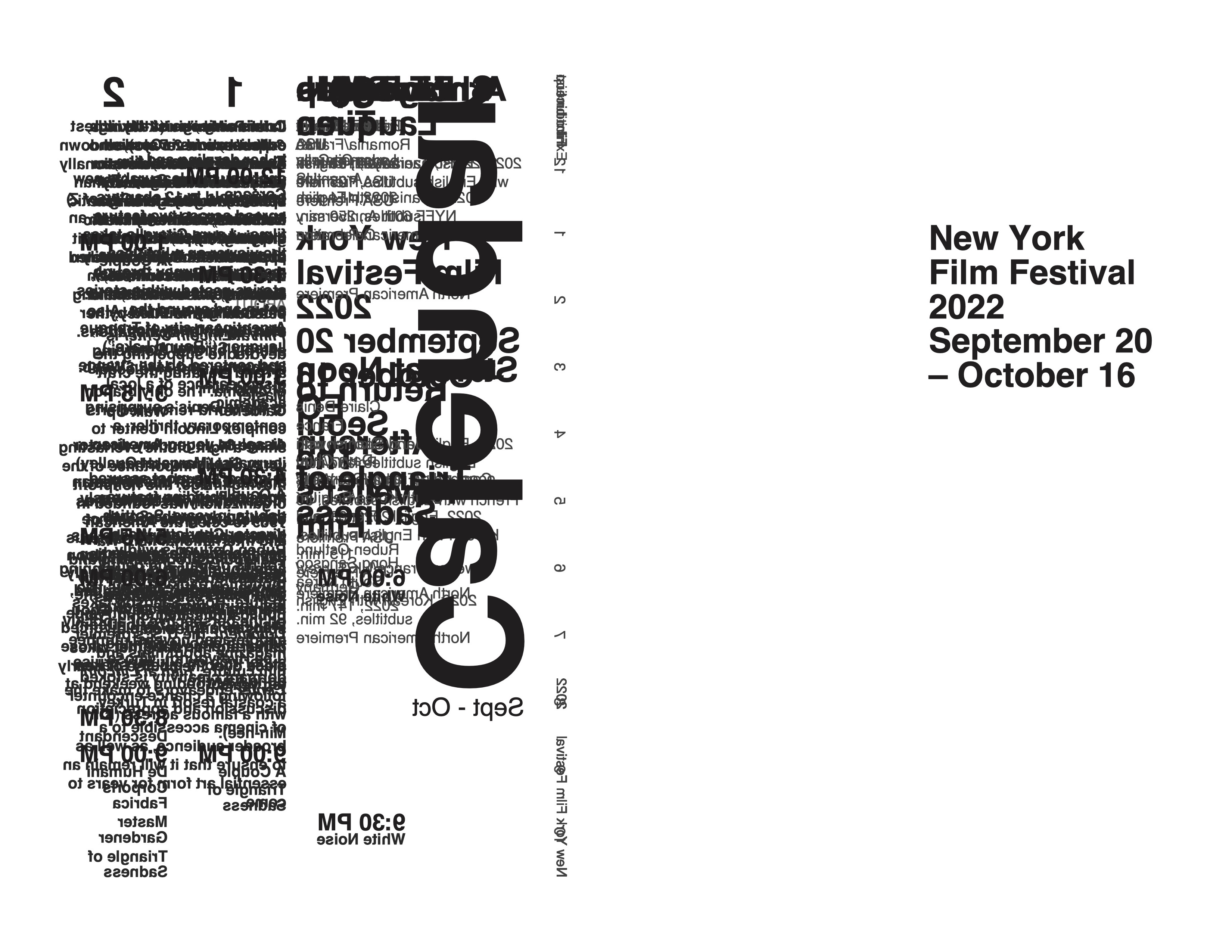
When designing the covers, I wanted to experiment with “smashing” all the inside content onto the back cover of the booklet.
Being inspired to recreate the effect of ‘smashed’ text on the actual page, vellum was used. It became an essential part to the entire design of the booklet, and opened up many more possibilities.
However, because vellum was transluscent and the text overlapped across multiple pages, it also brought a unique challenge to the design.
Fortunately, the material still allowed for good readability, as lifting the pages slightly off each other blurred the text behind it, but I still hoped to improve the readability of the pages. I decided to design an additional ticket for the film festival to serve as a ‘reading guide’. The back of the ticket was left empty to allow the viewer to fit the ticket between pages to read clearly.


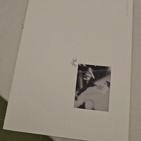
INVERTED DESIGN
Throughout several points in the book, I utilized the transparency of the vellum and flipped the text to show through the other side of the page.
Because of this design, the digital version of the book has a blank front page, but allowed for very specific and unique opportunities.
The ‘about’ page and the front cover was used in relation to each other, where I maintained the same text composition as I originally had, but flipped the text horizontally for the title of the festival to be read through the page.
In addition to the cover, the margin and column of the spotlight page was placed accordingly, to prevent any text overlap. As each page had to remain one-sided, the spotlight page was the only page double-sided with content, and was also an interesting task.
The inversion was not only applied on the text itself, but also its justification. This was one of the main design system applied throughout the entire booklet. As seen in the cover and lineup, the title (and description) was on the left column, justified to the right, and the description (body text) was on the right column and justified to the left. Carrying this theme through, the text in the spotlight spread was also justified the same way: left column justified to the right, the right column justified to the left.


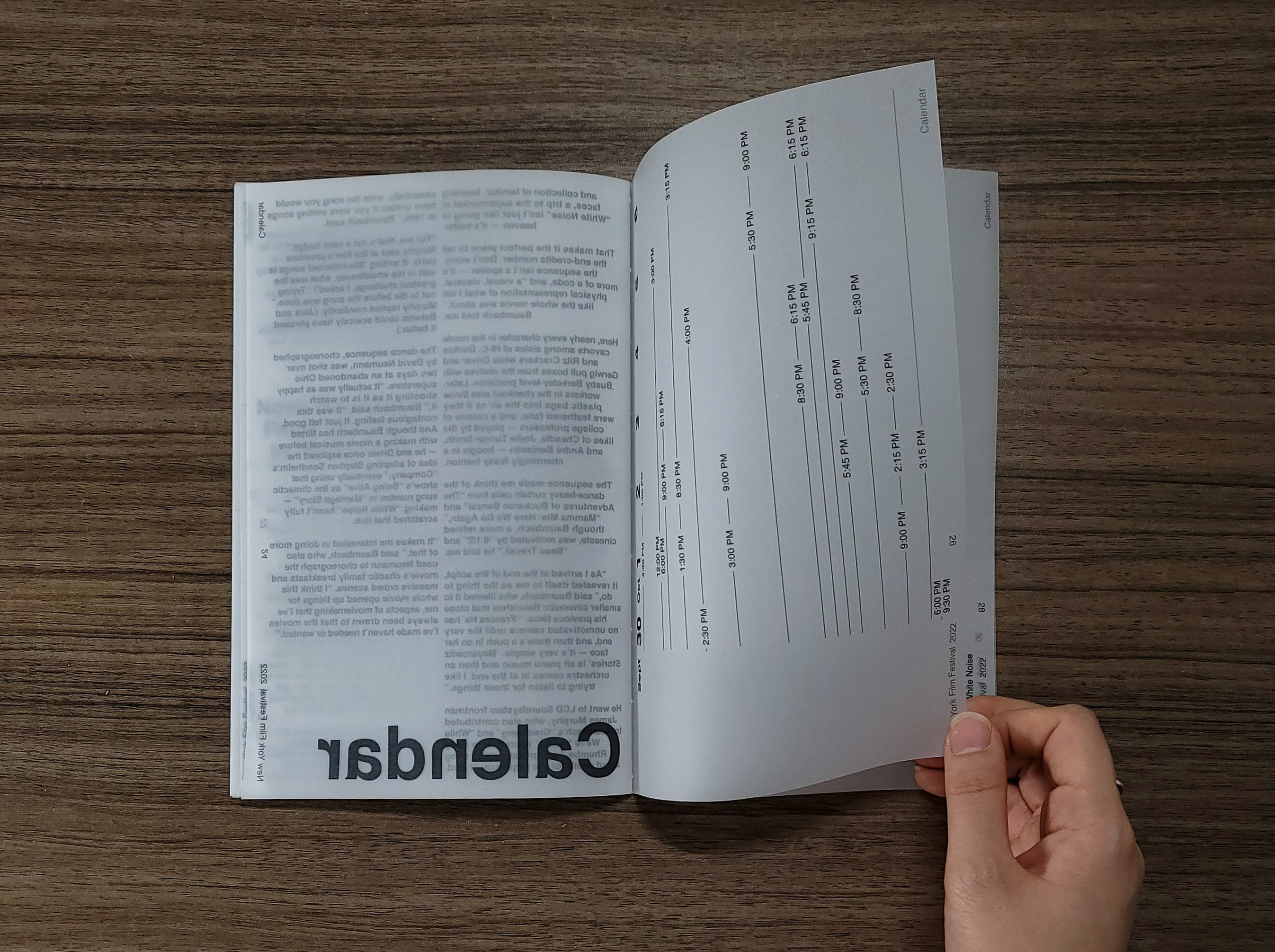
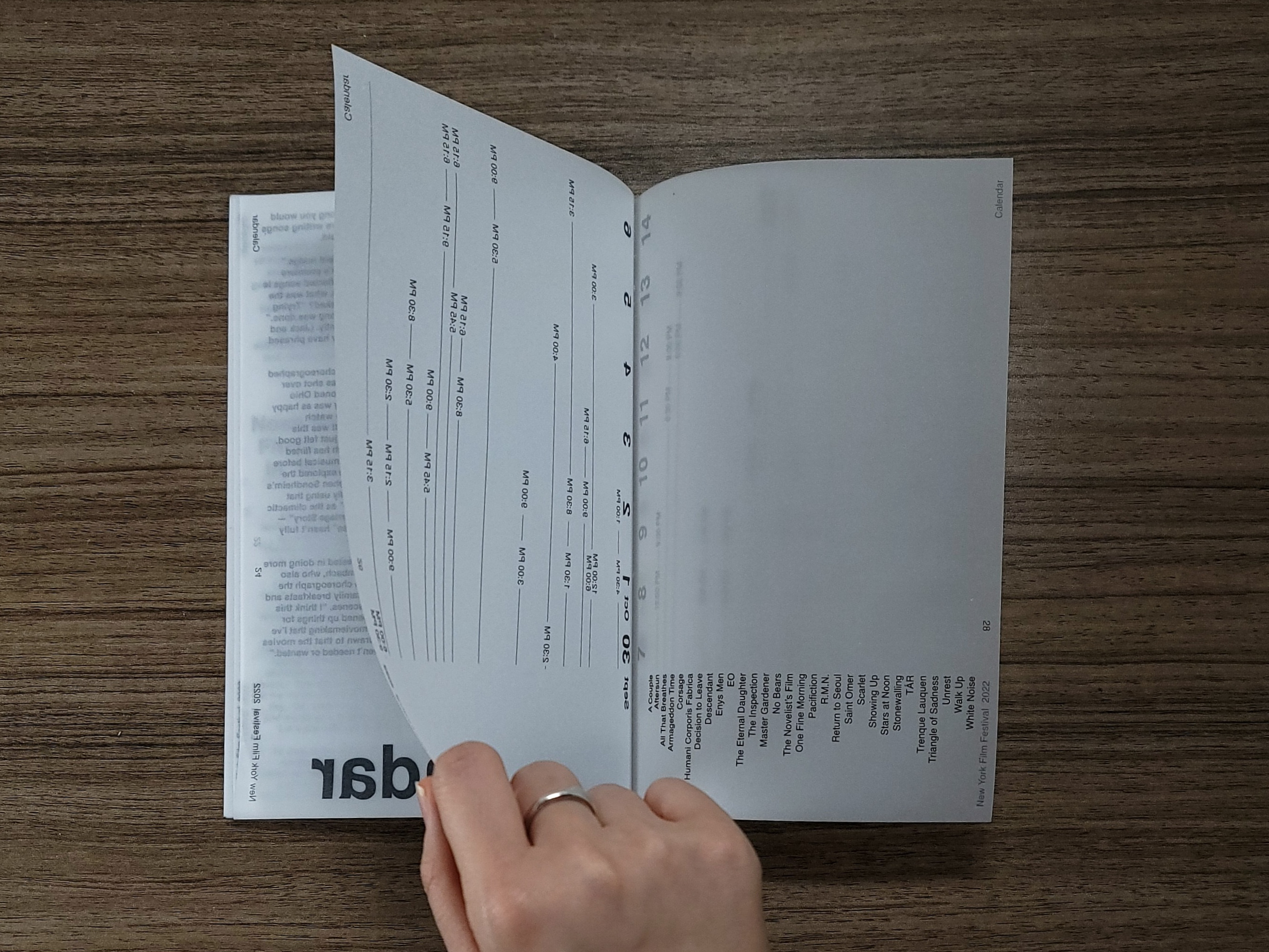
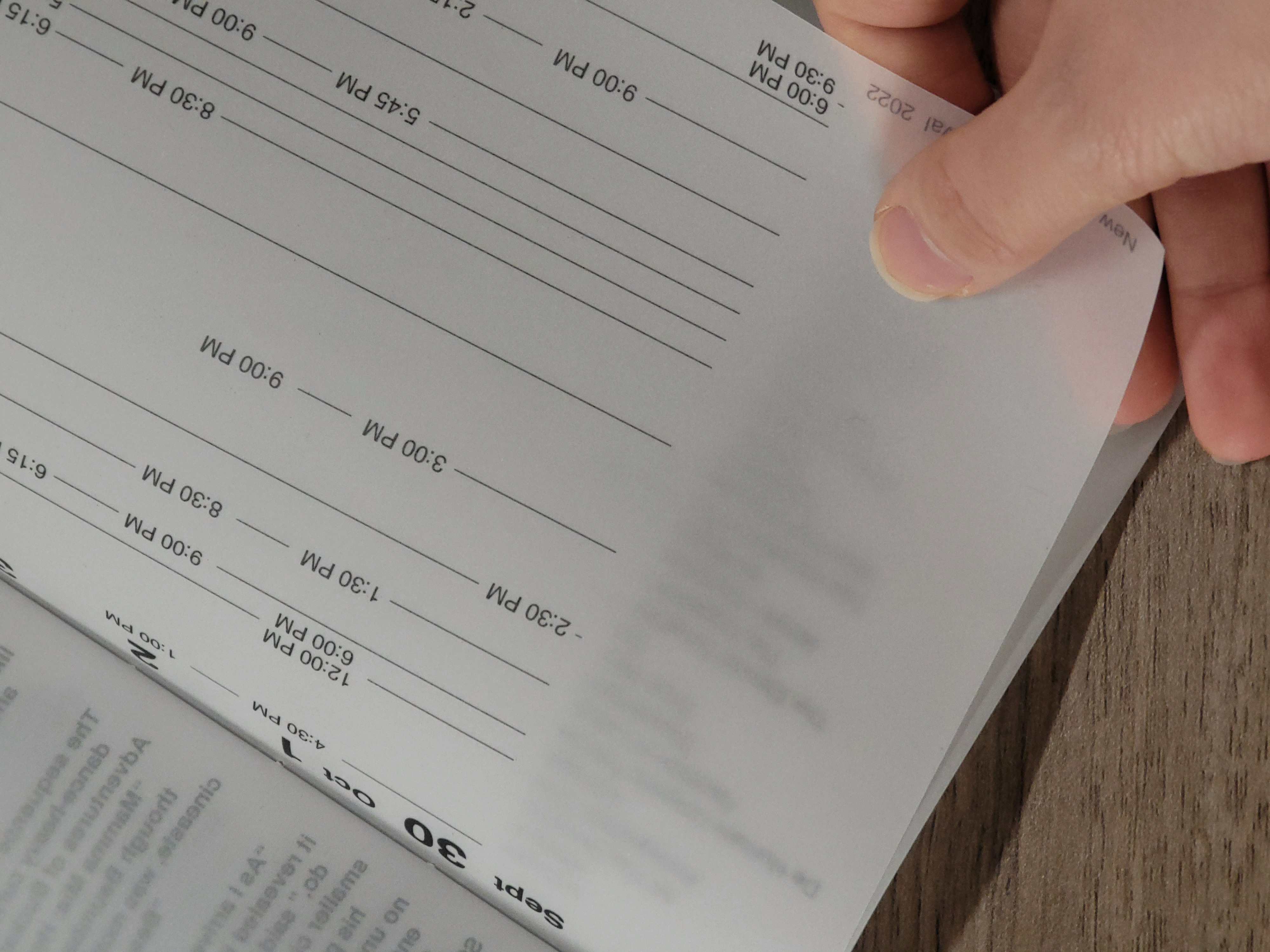
THE CALENDAR
Another feature that utilized the transparency of the material was the calendar design. This time the design was more practical, where layering of pages prevented the two different weeks of times from overlapping with each other, and allowed for an interactive experience with the book.
Another feature that utilized the transparency of the material was the calendar design. This time the design was more practical, where layering of pages prevented the two different weeks of times from overlapping with each other, and allowed for an interactive experience with the book.


︎BOOK OF ALEXANSWERS
DESIGN INTENTIONS
Multipurpose Book of Compliments
Weekly Planner/Journal + Scrapbook
Multipurpose Book of Compliments
Weekly Planner/Journal + Scrapbook
- Grid [left page]: 7(Days of Week) x 24(Hours in a Day) Weekly Planner
-
Grid of boxes [right page, bottom right]: 52 boxes (Weeks in a Year) Week counter
-
Semicircle thumbs scale [right page, bottom right]: 5 Thumb orientations to rate the past week from 1-5; by coloring in thumb of desired rating
-
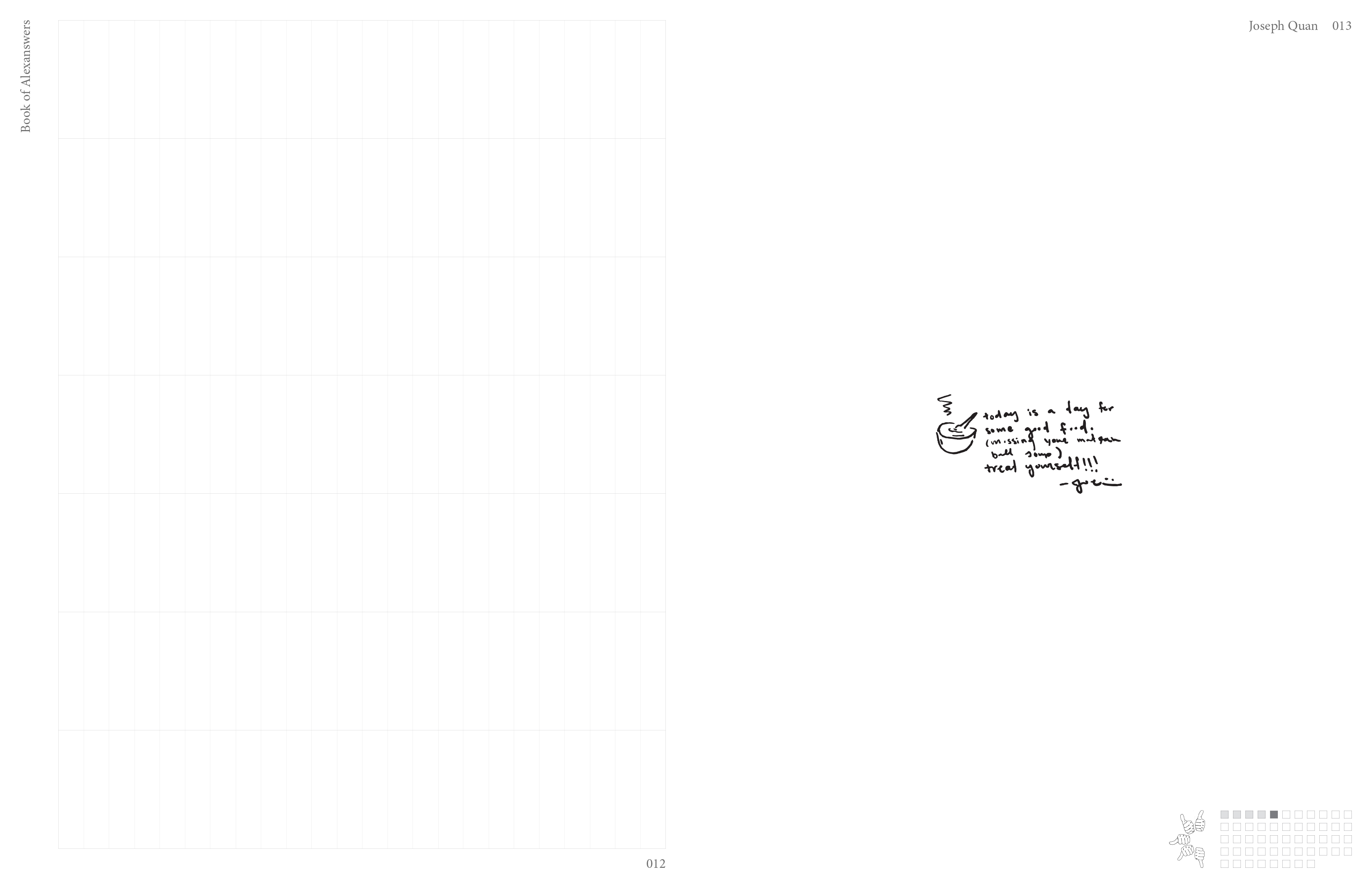
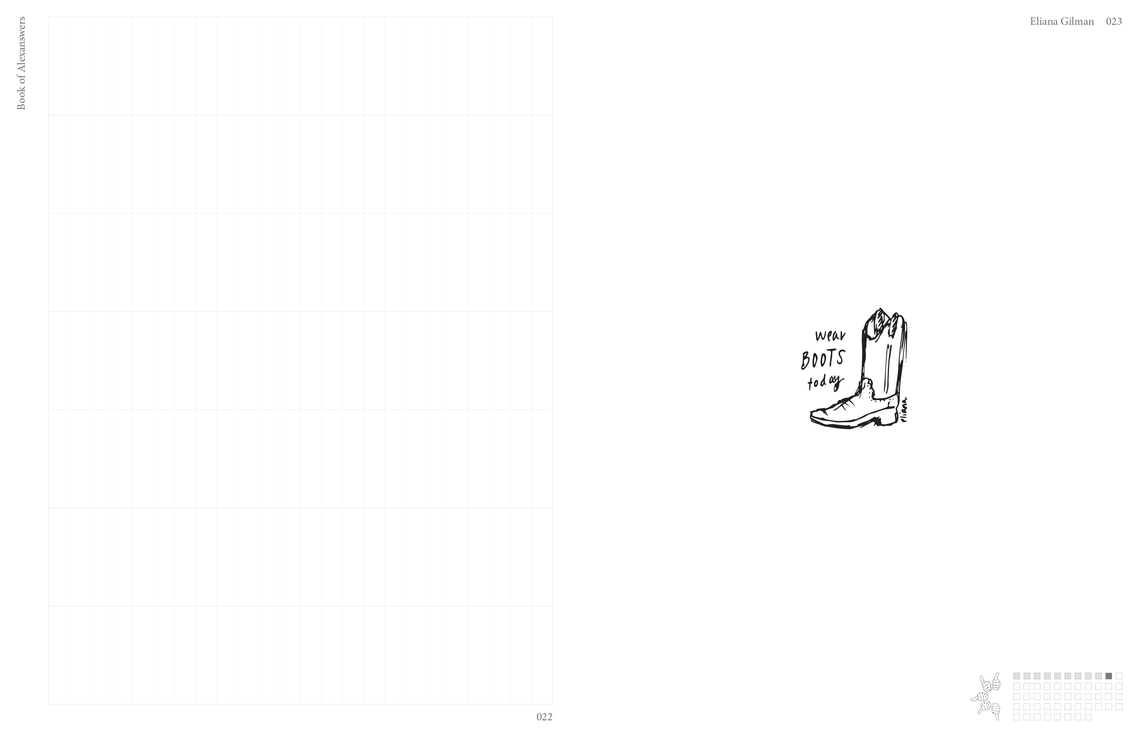
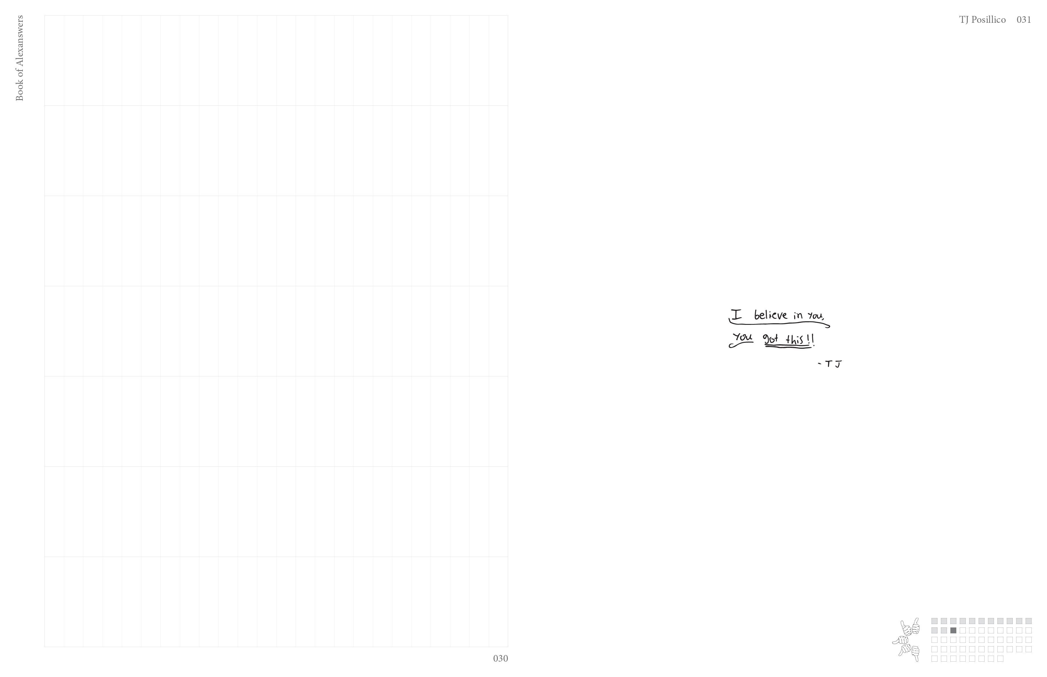
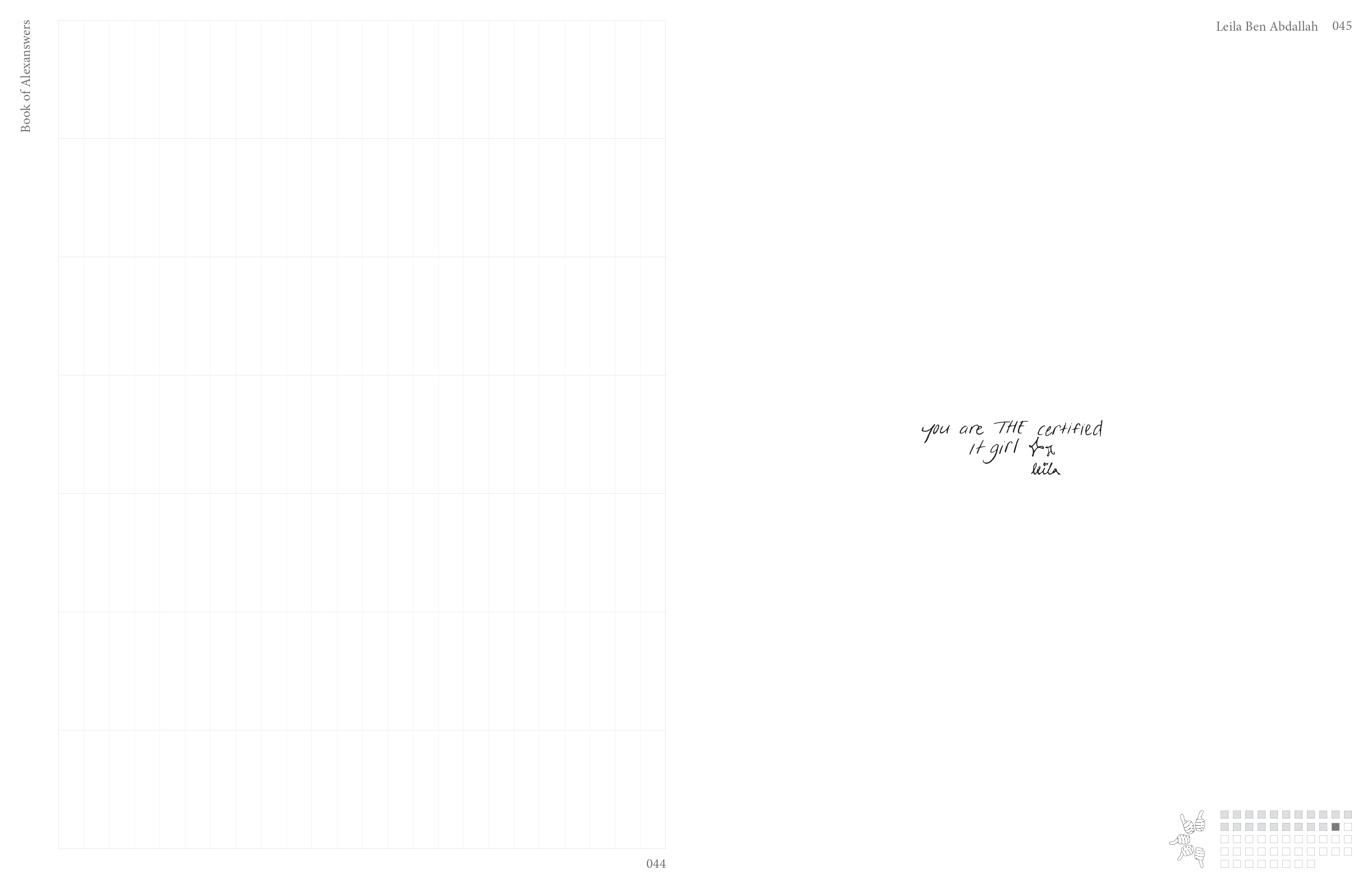
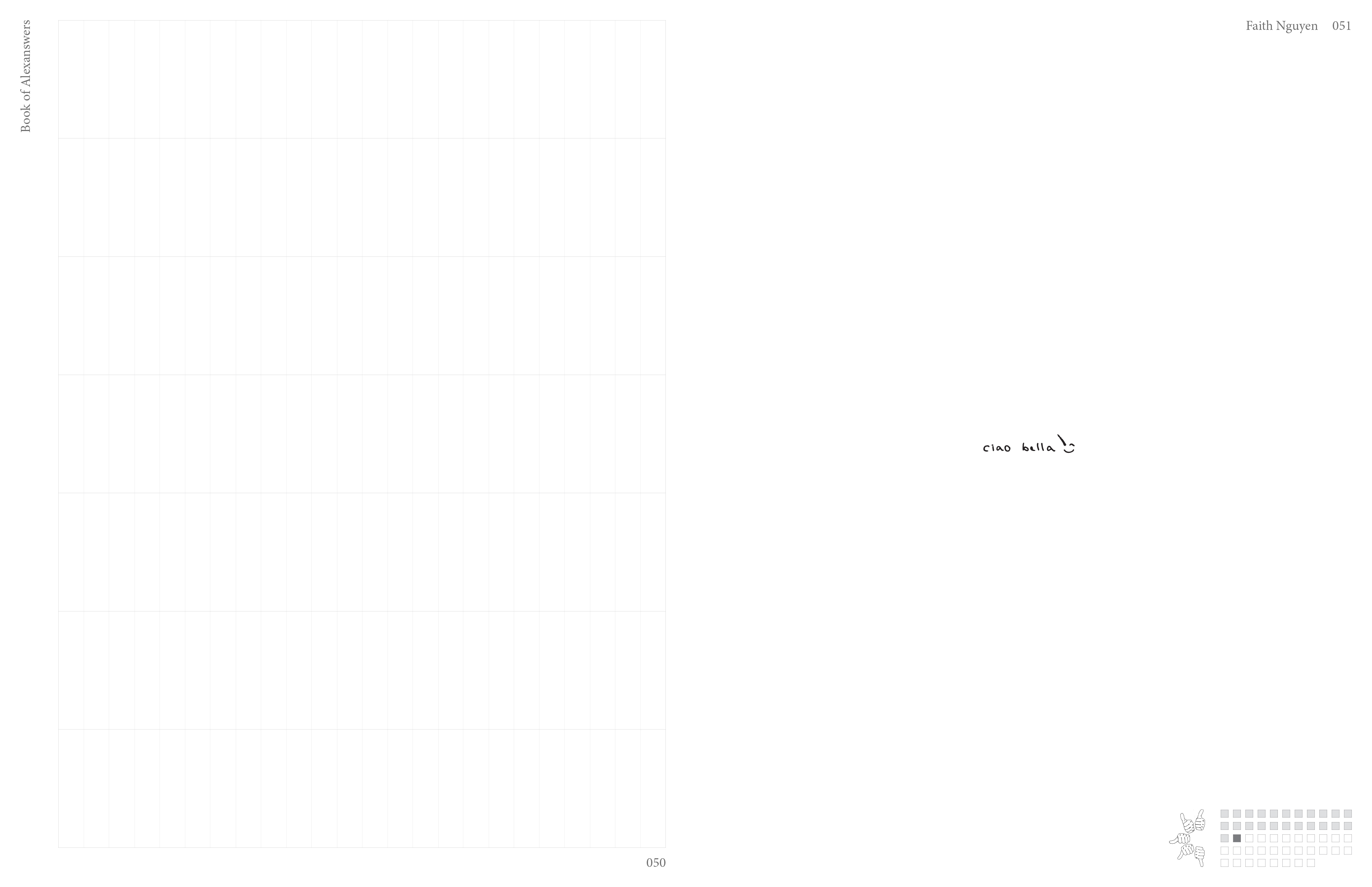
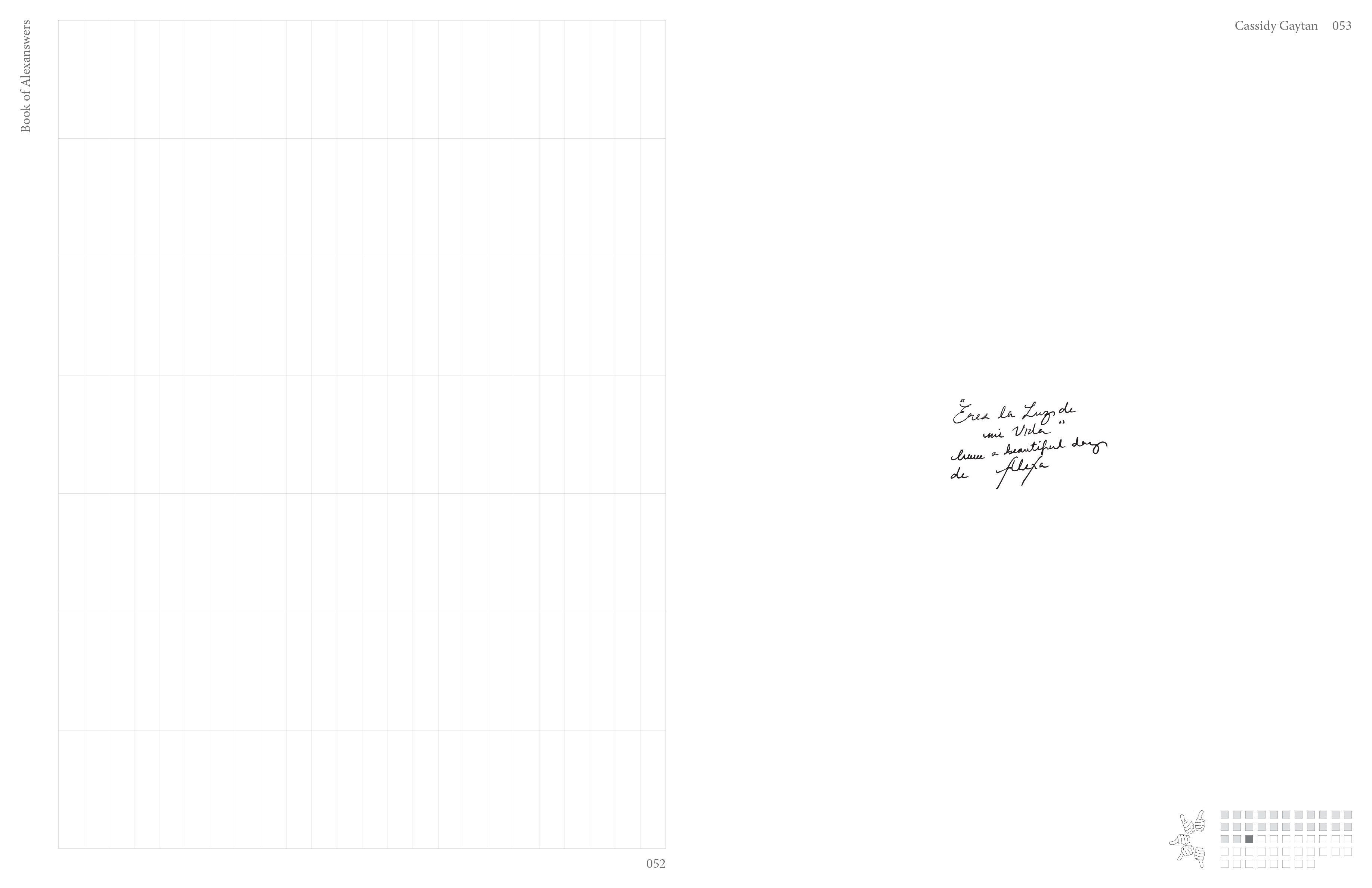
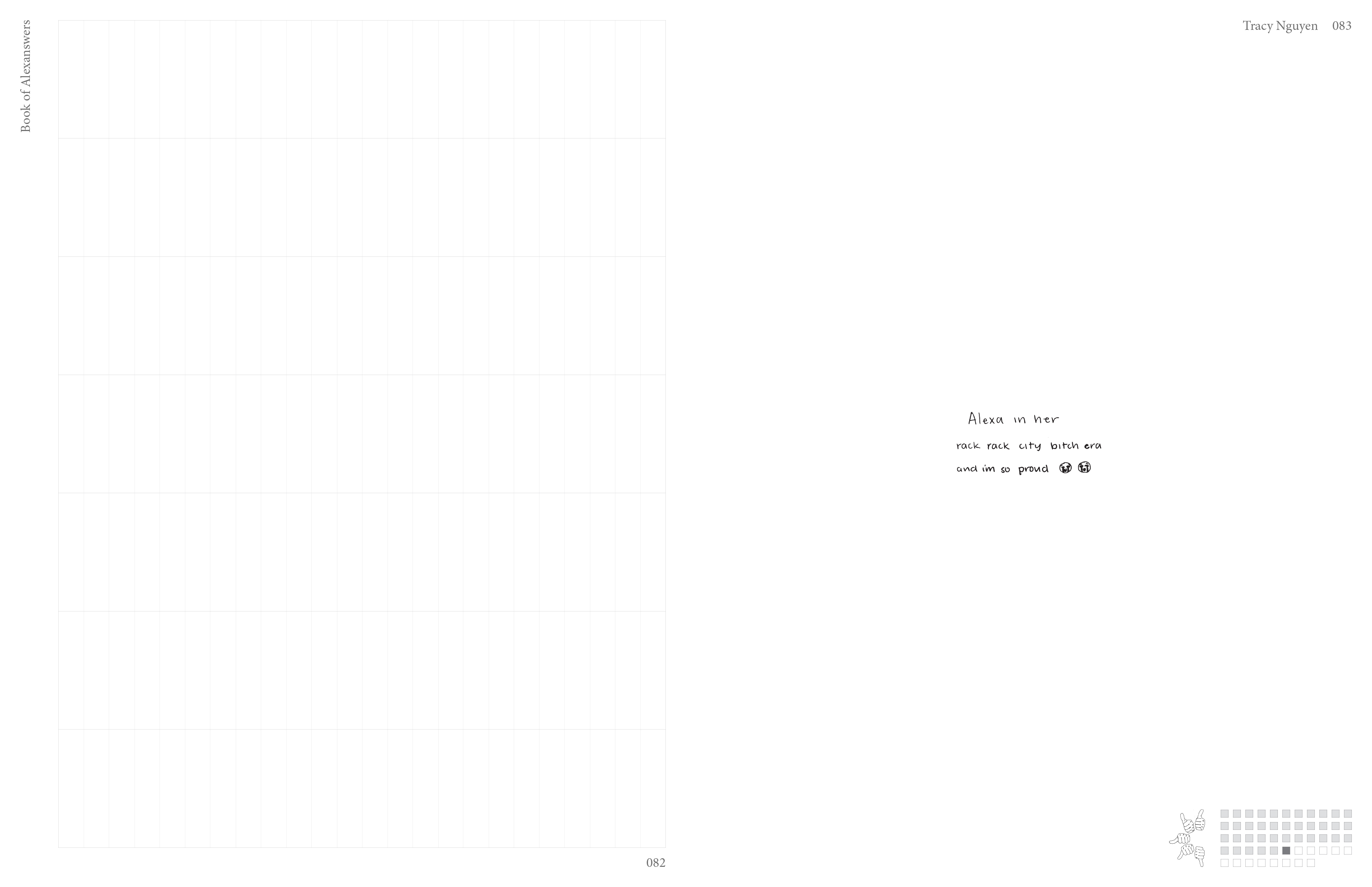
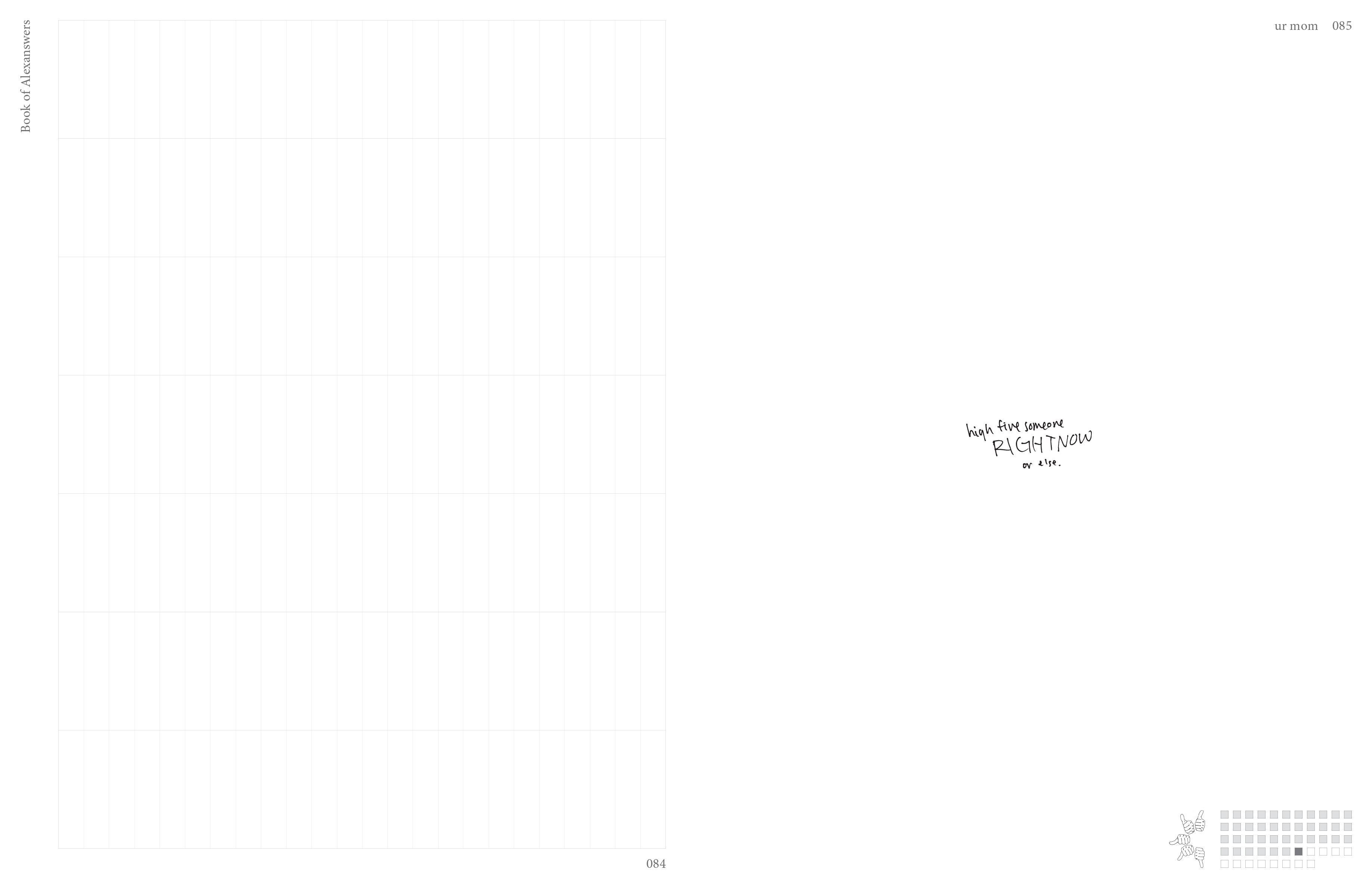
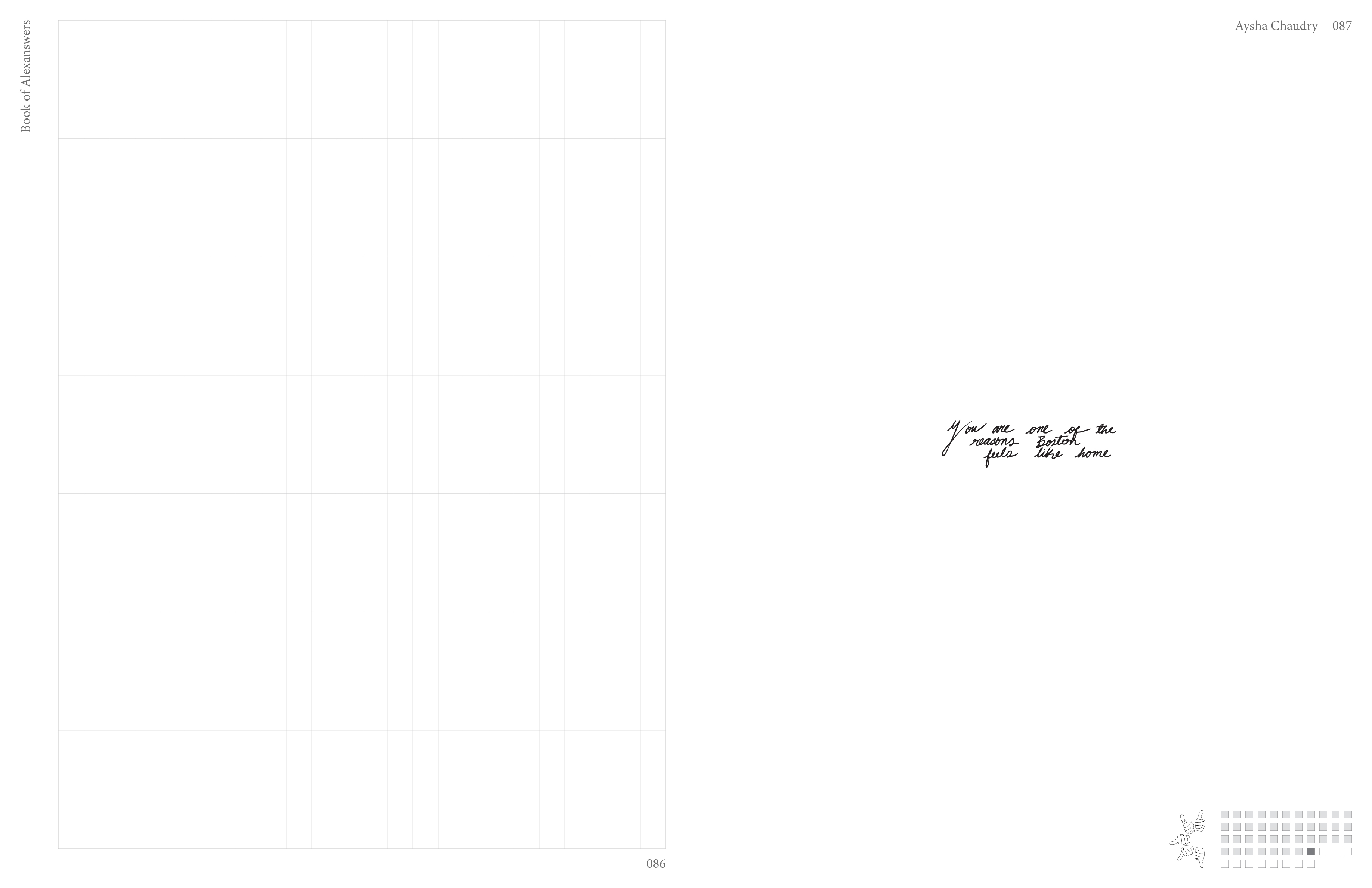
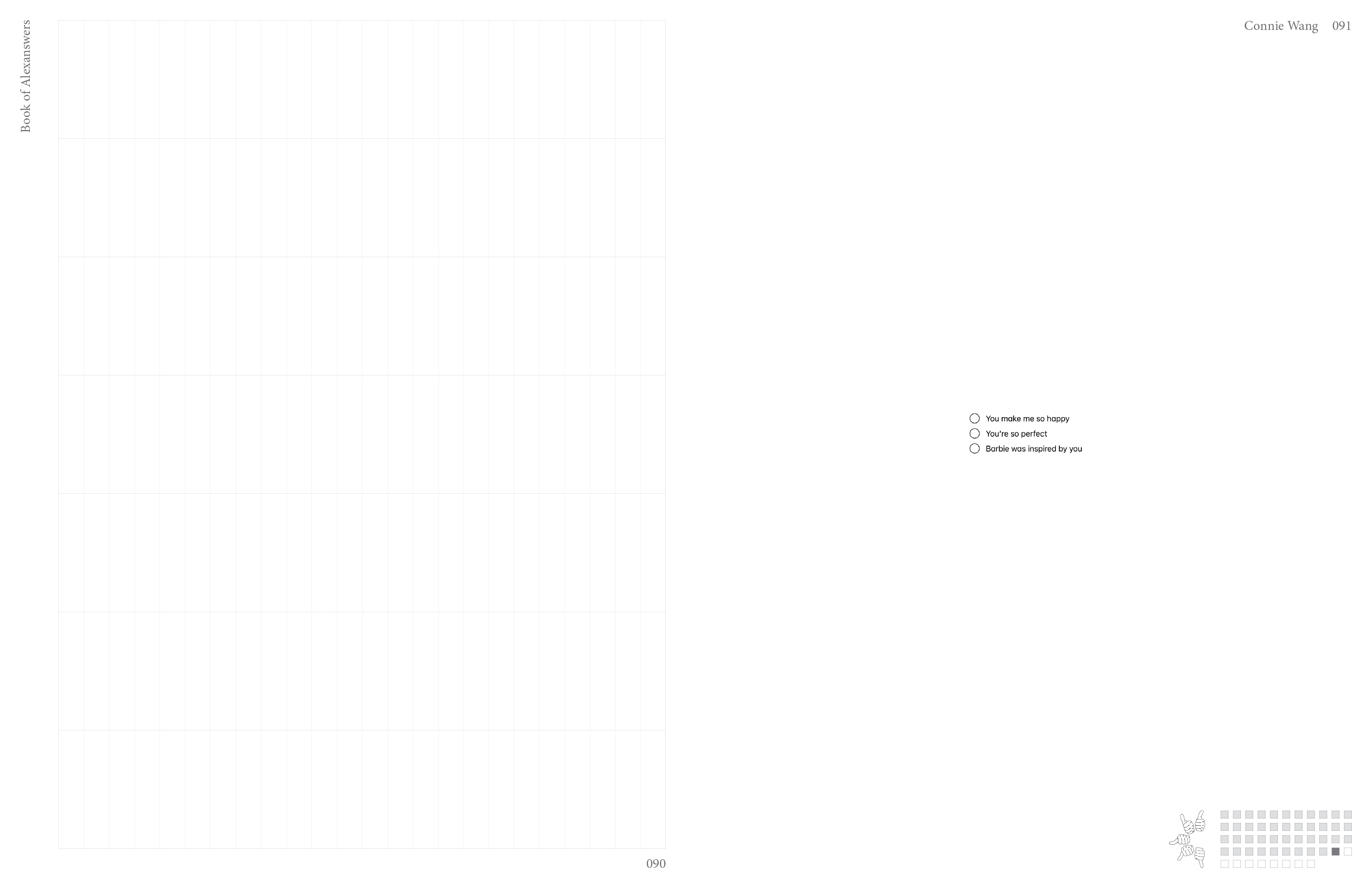
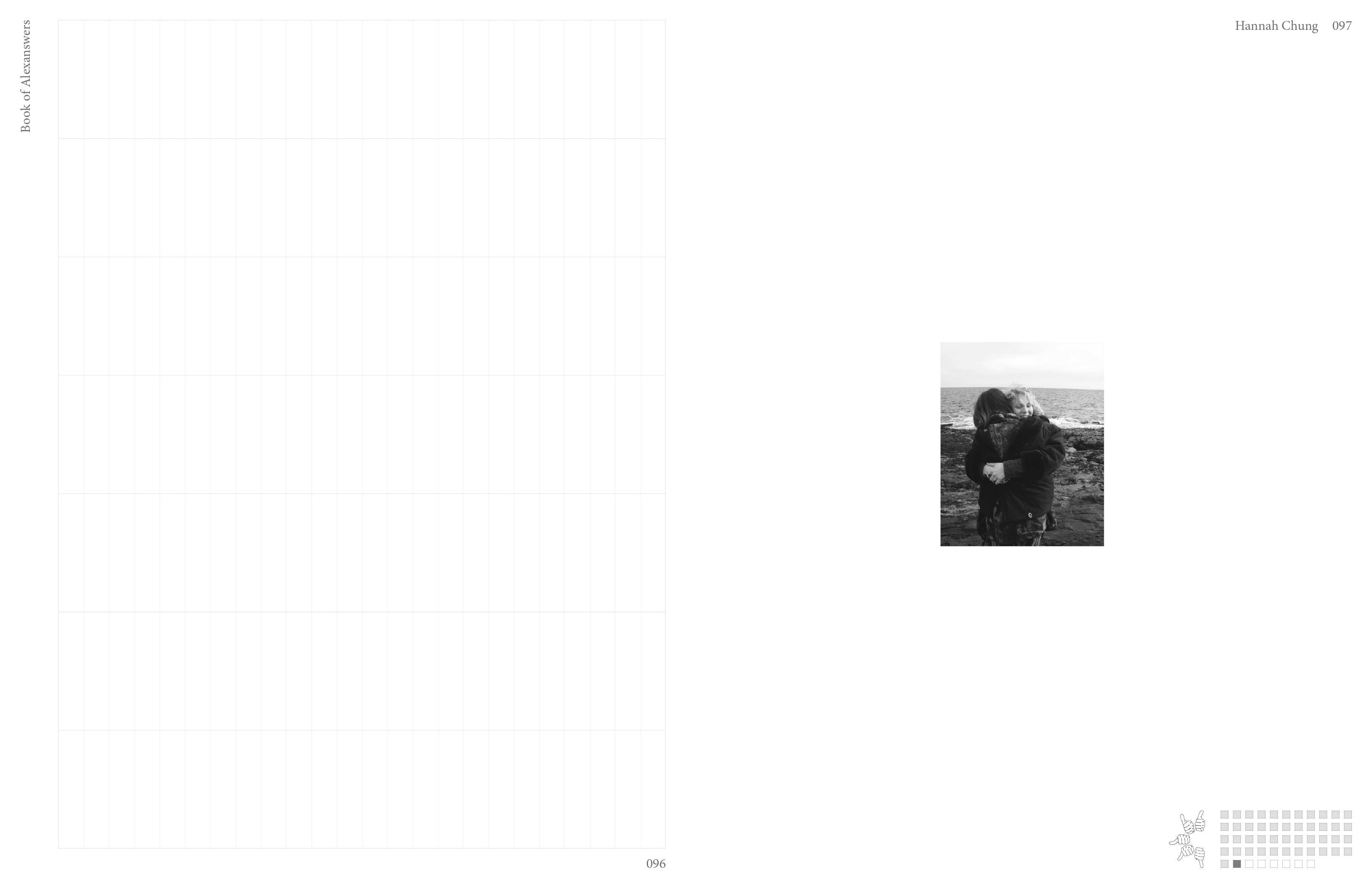
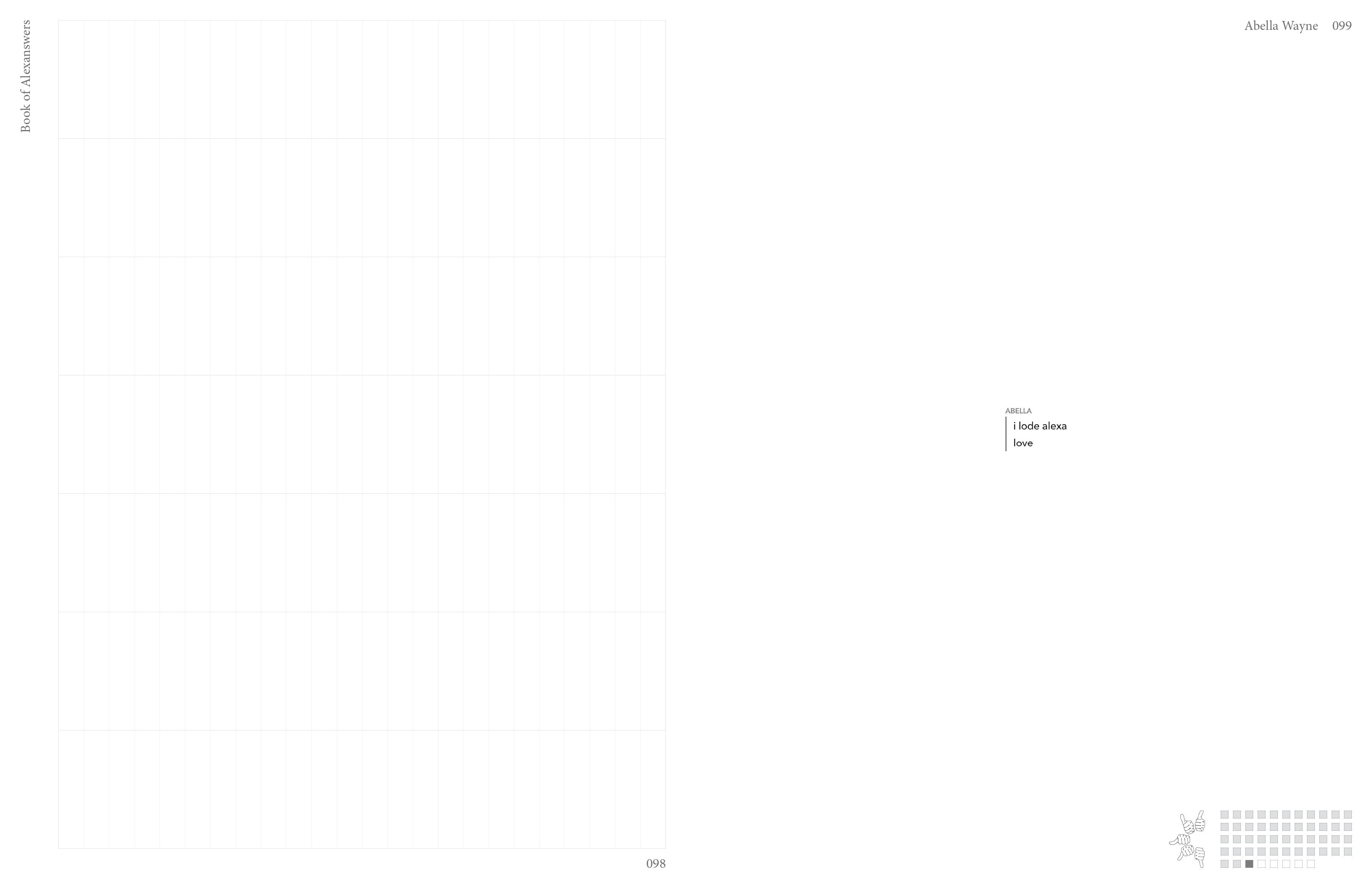
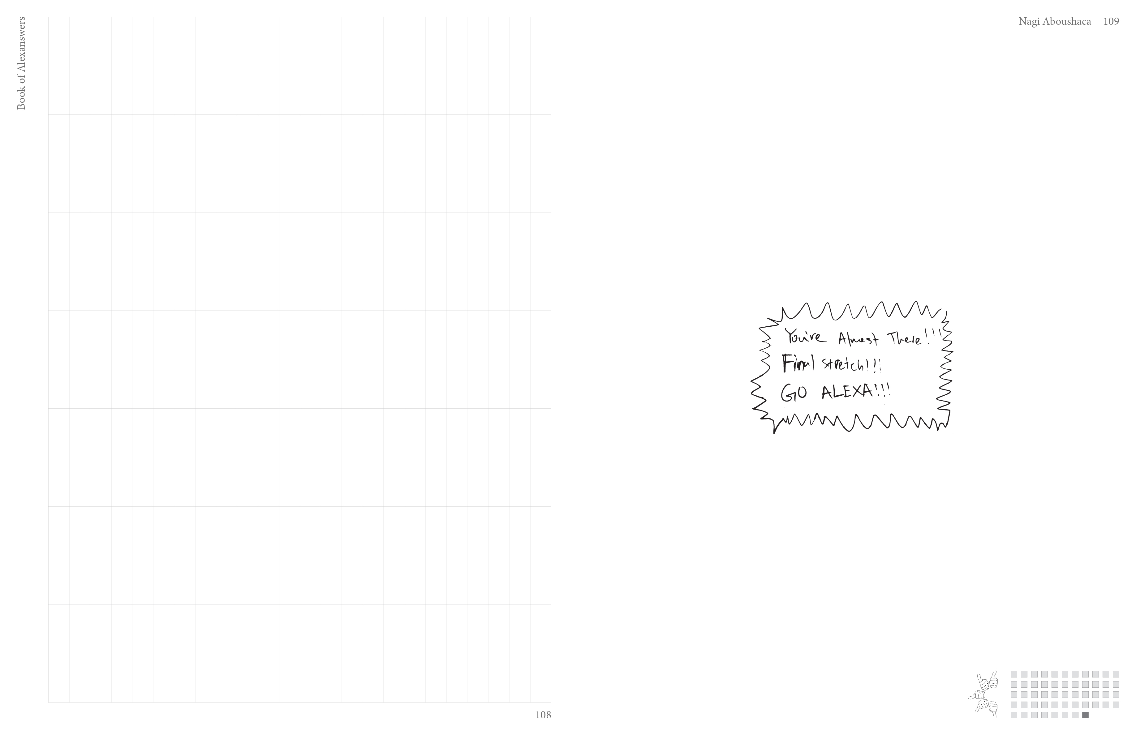
Writing [right page, center]: Handwritten and Digital notes of compliments for recipient
- Names [right page, top right]: Names of note writer
ADDITIONAL NOTES:
The design decisions were based on the preferences and characteristics of the recipient. She wanted to be able to scrapbook and remember the semester before leaving to study abroad, and also needed a planner. The weeks were left unlabeled to emphasize the book's multipurpose trait. Many of her friends were abroad already and was not able to meet many of them for her birthday, so the book was originally designed to bring all global friends together.
The design decisions were based on the preferences and characteristics of the recipient. She wanted to be able to scrapbook and remember the semester before leaving to study abroad, and also needed a planner. The weeks were left unlabeled to emphasize the book's multipurpose trait. Many of her friends were abroad already and was not able to meet many of them for her birthday, so the book was originally designed to bring all global friends together.
FULL BOOK (112 pages)
![]()
![]()
![]()
![]()
![]()
![]()
![]()
![]()
![]()
![]()
![]()
![]()
![]()
![]()
![]()
![]()
![]()
![]()
![]()
![]()
![]()
![]()
![]()
![]()
![]()
![]()
![]()
![]()
![]()
![]()
![]()
![]()
![]()
![]()
![]()
![]()
![]()
![]()
![]()
![]()
![]()
![]()
![]()
![]()
![]()
![]()
![]()
![]()
![]()
![]()
![]()
![]()
![]()
![]()
![]()
![]()
![]()