TEAM
Project Lead: Suraj Ramchandran, Christina Long
Design Lead: Christine Cho
Developers: Ansh Marwa, Anzhuo Wang, Michael Briggs, Diego Hernandez, Max Pinheiro
Designers: Anna Ji, Helen Miao, Cynthia Cao
THE PROBLEM
This project was given to us to build from scratch, so there were many fundamental parts of the program to be built. There weren’t any previous designs or brand identity that the client had in mind, so much of the challenges was specific to finding an identity and working out the capabilities of the developers.
There were also some challenges specific to the project as well. As the system we were creating was based on a paper form, there were some additional capabilities that the client wanted
There were also some challenges specific to the project as well. As the system we were creating was based on a paper form, there were some additional capabilities that the client wanted
- New project
- translate paper form (short answer, long answer) into application
- Inconvenient for submitting and organizing activities for both faculty and committee
faculty - manually have to remember everything done during the year onto one set of papers
merit committee - have to read through unnecessary information for each submission - Unable to edit activities after submissions
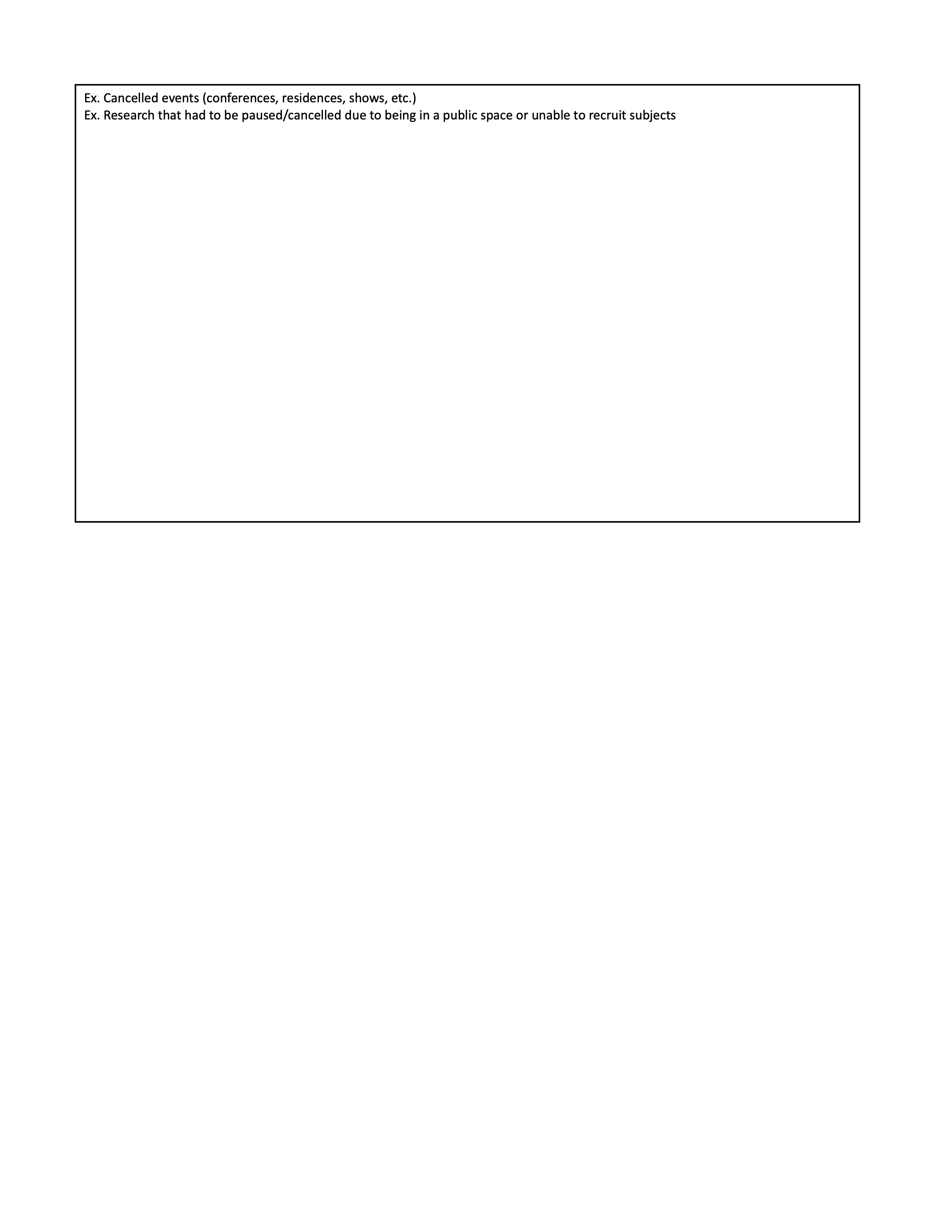
the significance of activities and statuses change (i.e. proposing a course vs. created a course vs. teaching a course) - Inconvenient to update (Especially with COVID, there were some considerable changes within the form, and the paper form was)
- Unable to track multiple semesters
- repetitive process in the form
TARGET AUDIENCE
- Northeastern College of Arts, Media, and Design professors and faculty
- Merit Committee, the faculty members who review the activities of the profs
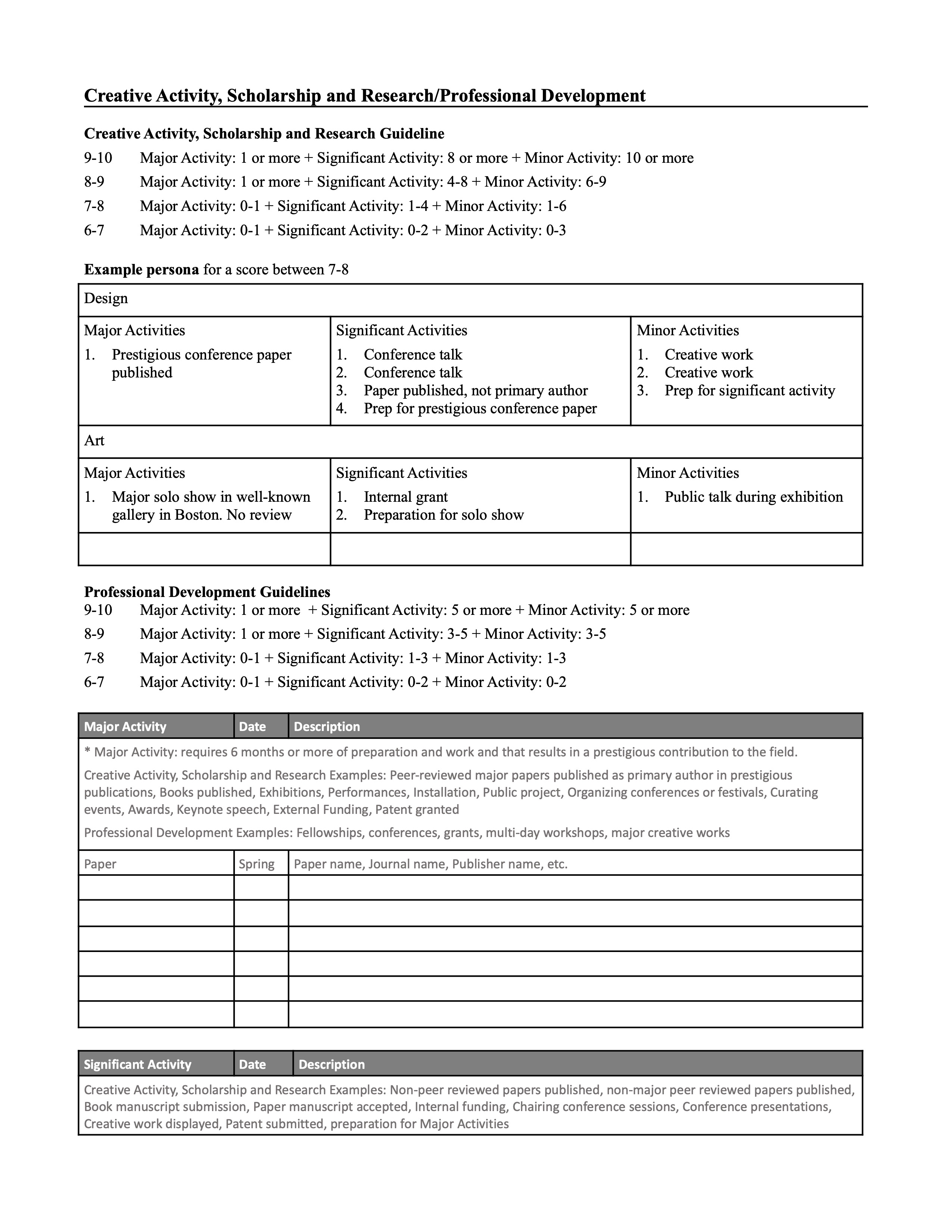
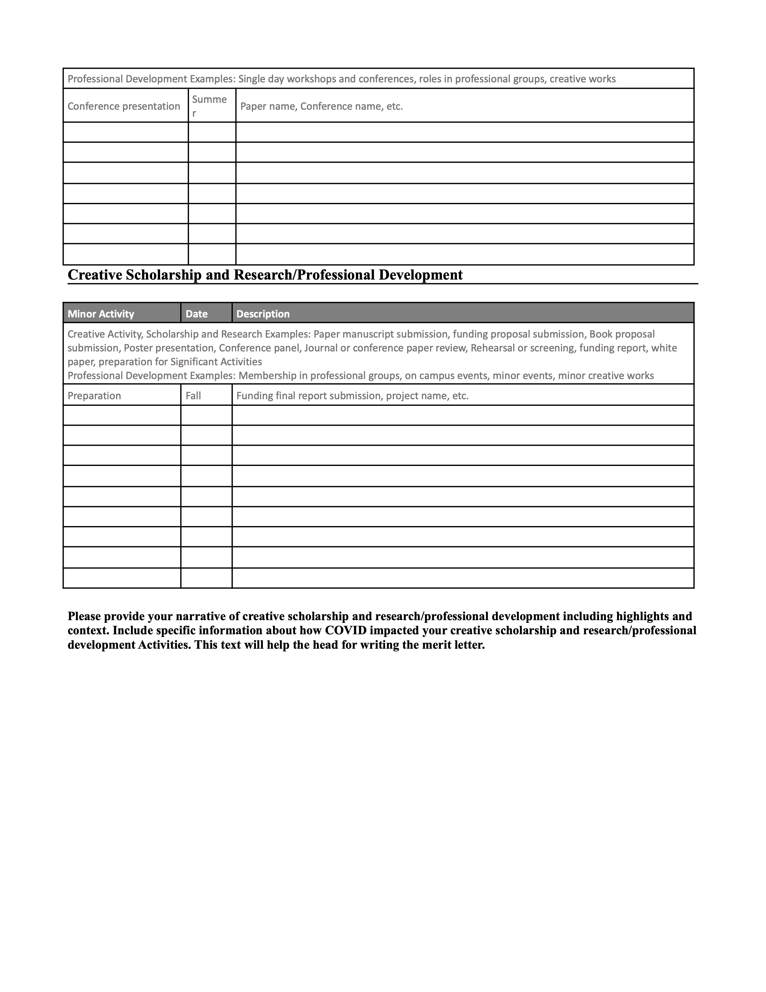
INITIAL FORM
The resources from the client was mainly this document. It was a paper form that the faculty would fill out in order to submit their activities to the Merit Committee.
This is one category (Creative Activity) of the form, and these sections were repeated for all of the other categories as well.
It had information that would have to be repeated on the page,
The actual parts of the pages that were being actively used was minimal, and the information presented was (not that clear)
There were 2 main sections
It lowered the efficiency when reading and filling out the form.
Any instructions and information would be repeated for each section, even though they were the same, and also made it less convenient for the committee to review.
This is one category (Creative Activity) of the form, and these sections were repeated for all of the other categories as well.
It had information that would have to be repeated on the page,
The actual parts of the pages that were being actively used was minimal, and the information presented was (not that clear)
There were 2 main sections
- filling out the different activities (Major, Significant, Minor)
- filling out the narrative
It lowered the efficiency when reading and filling out the form.
Any instructions and information would be repeated for each section, even though they were the same, and also made it less convenient for the committee to review.
USER FLOW
To begin planning out the application, I designed the flow by identifying the main information that needed to be included in the form:
Then we divided it into how we would collect the information. It was important to determine the chronological order of actions that would take place.
![]()
This meant that being able to review and see their past forms was very important, as it allowed them to see the activities themselves, but also write summaries on them, while the act of submitting a form was less important, as it would be a one-time process.
This brought us to tie the narratives into the Submitted Forms page, and also create a dashboard for the faculty to have a clearer summary of their submissions.
- Faculty member information
- Activity information
Then we divided it into how we would collect the information. It was important to determine the chronological order of actions that would take place.
- The faculty member would submit their first form of an activity
- They would be able to view their past activity forms
- At the end of the year, they would write a Narrative, a summary, of each category to further elaborate on what they did

This meant that being able to review and see their past forms was very important, as it allowed them to see the activities themselves, but also write summaries on them, while the act of submitting a form was less important, as it would be a one-time process.
This brought us to tie the narratives into the Submitted Forms page, and also create a dashboard for the faculty to have a clearer summary of their submissions.
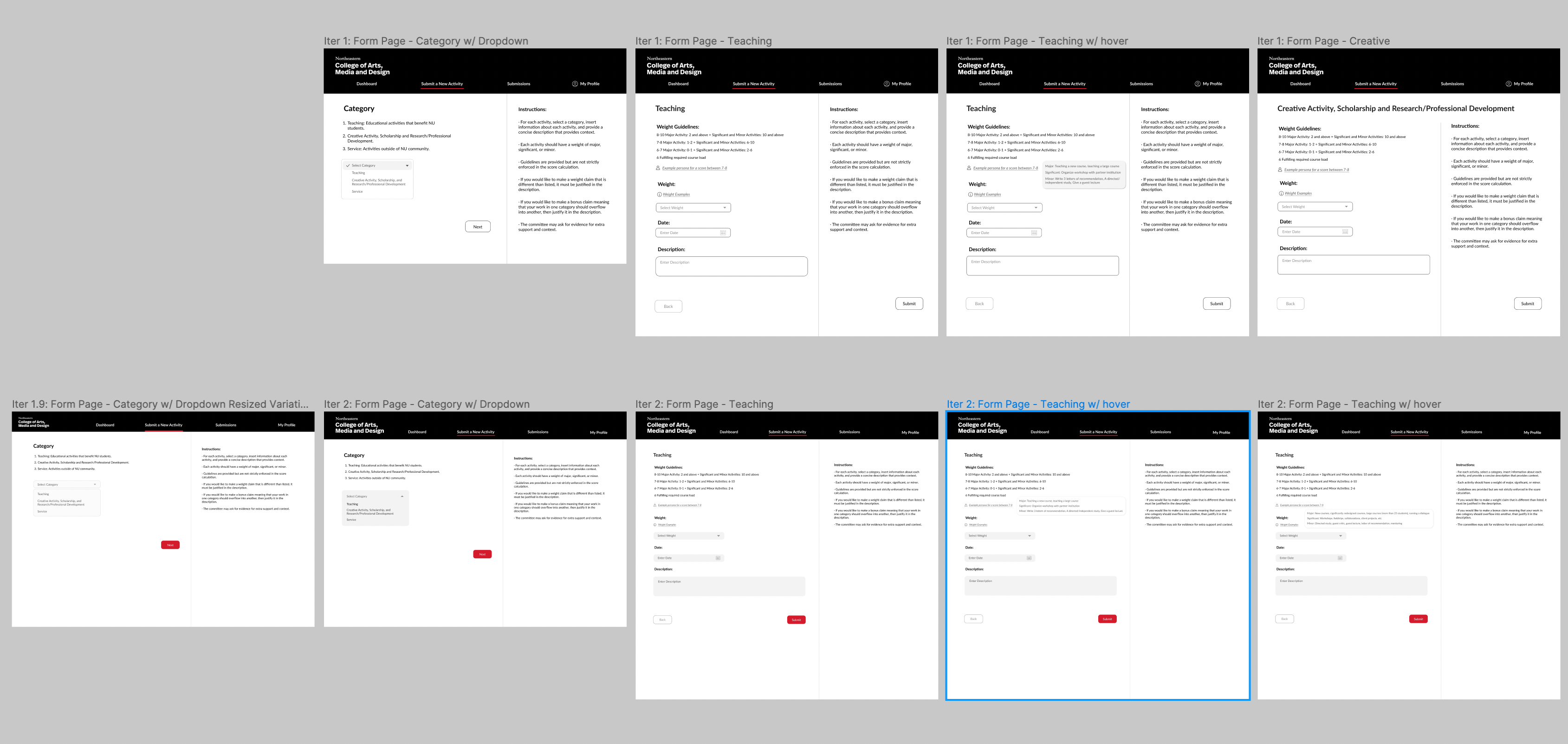
LOW FIDELITY ITERATIONS
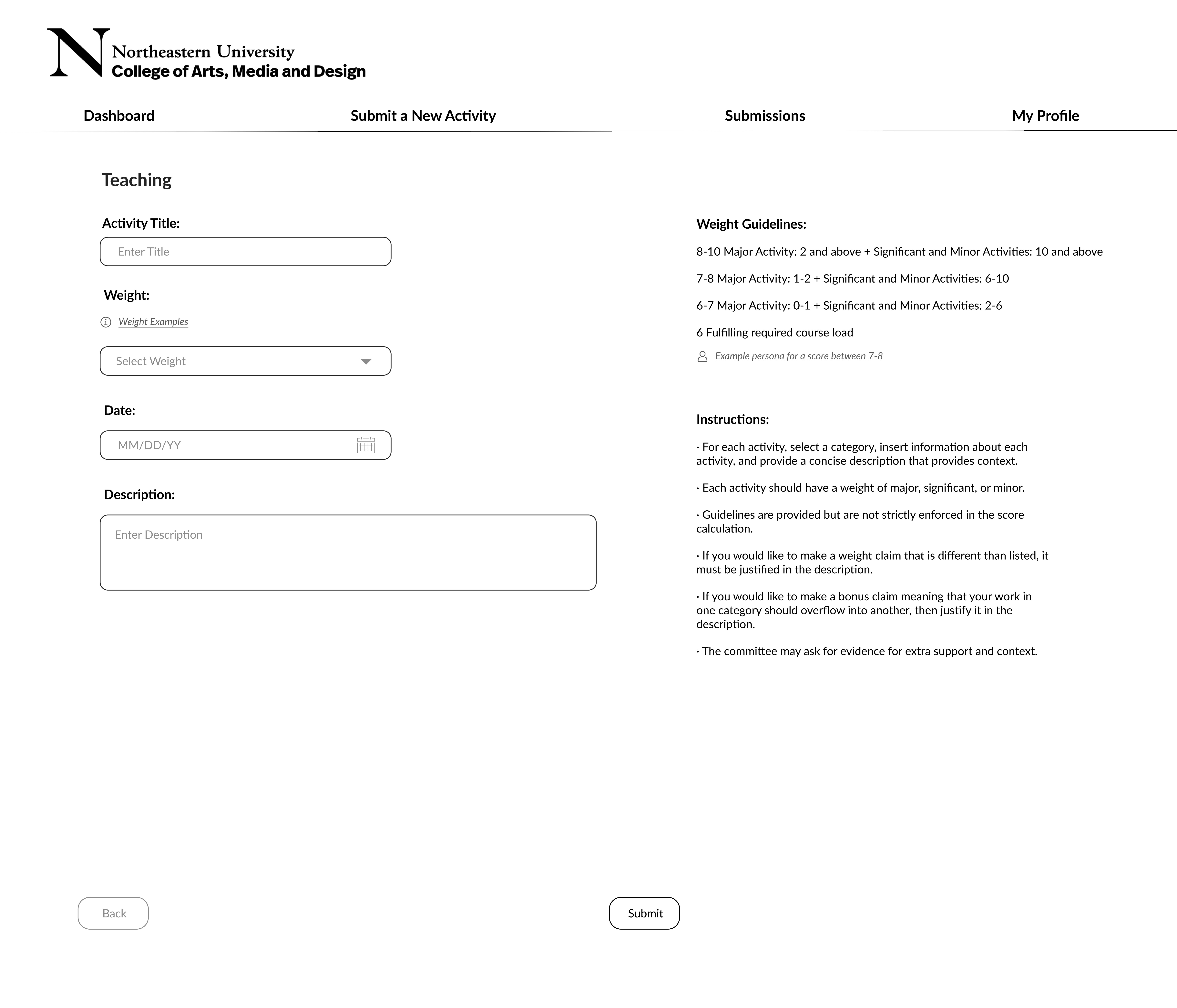
When designing the forms, we determined what information was more important than others. The following information had to be included:
By looking through the forms and discussing with the Merit committee, it was apparent that the differences between category was very significant, as each category would be graded on different rubrics. So we executed this so that there would be three types of form, each belonging to one of the three categories: Teaching, Creative, and Service; and the other information would be within each category.
In the low fidelity frames, we designed the Category to be selected in its own page, while all other information would be presented on one page.
Because the information the faculty would submit was very short, we found it would be most convenient for faculty to view all of their information in one screen, instead of dividing it up many.
Low fidelity frames were where we could come up with many variations of the content and composition to experiment with what designs would fit our needs the best.
- Category
- Name
- Description
- Time period
- Weight (the level of significance)
By looking through the forms and discussing with the Merit committee, it was apparent that the differences between category was very significant, as each category would be graded on different rubrics. So we executed this so that there would be three types of form, each belonging to one of the three categories: Teaching, Creative, and Service; and the other information would be within each category.
In the low fidelity frames, we designed the Category to be selected in its own page, while all other information would be presented on one page.
Because the information the faculty would submit was very short, we found it would be most convenient for faculty to view all of their information in one screen, instead of dividing it up many.
Low fidelity frames were where we could come up with many variations of the content and composition to experiment with what designs would fit our needs the best.


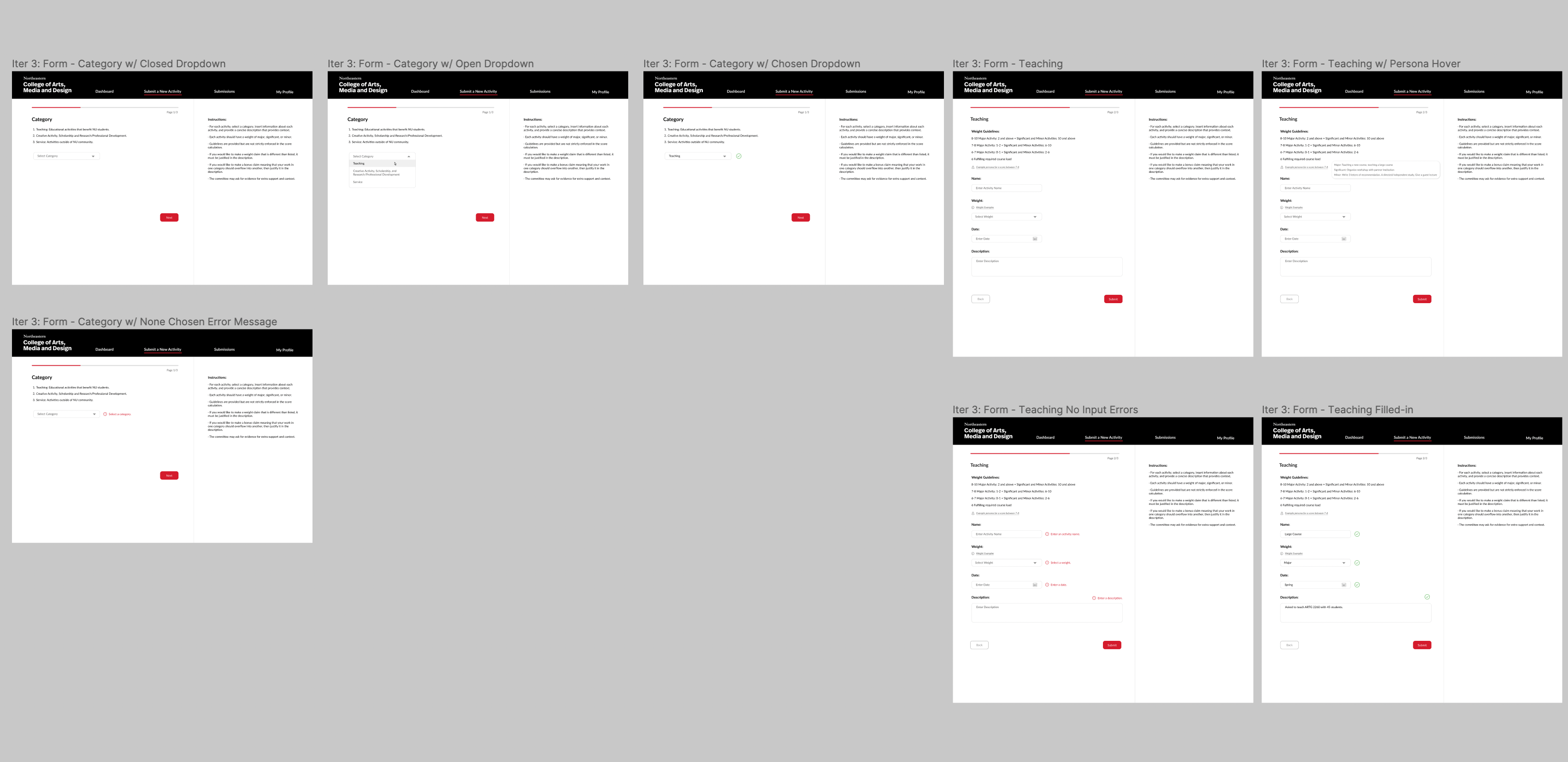
CHANGED SCREENS
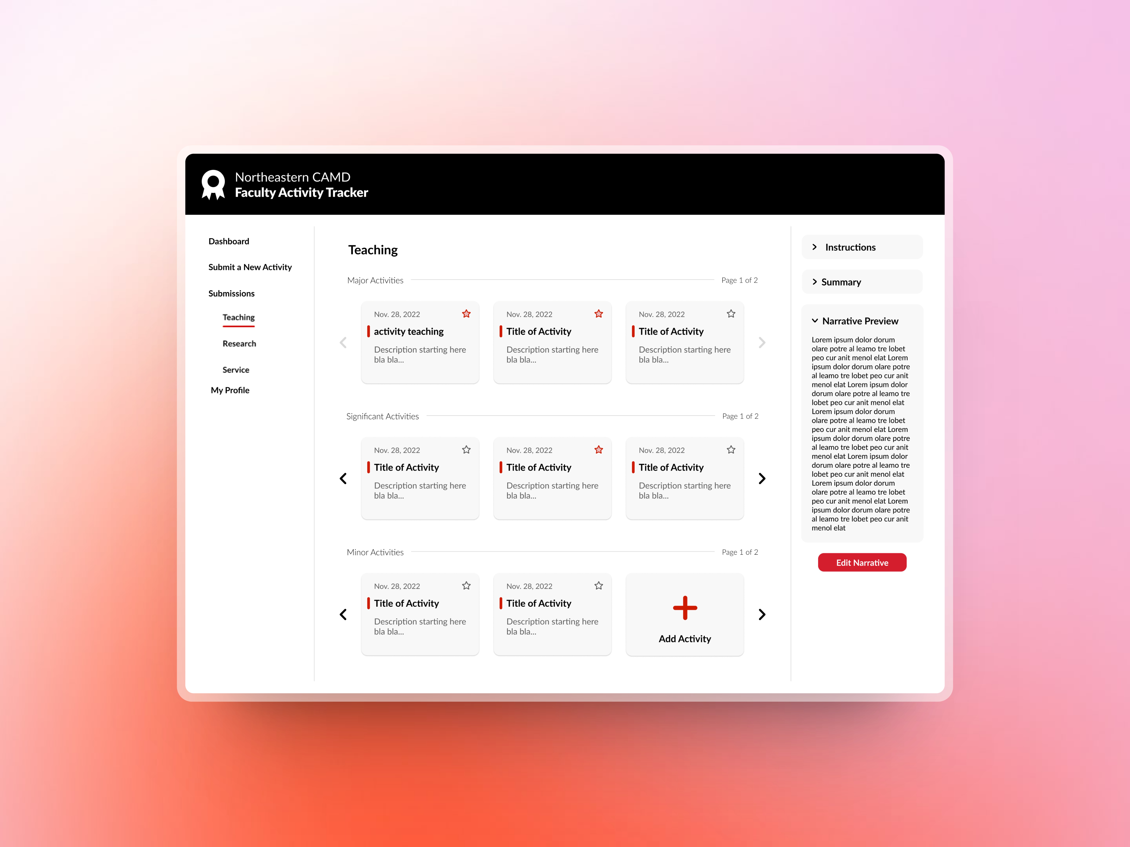
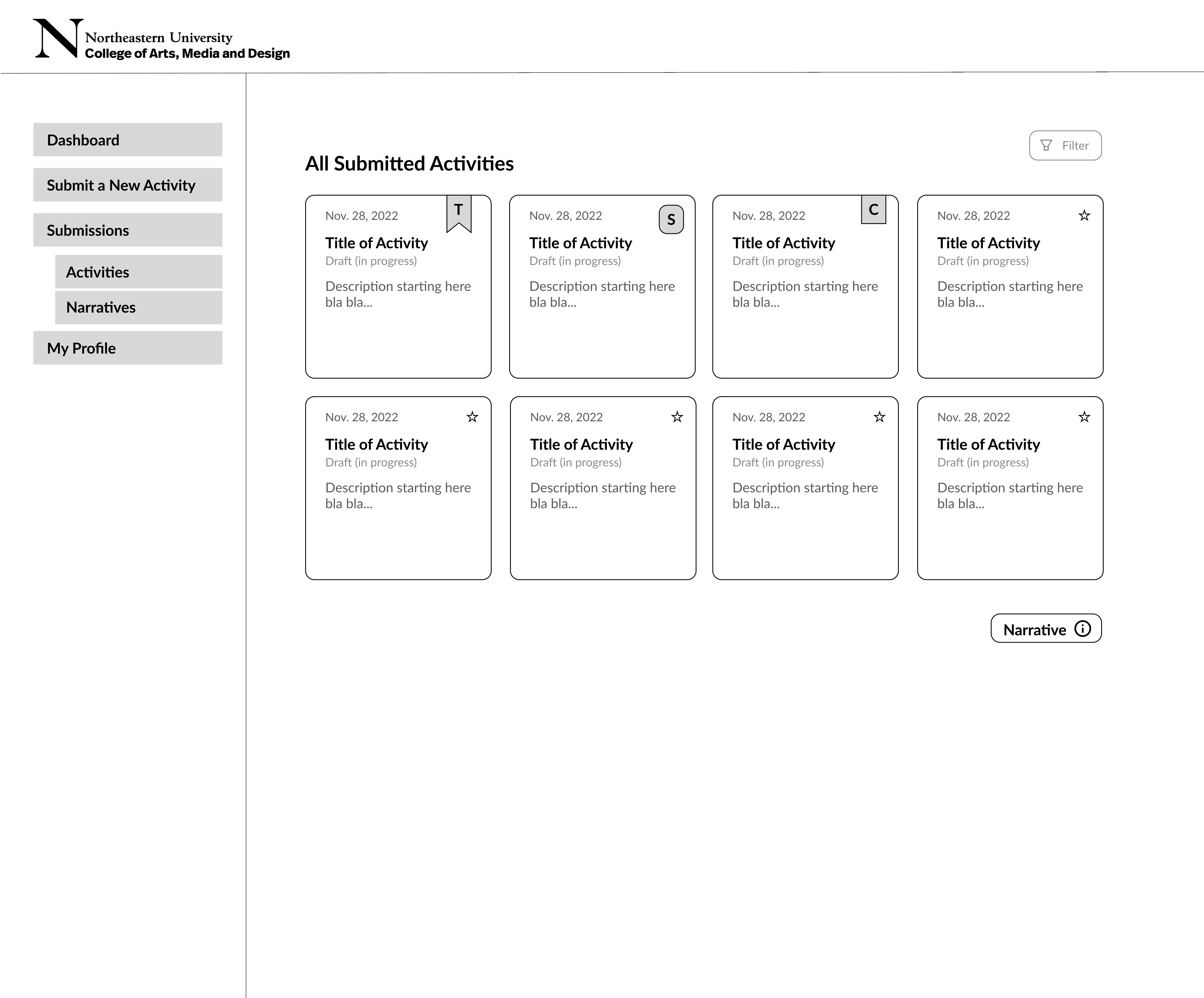
One of the most important aspects of the application: the view of the submitted activities, was one we tested out many iterations for. We determined what information would have to be prioritized, and how such information could be clearly communicated. Starting with lines of documents, we ended up using cards, and setting them up in the three categories, and presented as a carousel. This prevented the dashboard from looking too crammed, while allowing the information to be easily accessible and organized to the viewer.

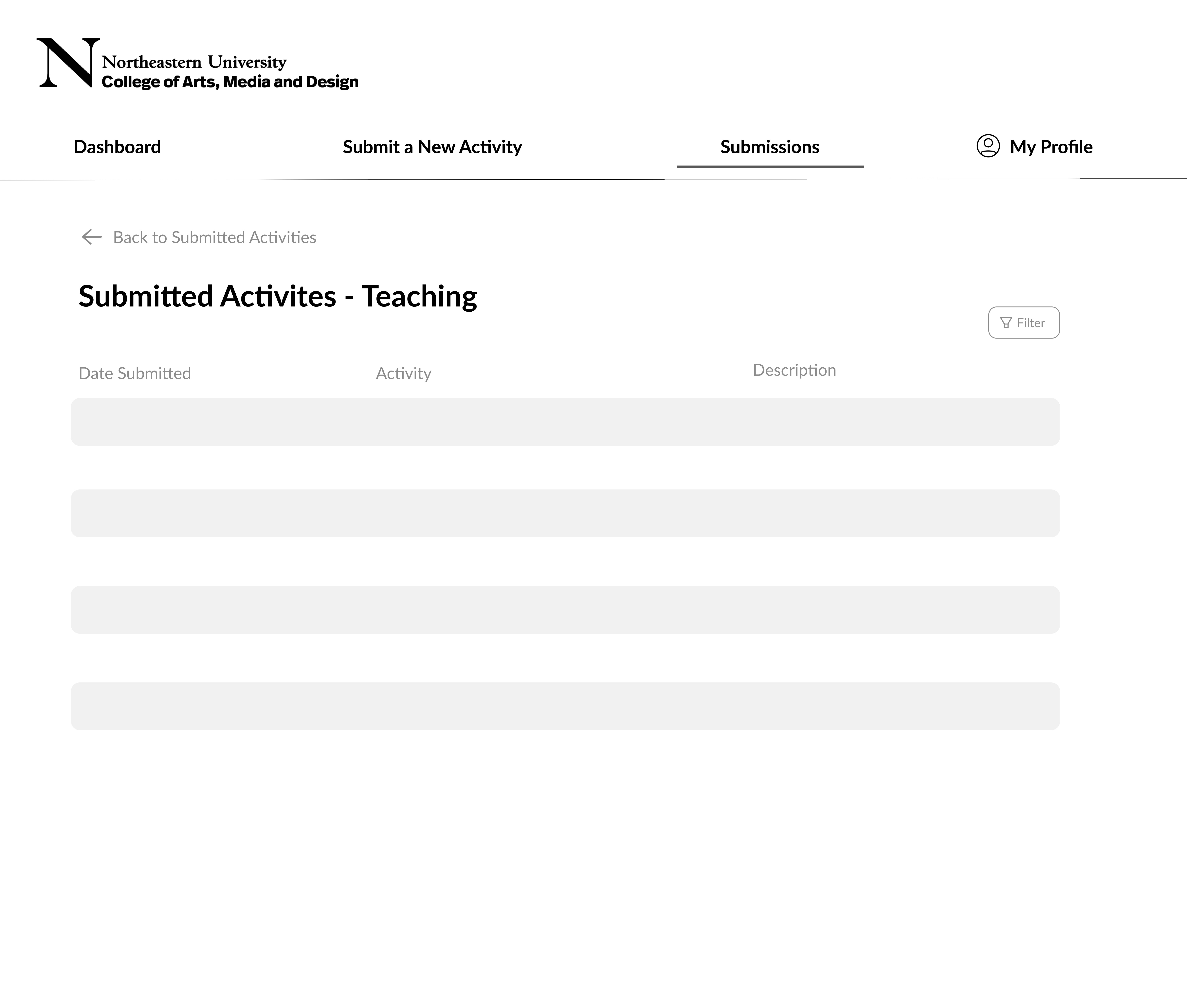
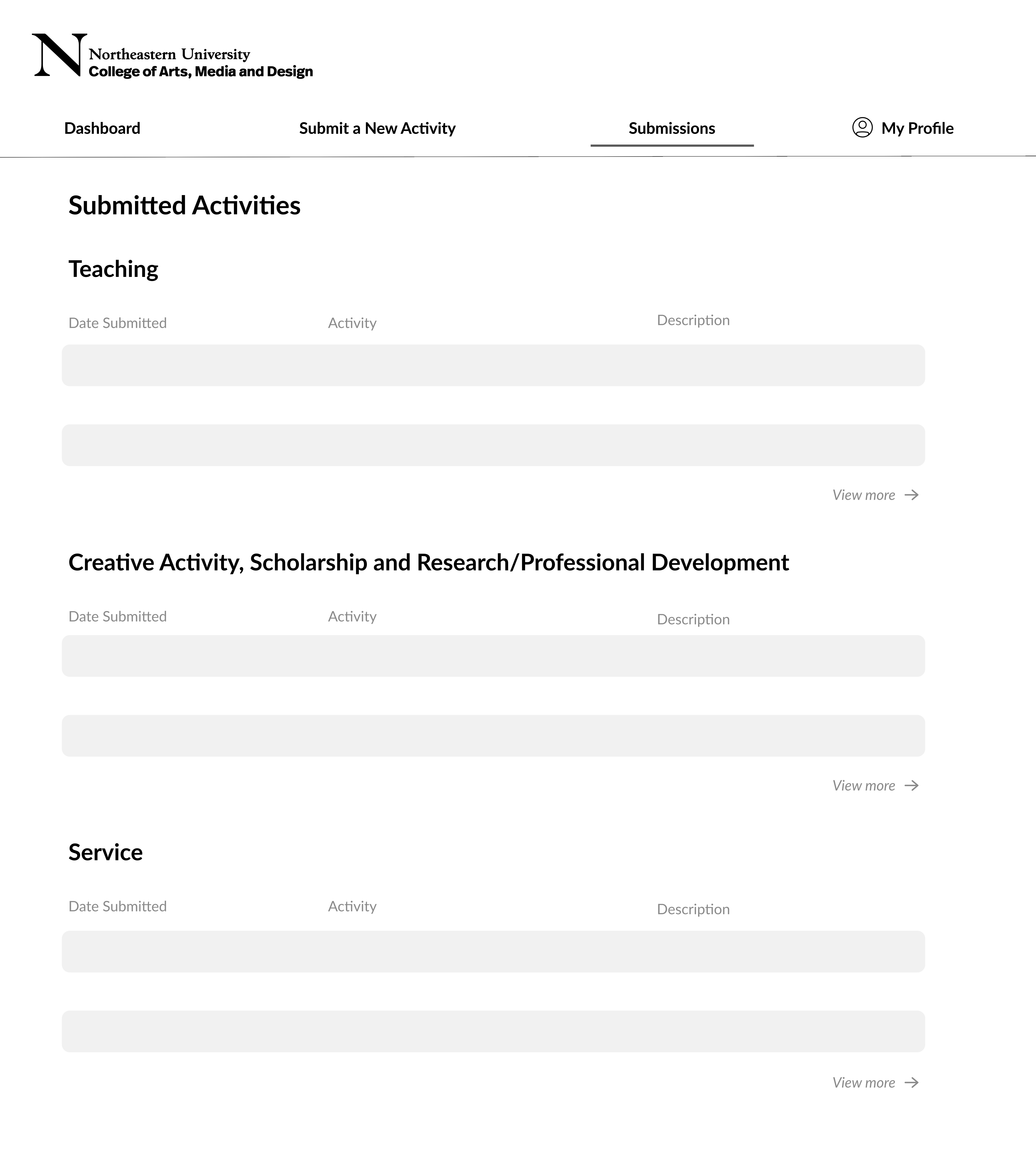
Additionally, after continuing to iterate and brainstorm the composition of the website, we also decided to relocate the navigation bar to the left side, and add instructinos or other textual content as an information bar on the right. This helped even out the margins within the screen, and made it easy for the user to view necessary information in one view. This increased convenience, and also worked well, as much of the information was related to each other and made more sense in the same context. Especially as each form did not demand too much content, it allowed each screen to be well balanced and not overwhelming with information.

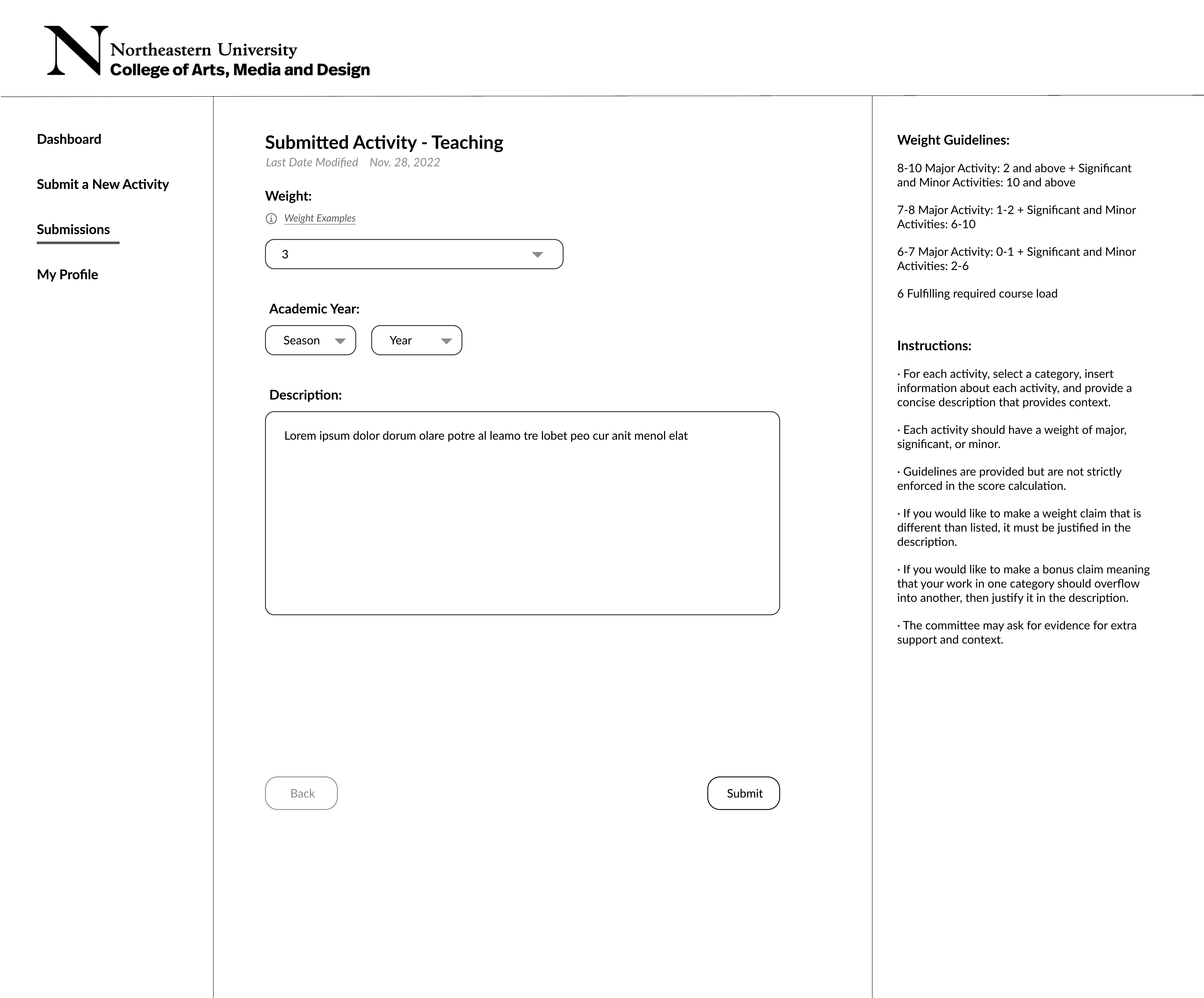
HIGH FIDELITY ITERATIONS
Though the high fidelity frames are a work in progress, this allowed us to pick out a color scheme and brand identity.
As most of the information was based on text, incorporation of color and design elements were minimal.
We made sure to keep all information clear and organized, accentuating the navigation, while keeping most of the information on the page work in relation to each other.
The navigation bar and color scheme was also designed to align with the brand identity of the College of Arts, Media and Design of Northeastern, to keep a continuity within the school programs.