MEMORIAL DESIGN
Course Project [ARTF 1122]PROMPT
Design a public art memoral with a shared symbolic culture
Design a public art memoral with a shared symbolic culture
THE CONCEPT
When starting, I began by thinking of what publicity would bring to a monument. I wanted to create an inclusive environment in the public space, and took an approach that would allow for personal connections from a big audience.
Mostly everyone has a childhood, and what they define to be the “good old days”. A point in our lives where we perceived the world to be much simpler yet more beautiful and grand than we do now, as adults.
I wanted to relive this experience, remind us of how this perception and memories of ours used to feel, but also how they sometimes change. I aimed to encompass both sides of childhood memories in this project, both the beautiful and dreamy nature, but also the bittersweet contrast to reality.

THE VISUALIZATION
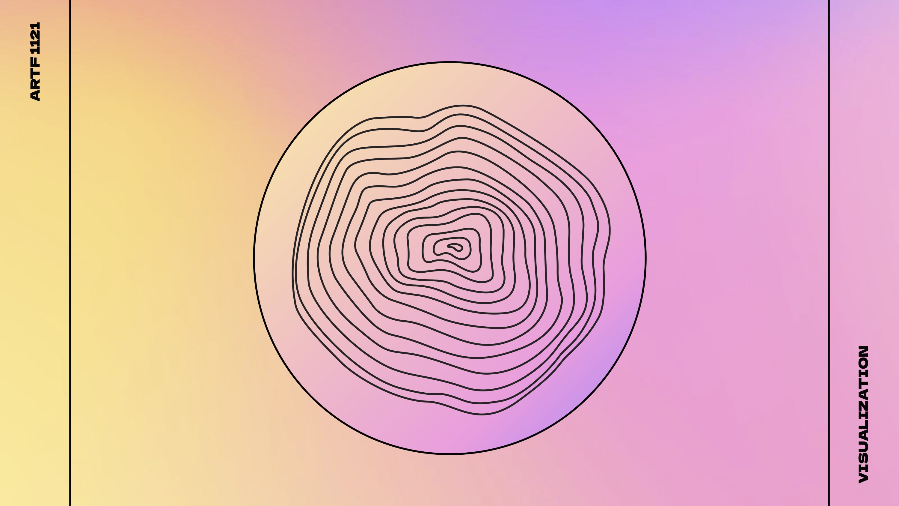
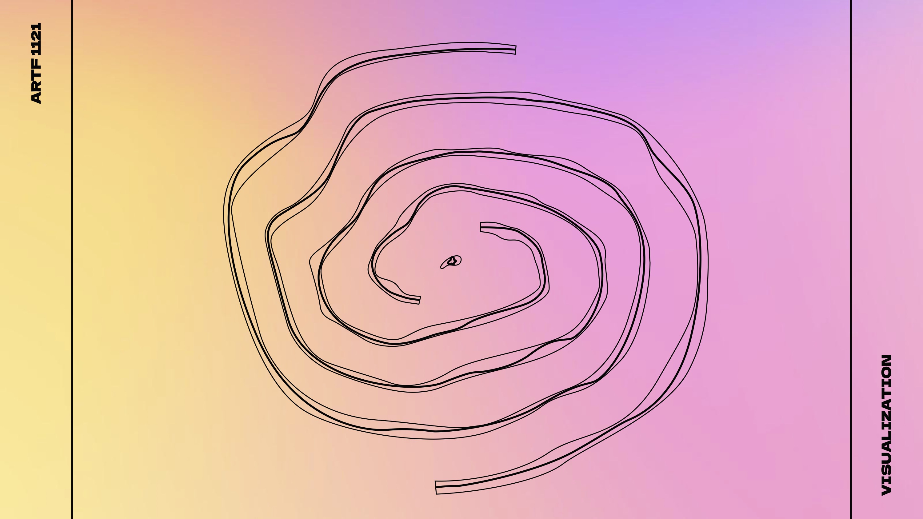
To start, I started with an exercise that we had done for one of my architecture assignments. It was a rule drawing, where we would start off with a shape, and draw parallel to that shape on its exterior. The rule drawing would stop after drawing 10~20 lines, and only the small initifal form and the outermost form would be compared.
This process of abstraction (of the starting shape) reminded me of the way our memories would slowly fade with time, and become a different form. However I wanted to represent how memories continue to change depending on our ever-changing perceptions, so I decided to take an extra step.
Once reaching the edge of the paper, I copied the outermost shape I drew, and began drawing parallel shapes to its interior. I continued drawing until I ended up with another small form in the center.
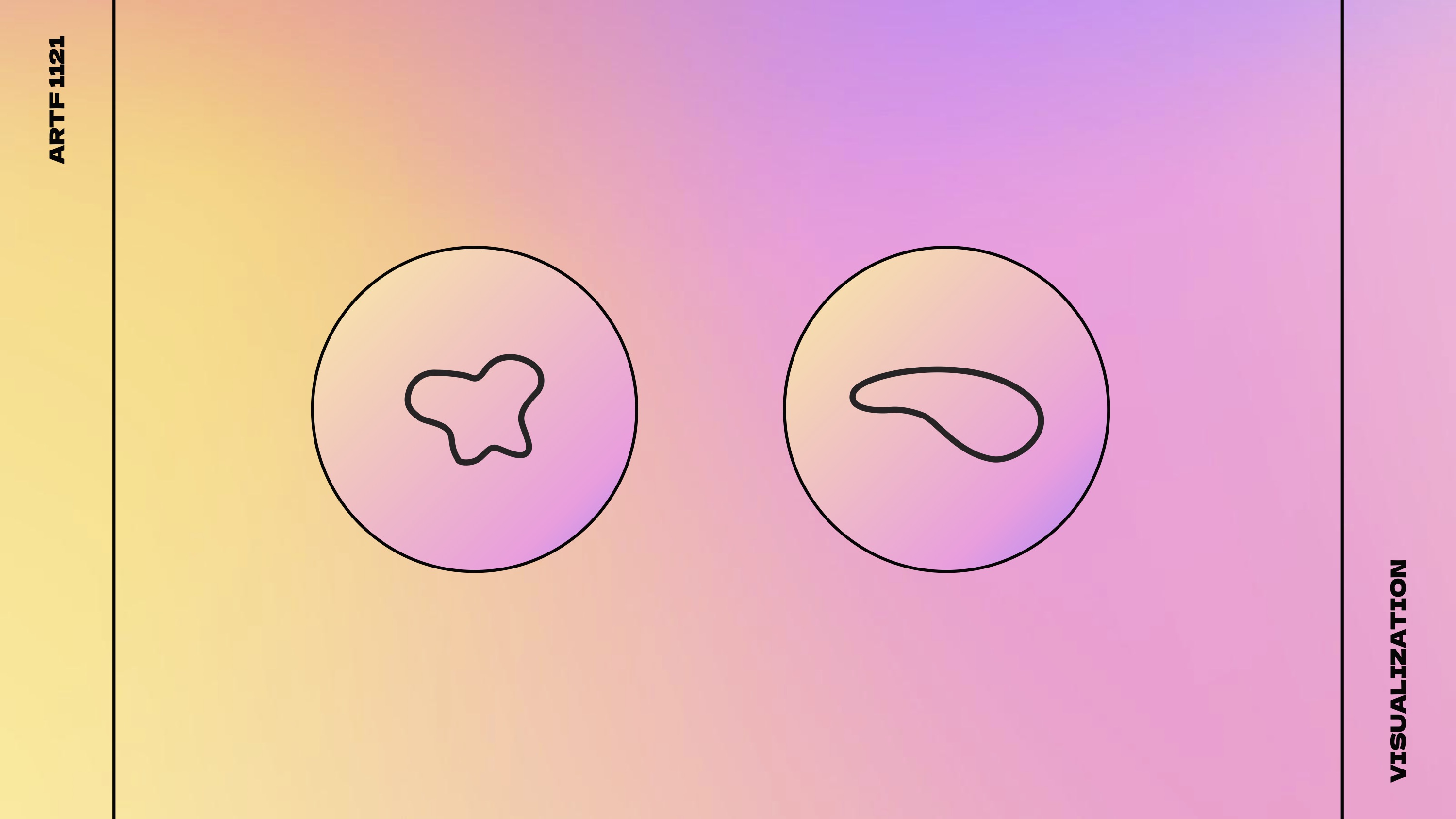
I then compared these two shapes in the center, which were drastically different shapes from each other. This resulting difference well-encapsulated how the passing of time altered our perception of the memory.
I drew a form that resembled a tooth to represent childhood, symbolizing the teeth exfoliation process of children.
To start, I started with an exercise that we had done for one of my architecture assignments. It was a rule drawing, where we would start off with a shape, and draw parallel to that shape on its exterior. The rule drawing would stop after drawing 10~20 lines, and only the small initifal form and the outermost form would be compared.
This process of abstraction (of the starting shape) reminded me of the way our memories would slowly fade with time, and become a different form. However I wanted to represent how memories continue to change depending on our ever-changing perceptions, so I decided to take an extra step.
Once reaching the edge of the paper, I copied the outermost shape I drew, and began drawing parallel shapes to its interior. I continued drawing until I ended up with another small form in the center.
I then compared these two shapes in the center, which were drastically different shapes from each other. This resulting difference well-encapsulated how the passing of time altered our perception of the memory.
I drew a form that resembled a tooth to represent childhood, symbolizing the teeth exfoliation process of children.

APPLIED DESIGN
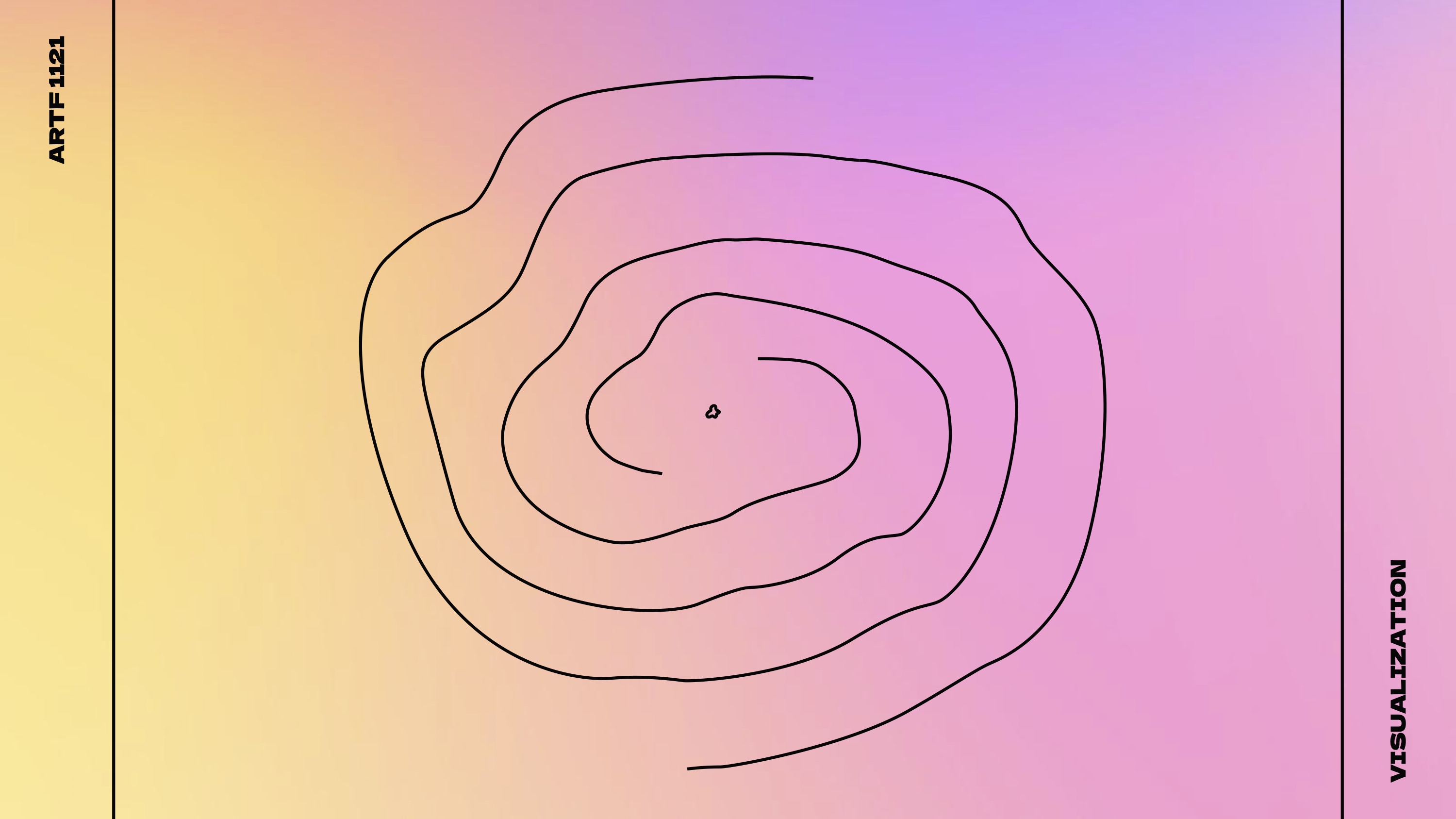
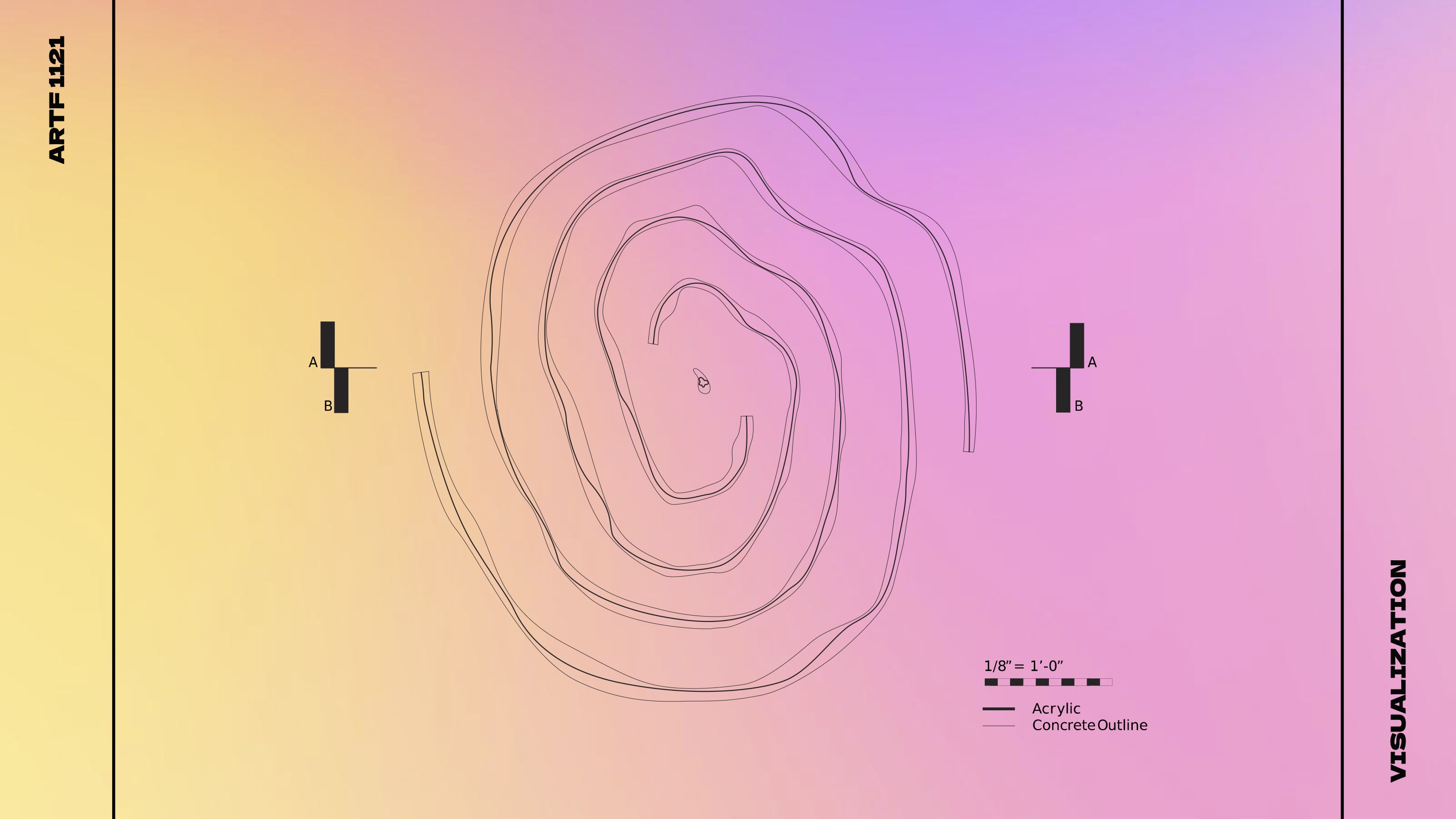
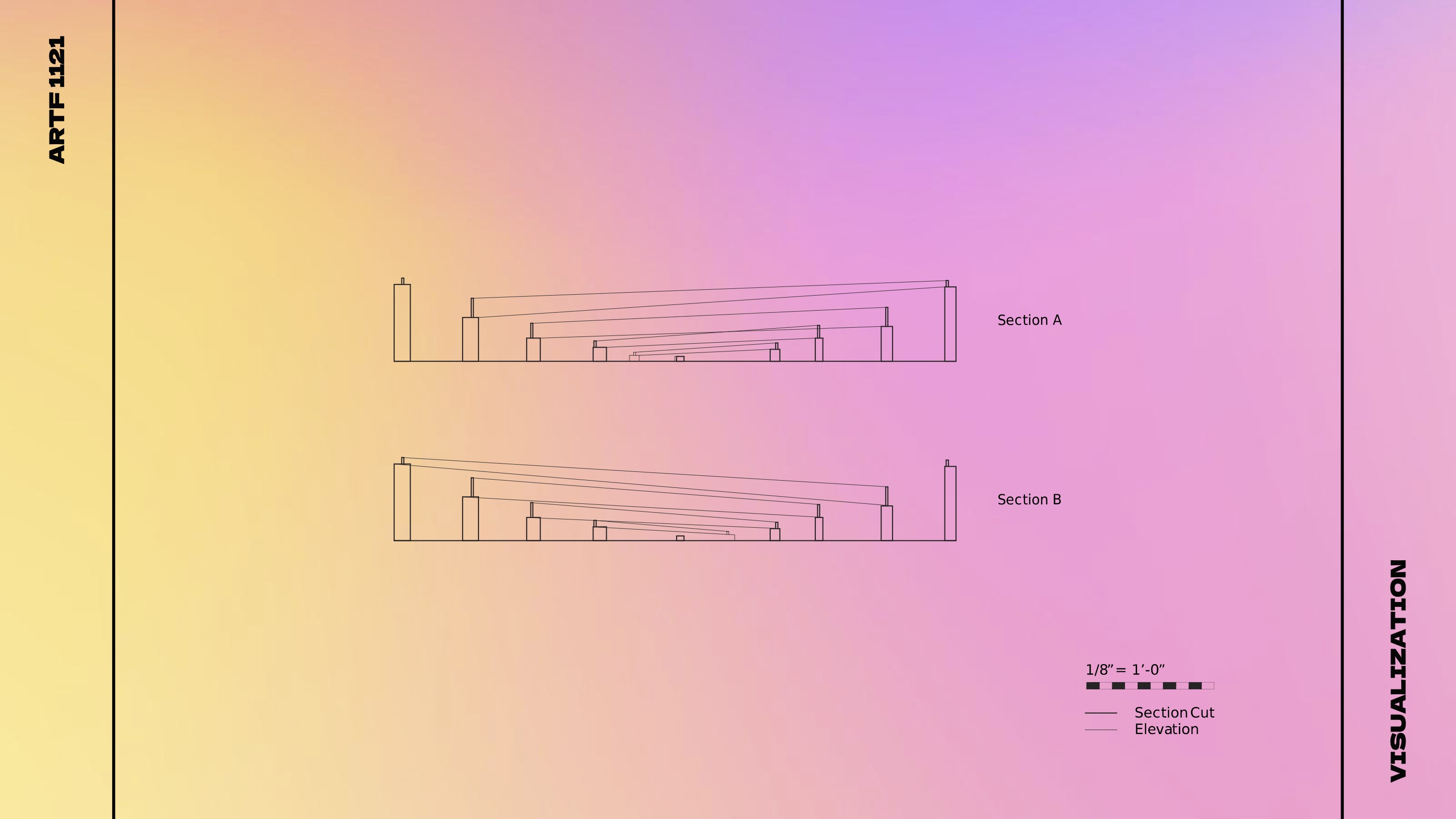
To apply these two varying patterns, I tried to find a way to juxtapose these two forms and emphasize their slight differences. I modified the drawing into a spiral form, to create a directional circulation within the monument.
I represented adulthood with a 6 inch thick concrete wall, concrete representing the way reality sometimes felt: dull and rough, while the childhood was represented as 1/2~1 inch thick acrylic resin to represent the dreamy yet ephemeral characteristic of childhood.
The acrylic would go on top of the concrete wall, to create contrasting curves against the form of the concrete.
In order to enhance the experience in the memorial, I designed the walls to descend, creating a sense of enclosure in the memorial. This allowed the person walking through the memorial to see the walls come down, revealing the These walls would eventually lead the center, where the direct comparison of the differing results would be. The concrete ‘wall’ would shaped like the result of the adult representation, with a layer of acrylic in the form of the result of the childhood representation on top.


TARGET AUDIENCE
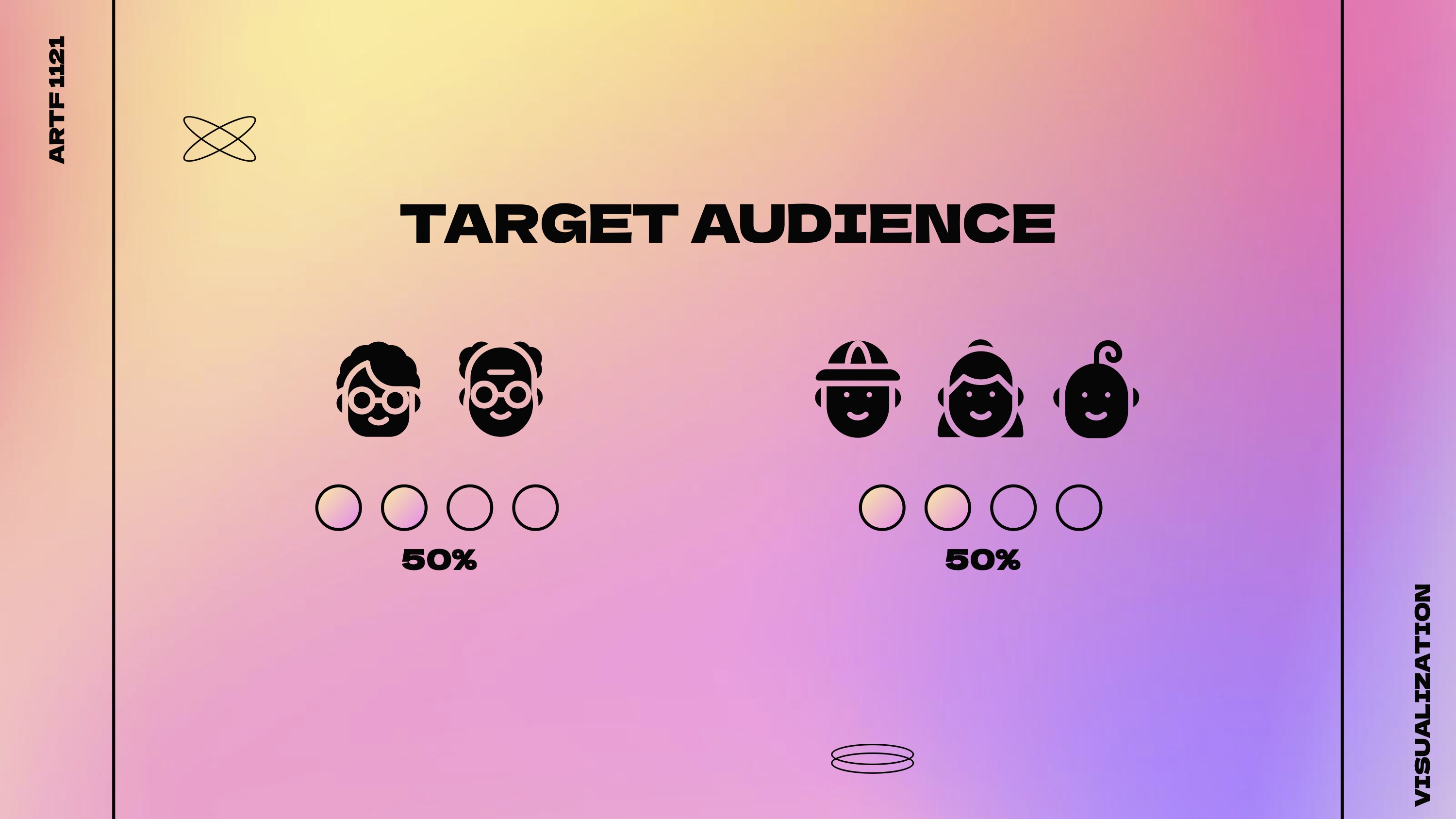
To accentuate the act of reminiscing, I wanted to dedicate this monument mostly to seniors, and bring them back to the nostalgic past, but also connect them with actual children and people “living their childhood”. I found that unifying these two age gaps would allow for the combination of the liveliness and joyfulness of childhood with the bittersweet memories, fulfilling the purpose behind the memorial.
To accentuate the act of reminiscing, I wanted to dedicate this monument mostly to seniors, and bring them back to the nostalgic past, but also connect them with actual children and people “living their childhood”. I found that unifying these two age gaps would allow for the combination of the liveliness and joyfulness of childhood with the bittersweet memories, fulfilling the purpose behind the memorial.
POTENTIAL LOCATION
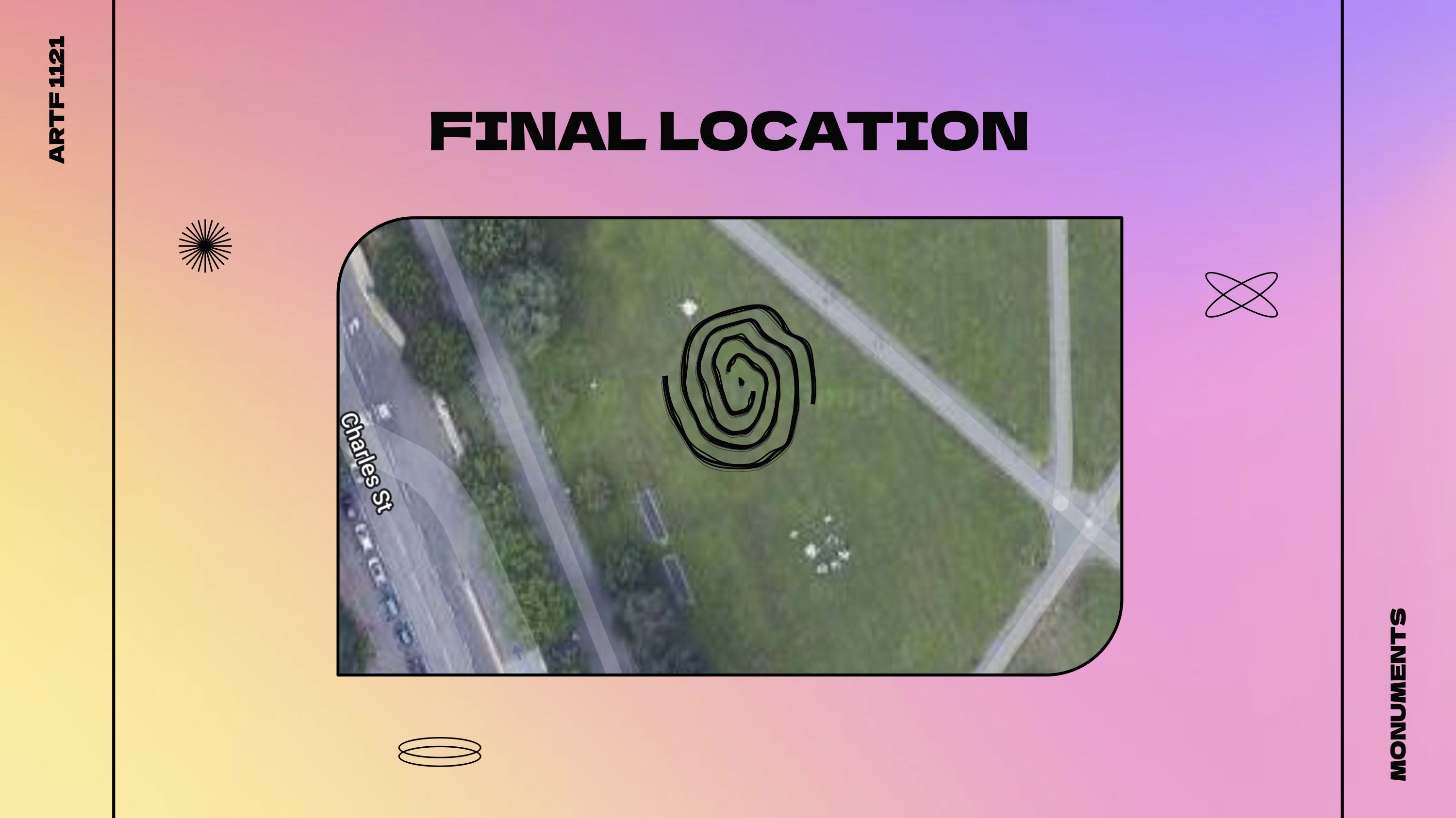
I looked for a location among many nursing homes and elementary schools to fulfill this target audience, and I needed a large interactive monument to coincide with the nature of memories and its immersiveness, so chose a large green area in Boston Common, located here
I looked for a location among many nursing homes and elementary schools to fulfill this target audience, and I needed a large interactive monument to coincide with the nature of memories and its immersiveness, so chose a large green area in Boston Common, located here