DESIGN WORKS
View more works here↗ANAPHORA POSTER
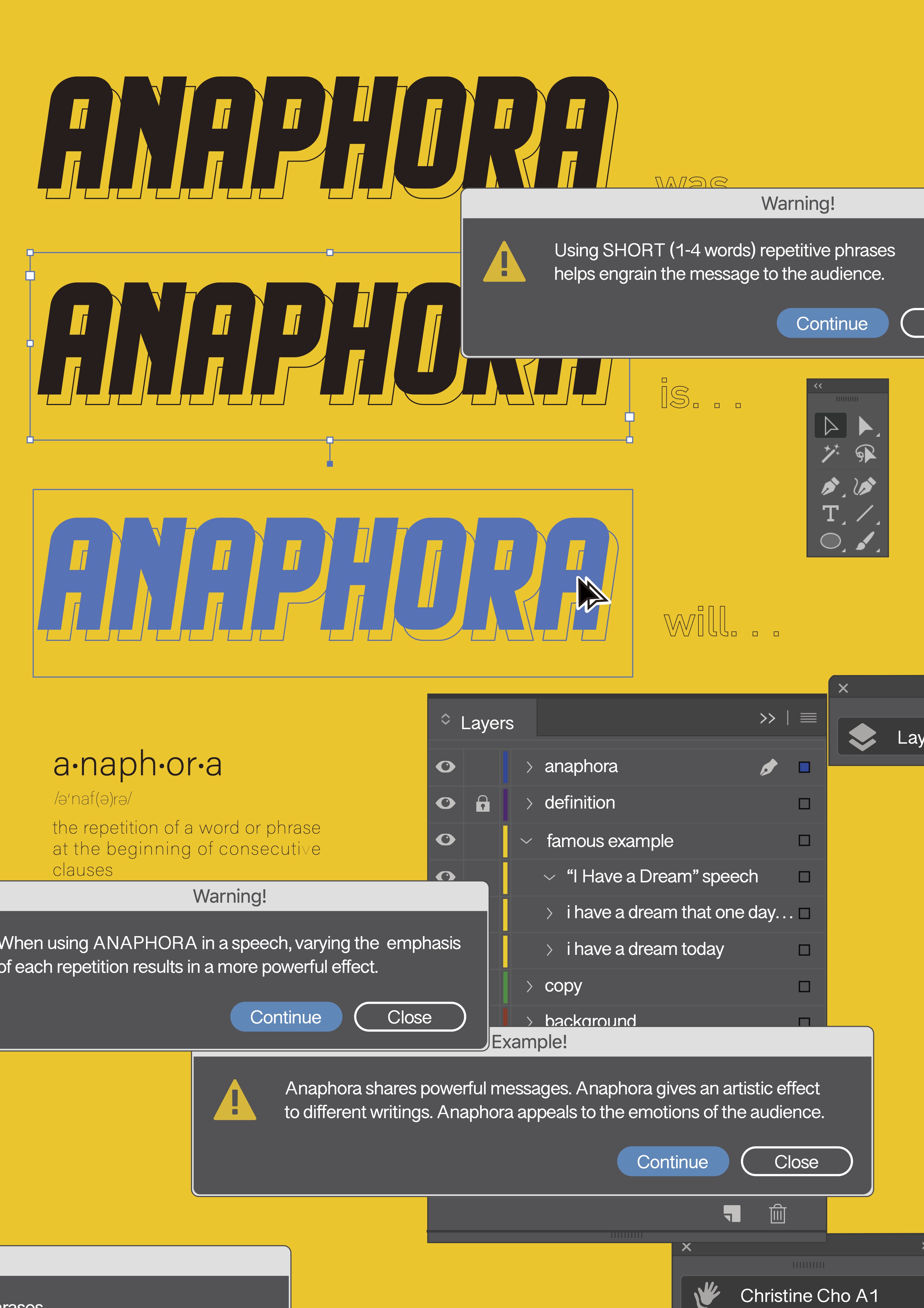
297x420mm (A3).
This is a poster for a collaborative series of posters representing literary devices, and I designed the term anaphora.
We were assigned to include the following:
In addition to these textual requirements, I also visually represented the definition of anaphora through imitating the screen when using the ‘option+drag’ copy command in Adobe Illustrator.
This served as the stepping stone for the theme of the project, that guided me to include the rest of the information as different aspects of Illustrator.
I utilized the varying pop-ups and customizeable windows to convey the rest of the information:
To result in a visually interesting composition, I made the effort to use colors that would fit in but have high contrast against default Illustrator colors. I utilized the same series of greys for the windows, and the same blue that appeared when copying an object. The main color to choose was the background, and I decided to use a yellow reminiscent of that of the warning symbol. It had an interesting contrast against the blue, but also carried the yellow theme that was present in the warning and layer panels.
297x420mm (A3).
This is a poster for a collaborative series of posters representing literary devices, and I designed the term anaphora.
Anaphora is when there is a repetition of a word or phrase at the beginning of consecutive clauses.
We were assigned to include the following:
- Definition
- Famous example
- Tips on how to use the device
- Personal example
In addition to these textual requirements, I also visually represented the definition of anaphora through imitating the screen when using the ‘option+drag’ copy command in Adobe Illustrator.
This served as the stepping stone for the theme of the project, that guided me to include the rest of the information as different aspects of Illustrator.
I utilized the varying pop-ups and customizeable windows to convey the rest of the information:
- The definition was integrated on the main “artboard”
- A famous example was included as the names of layers
- Two tips were presented as ‘Warning’ pop-up windows
- The pop-up window design was continued to add one example I came up with.
To result in a visually interesting composition, I made the effort to use colors that would fit in but have high contrast against default Illustrator colors. I utilized the same series of greys for the windows, and the same blue that appeared when copying an object. The main color to choose was the background, and I decided to use a yellow reminiscent of that of the warning symbol. It had an interesting contrast against the blue, but also carried the yellow theme that was present in the warning and layer panels.
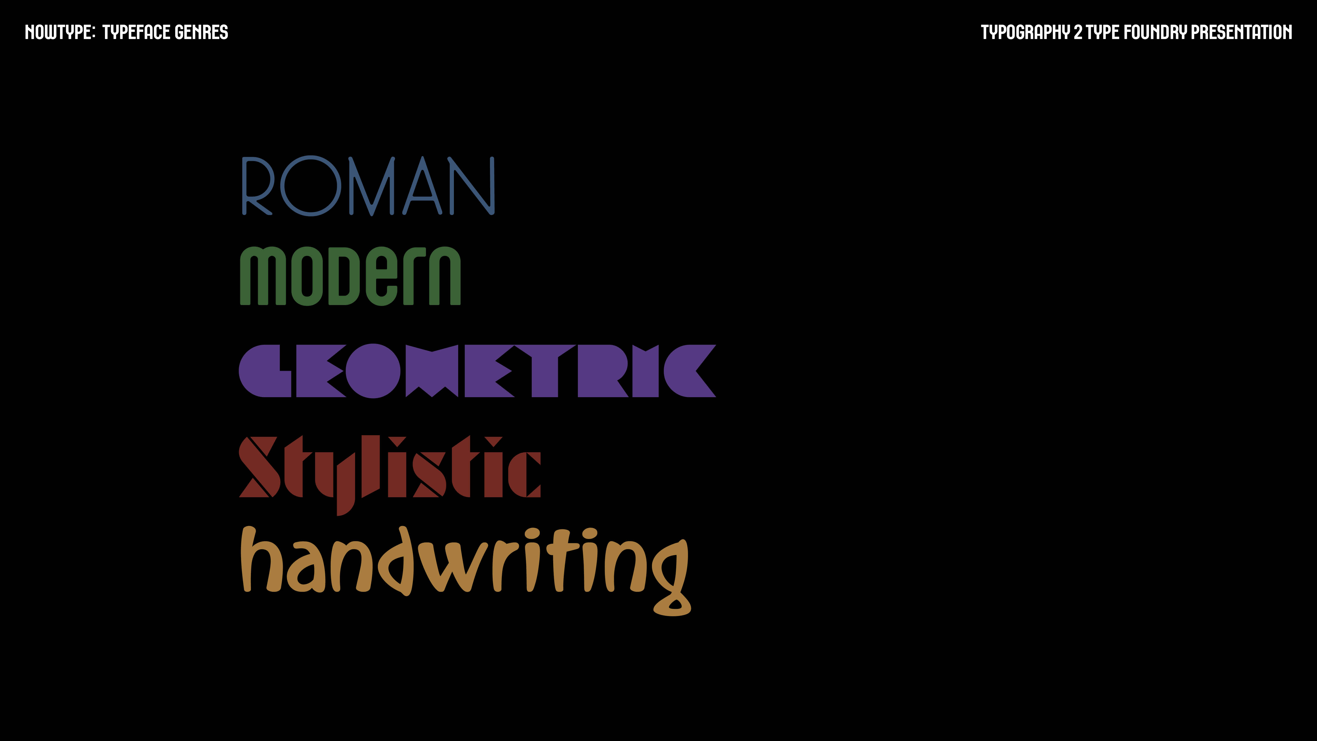
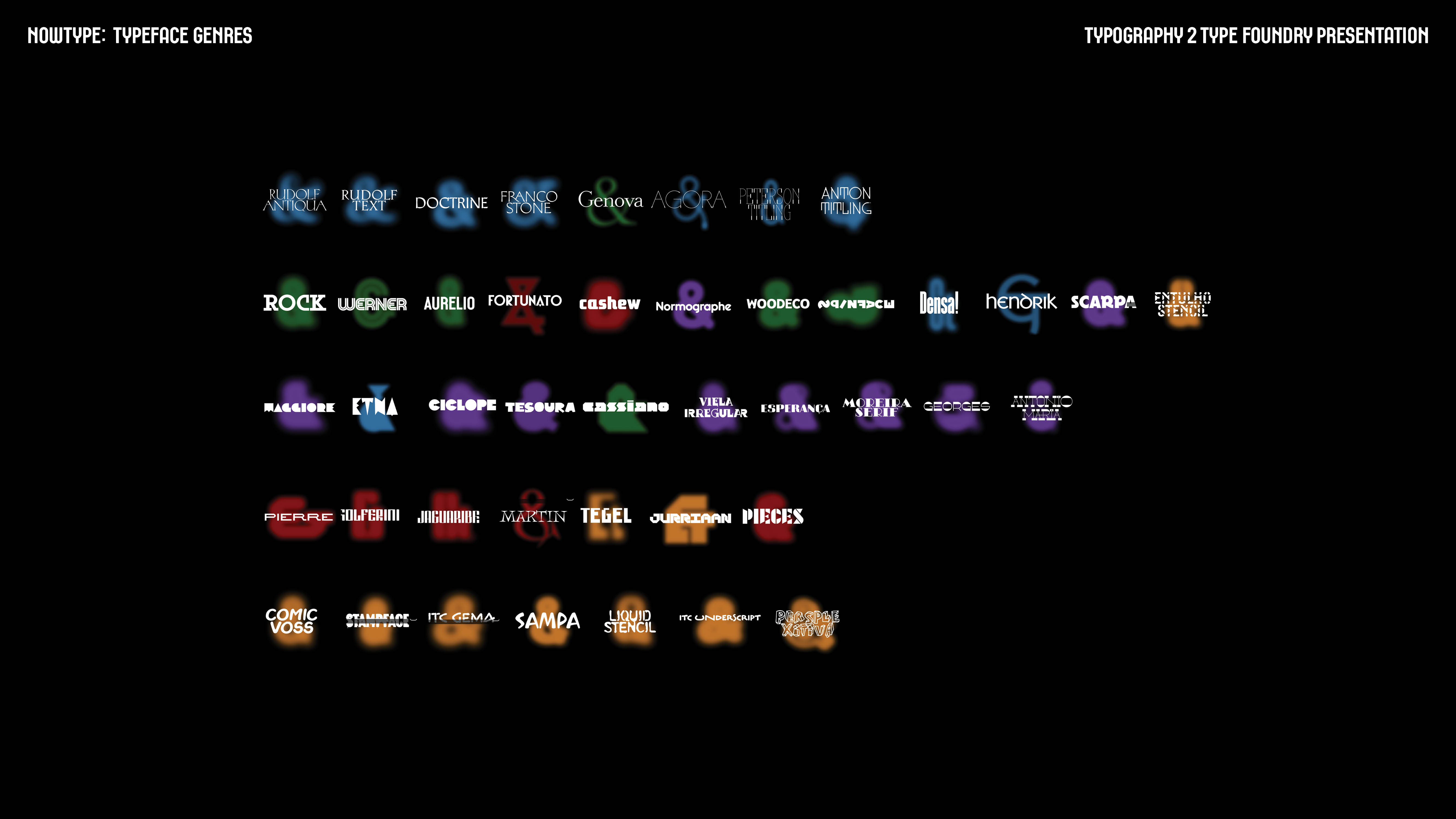
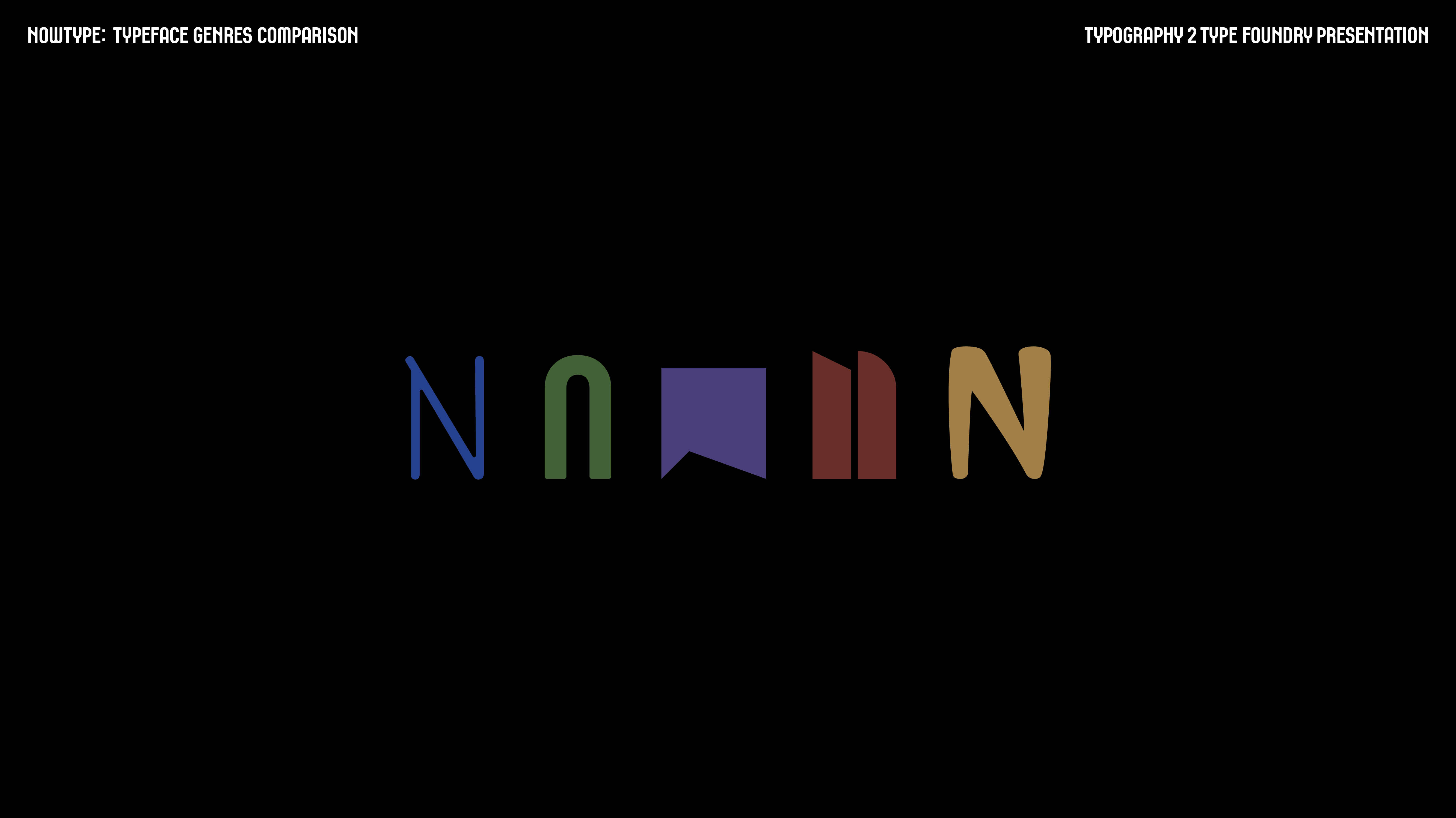
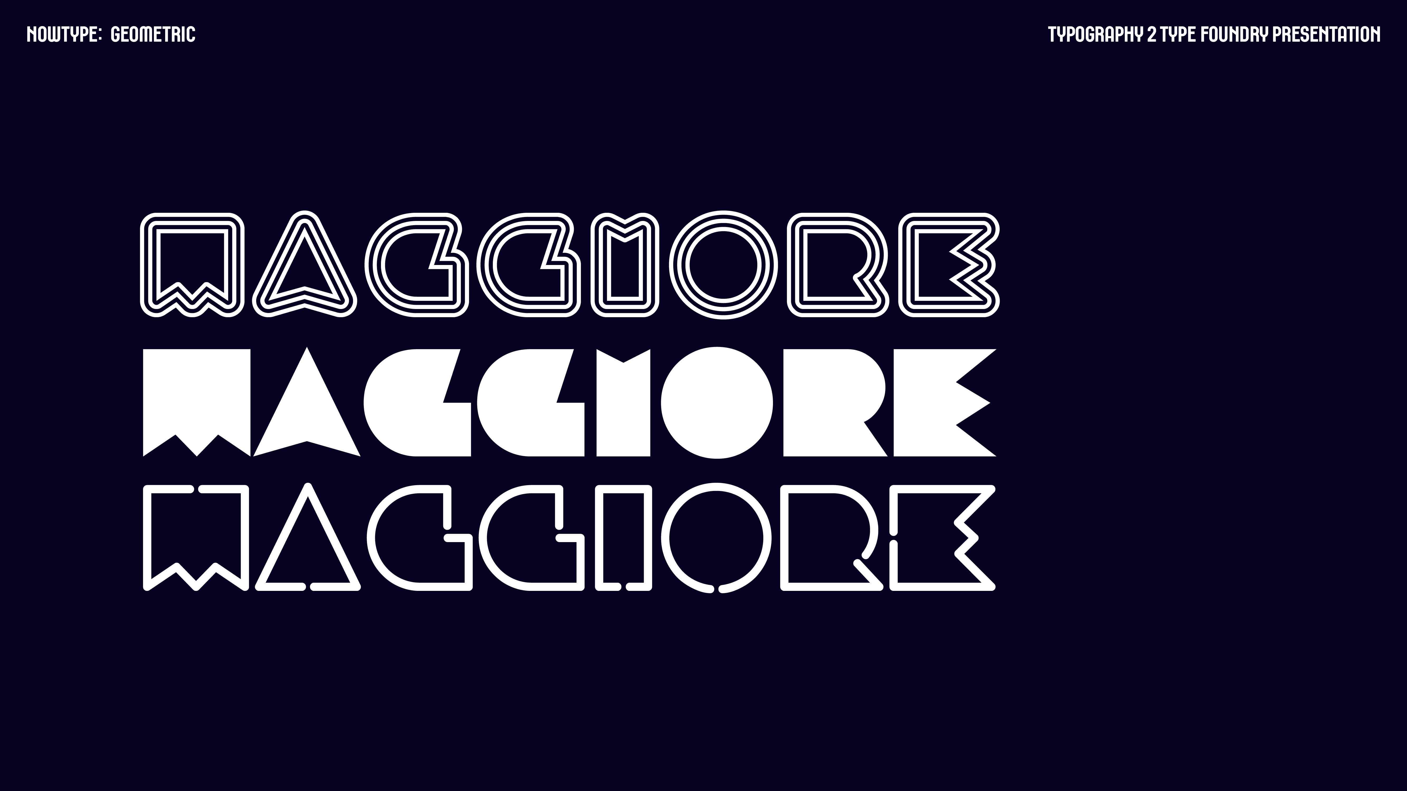
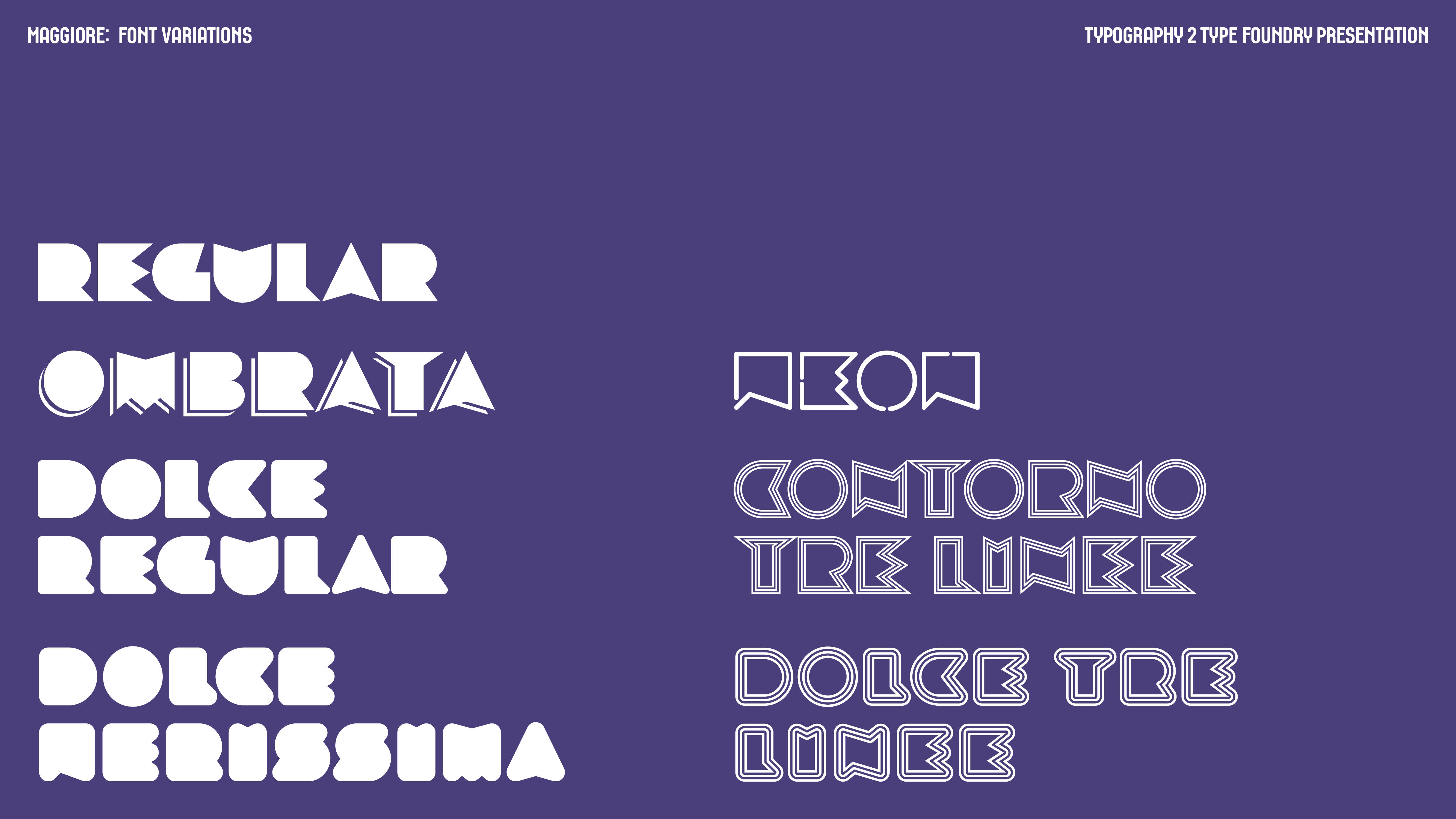
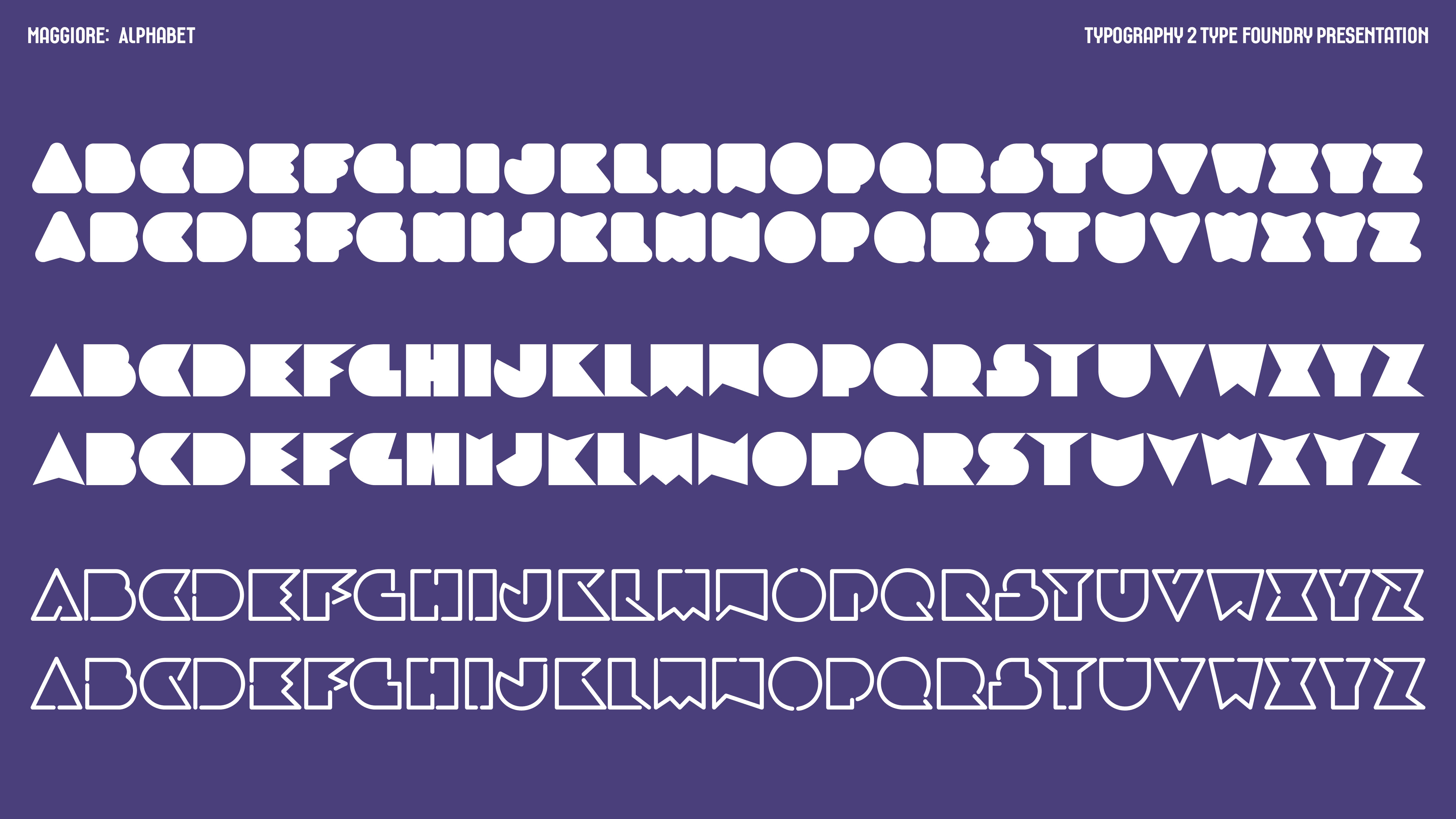
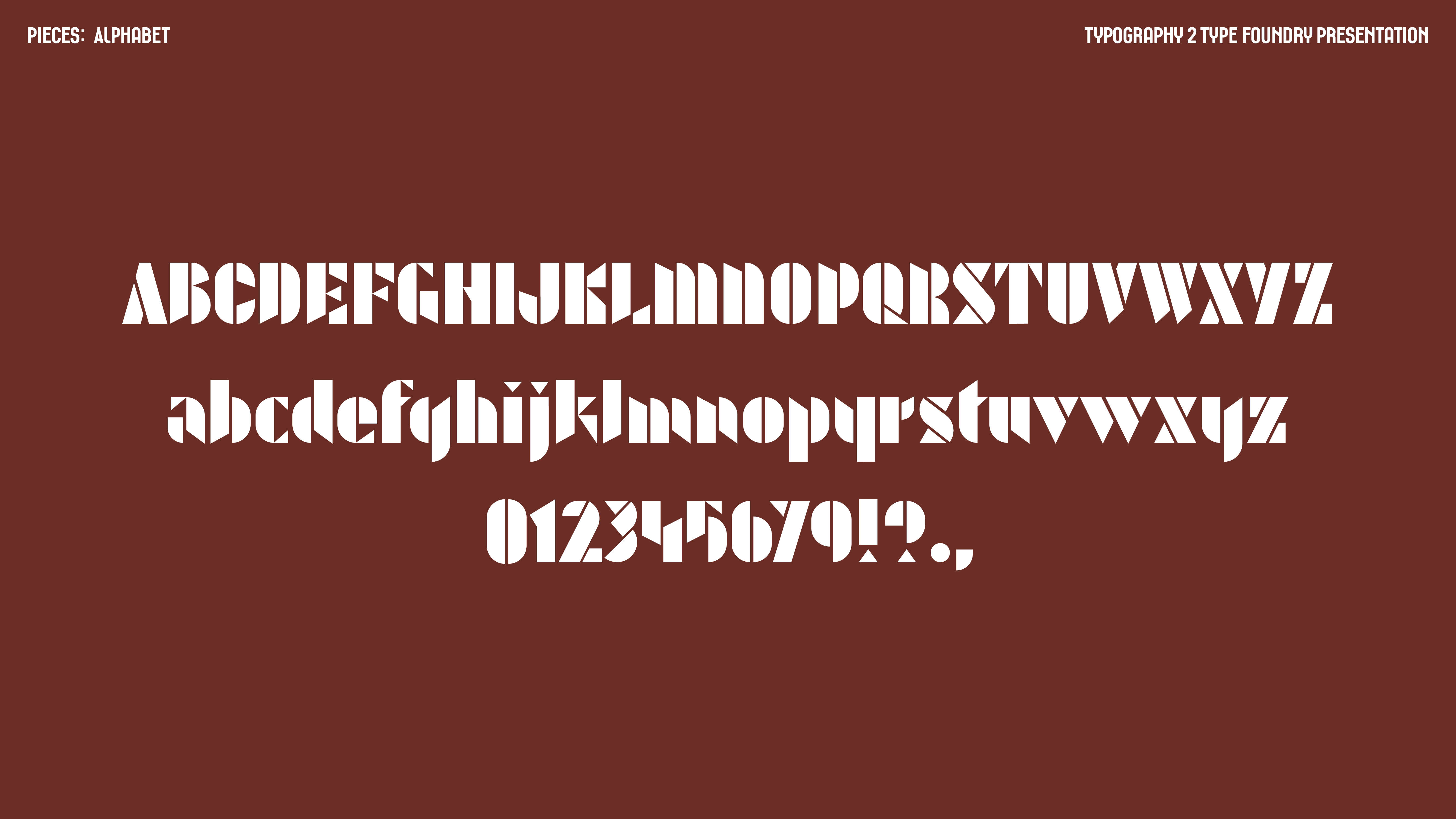
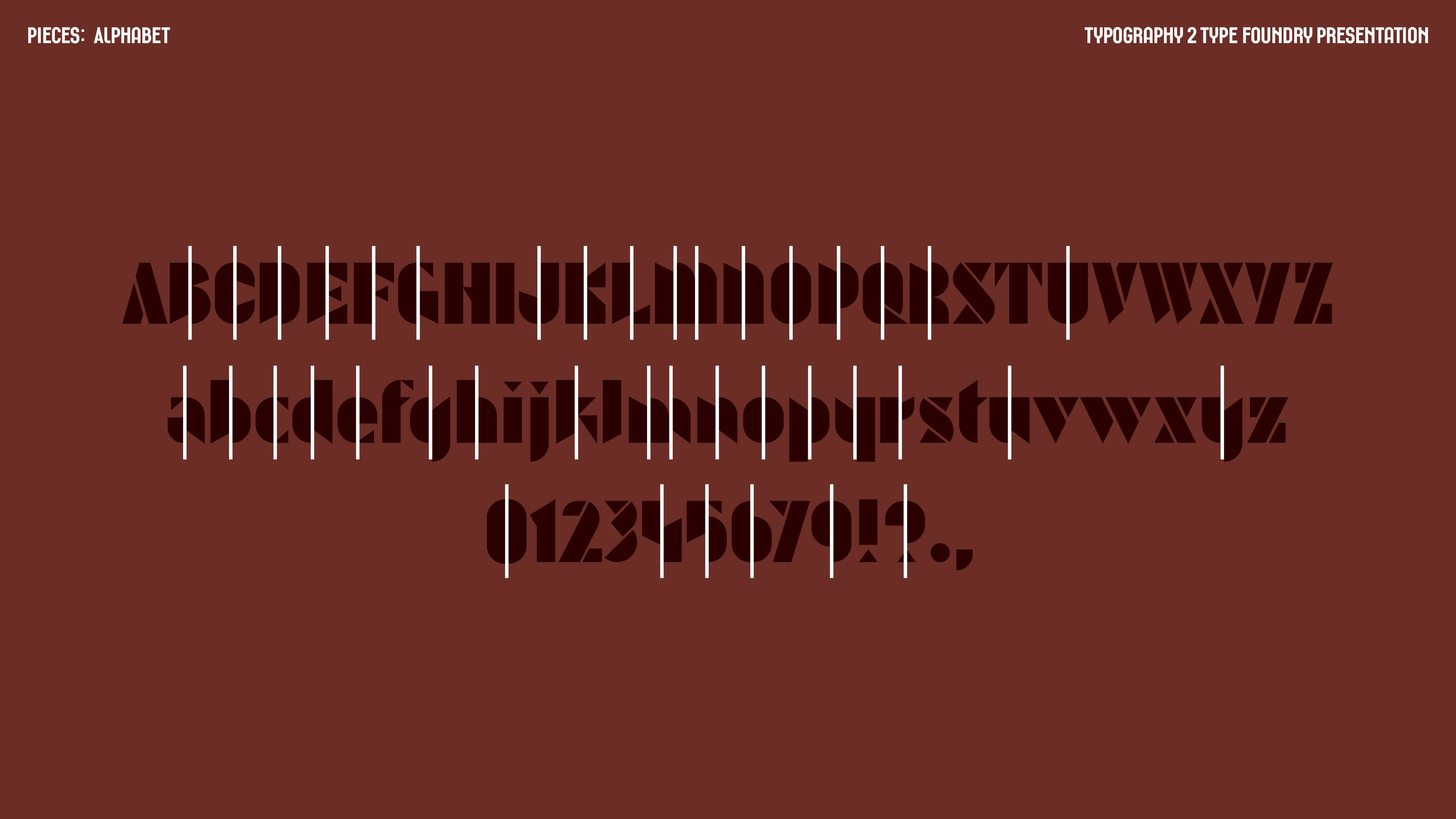
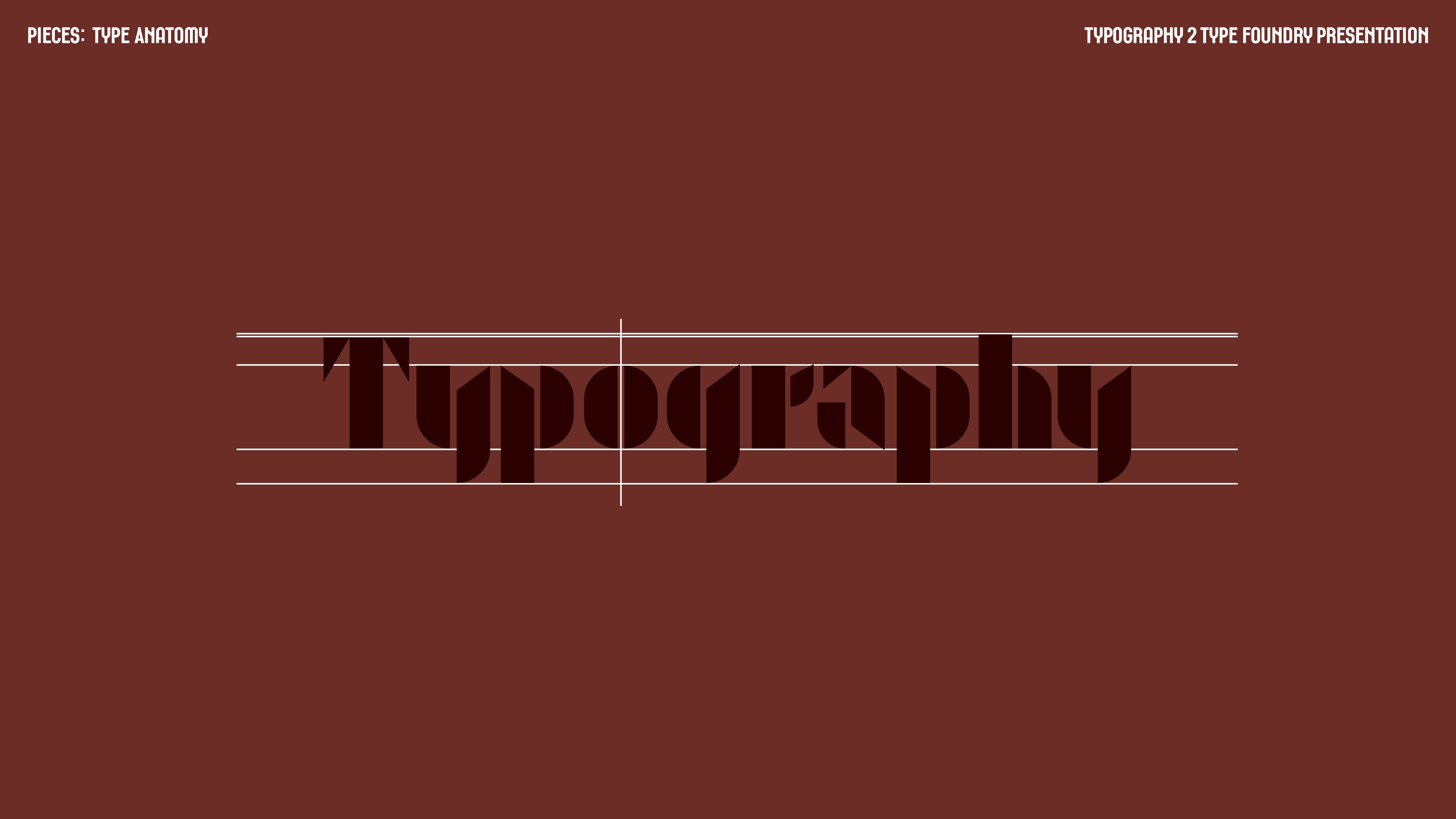
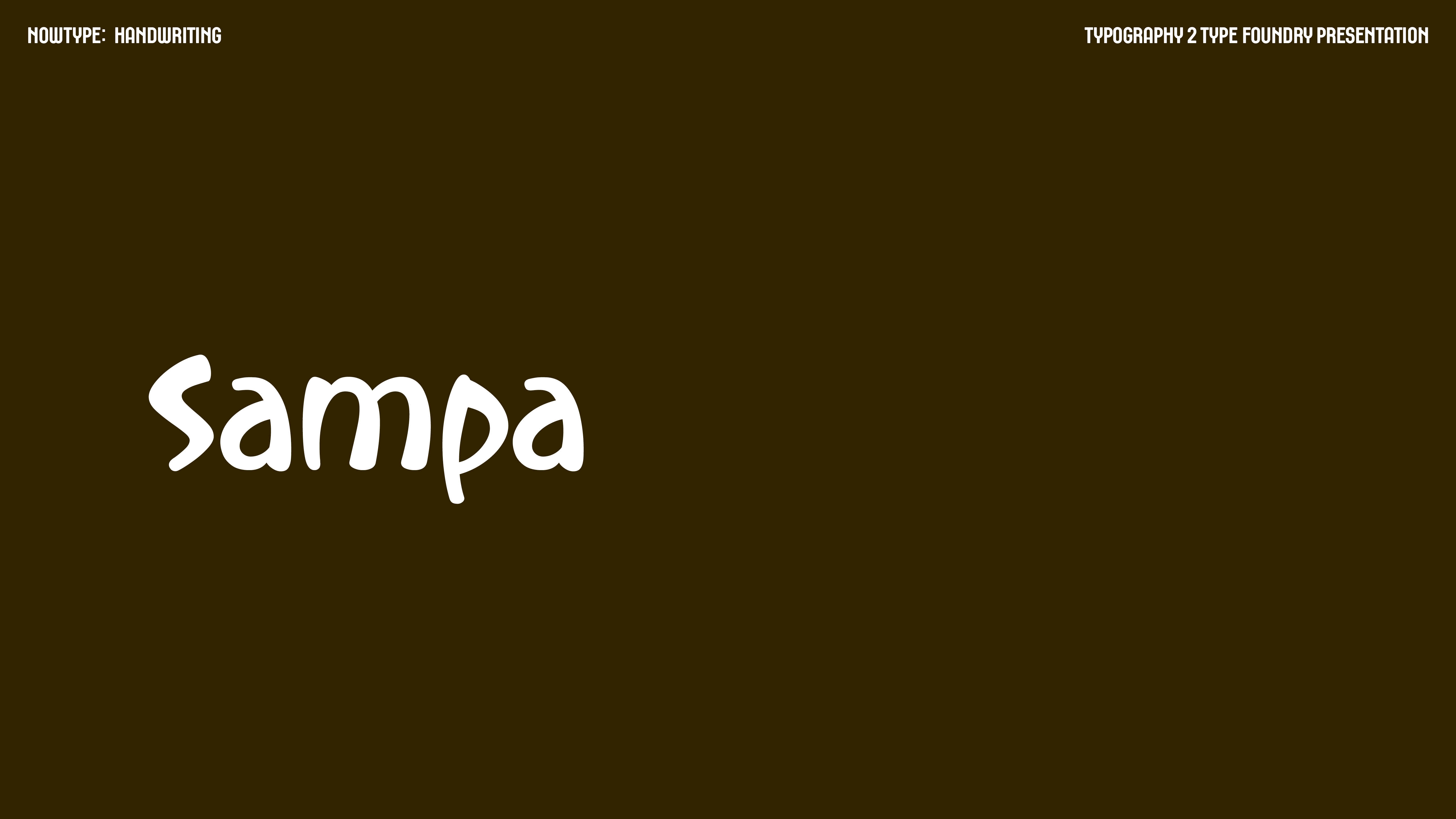
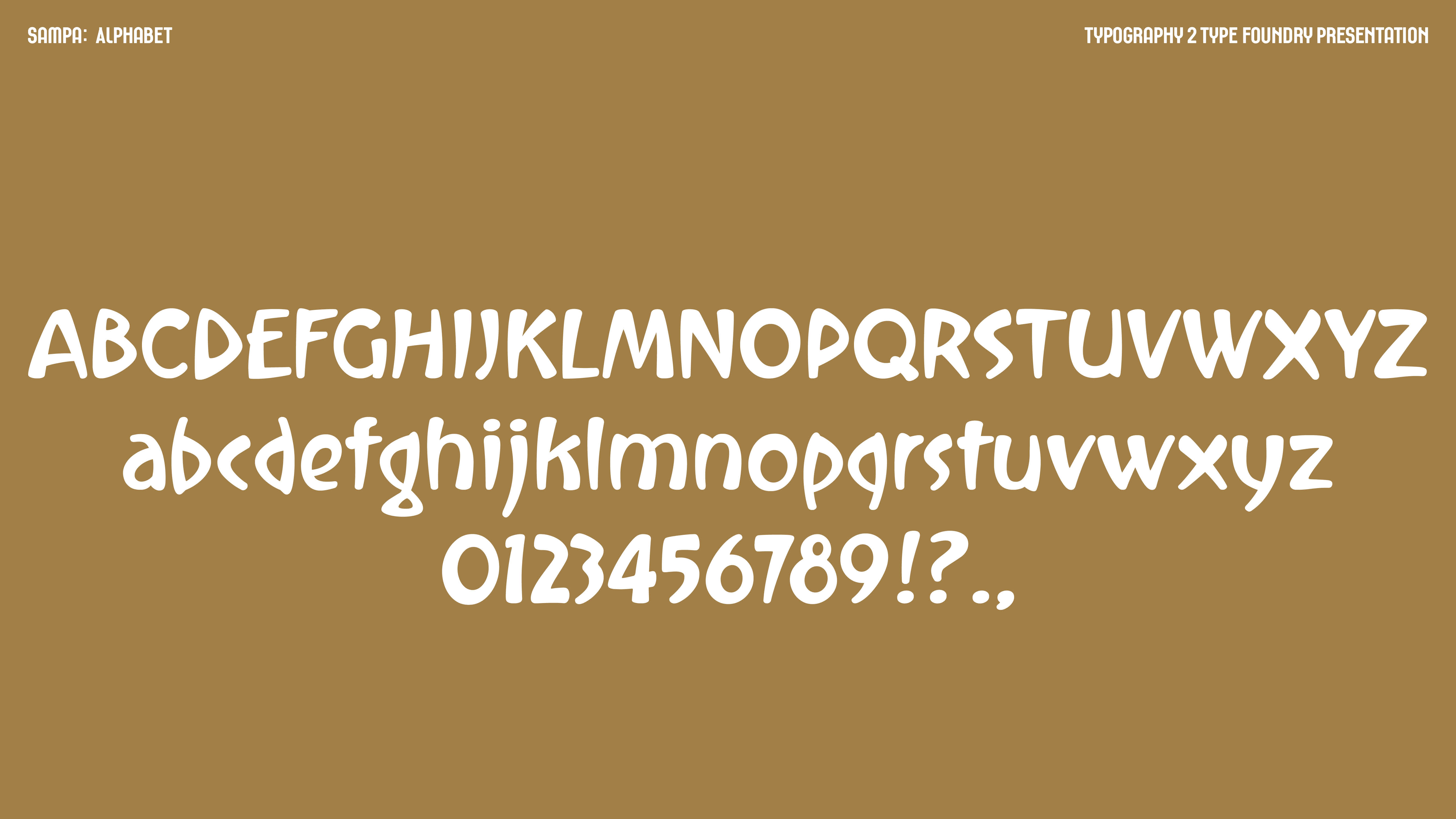
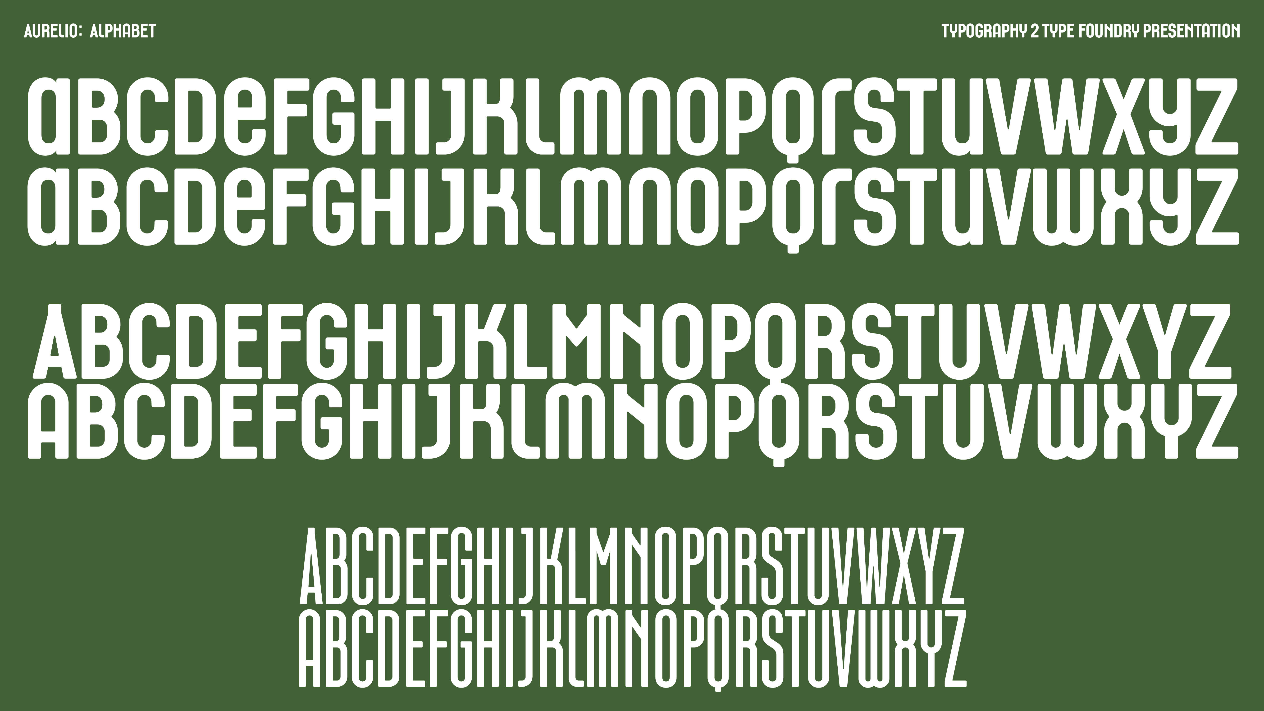
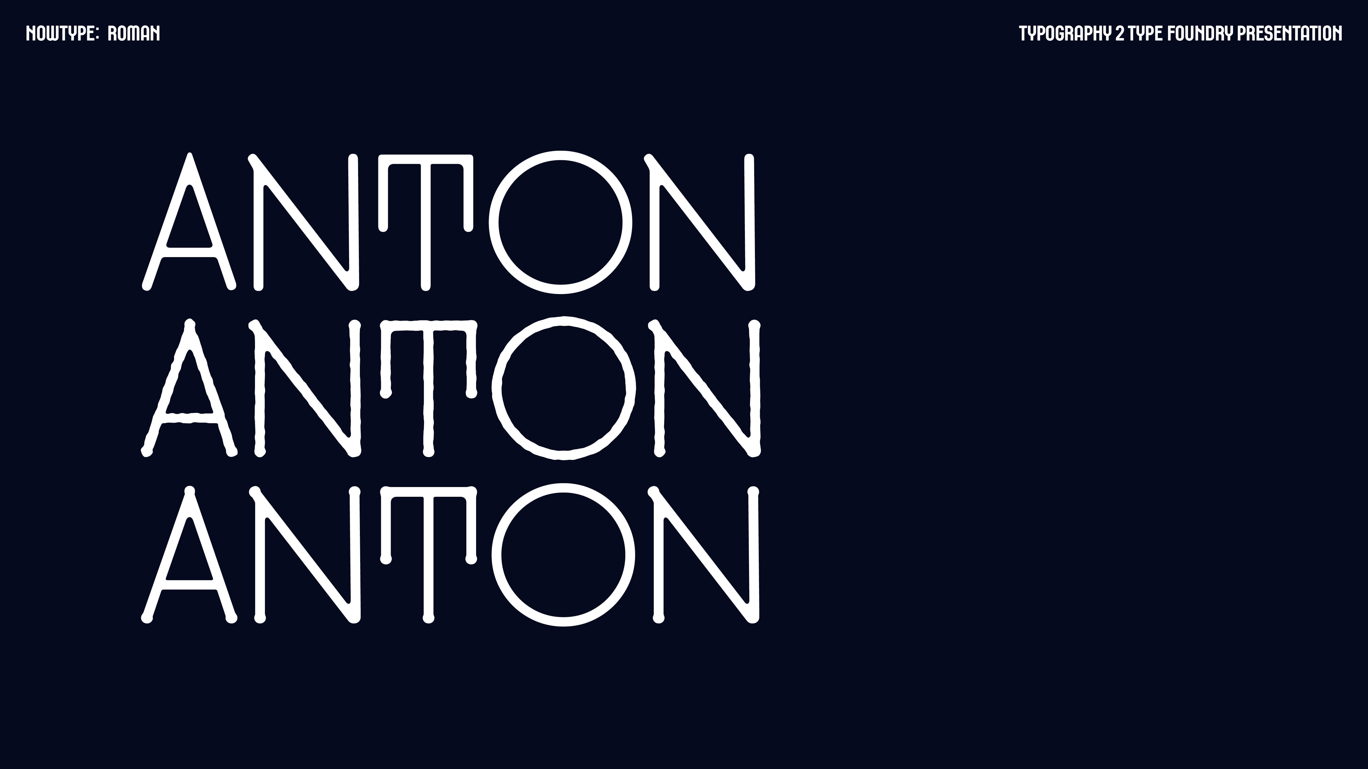
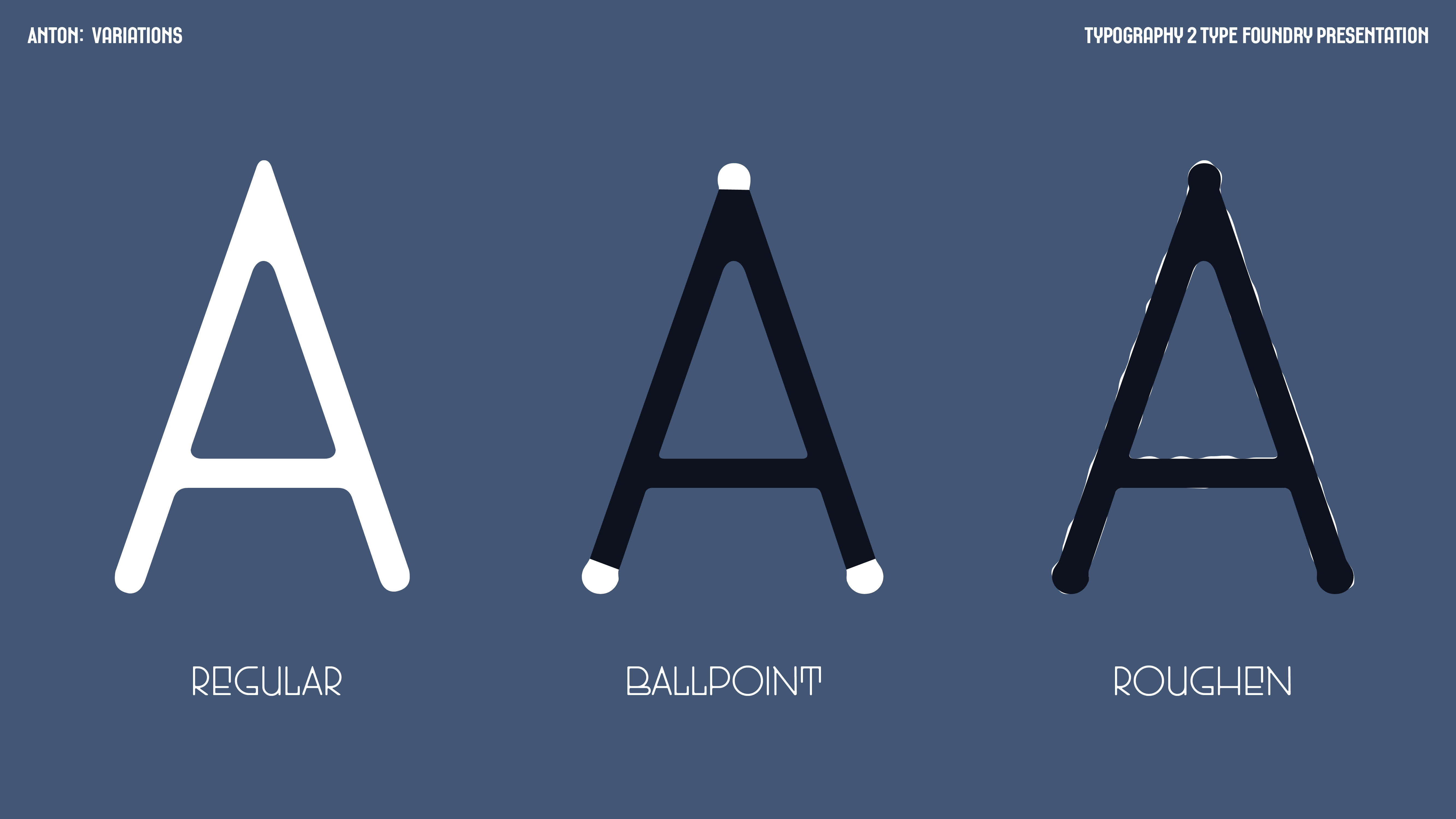
NOWTYPE RESEARCH PRESENTATION
160p0×90p0, 29 pages.
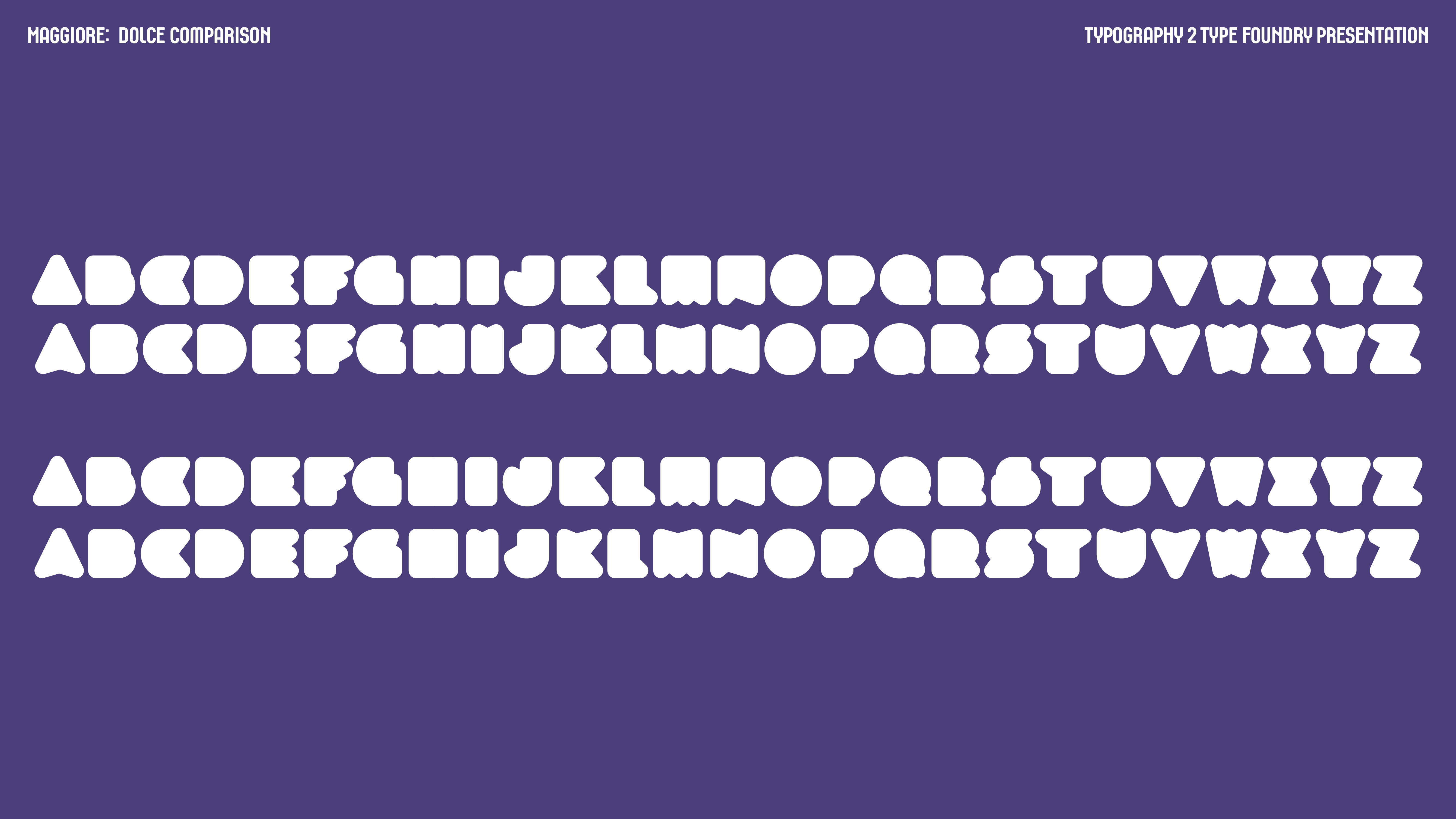
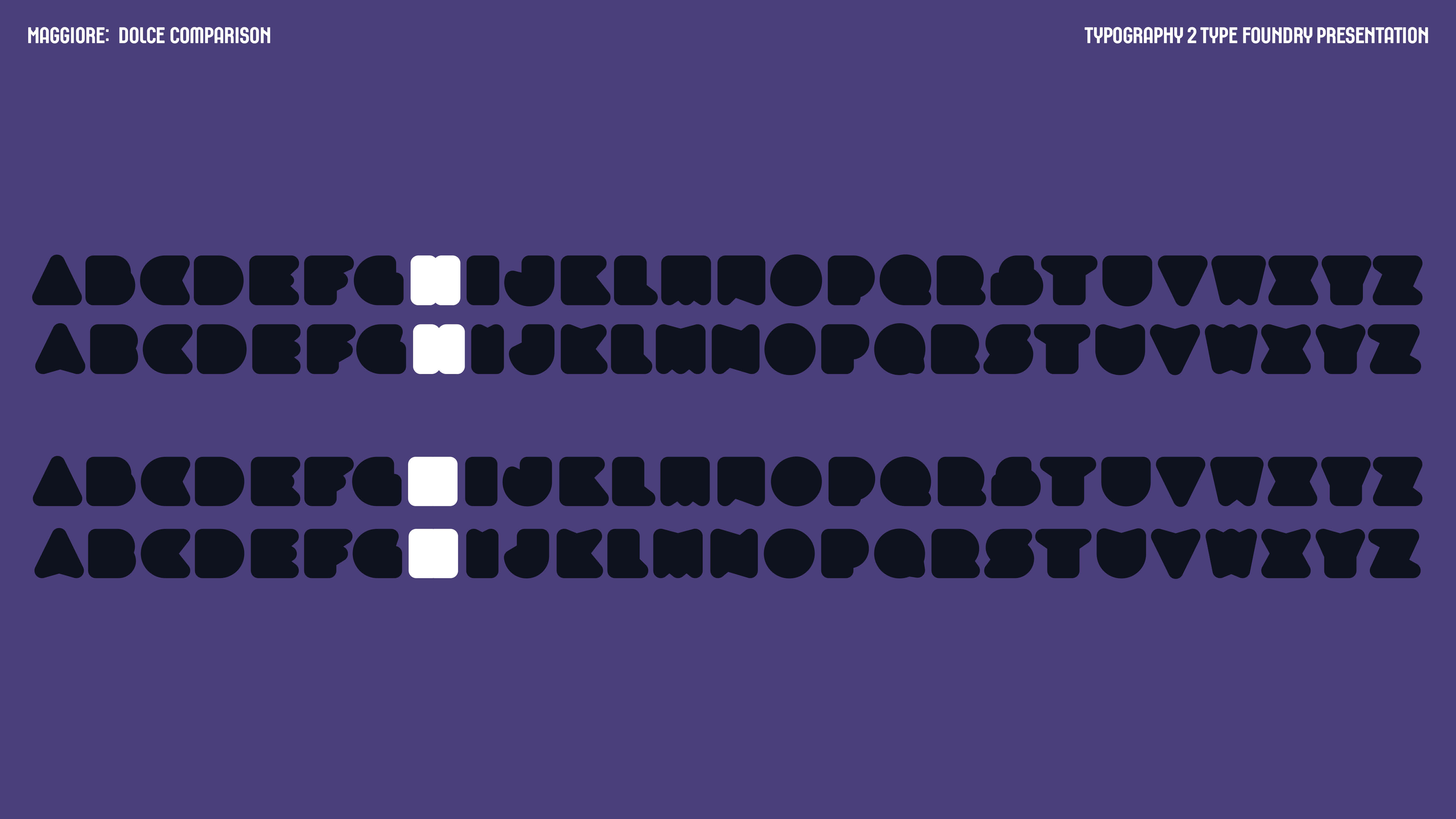
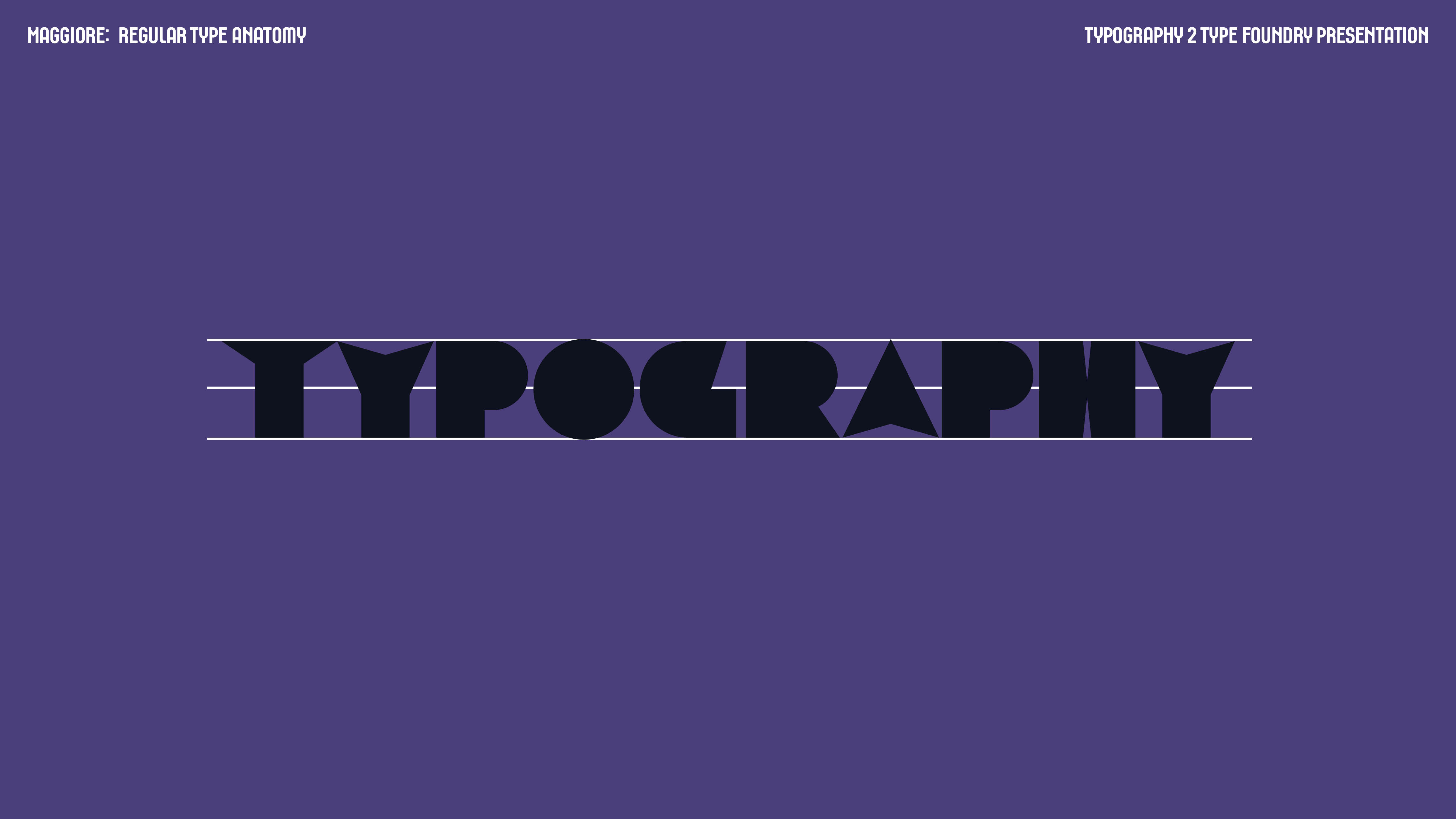
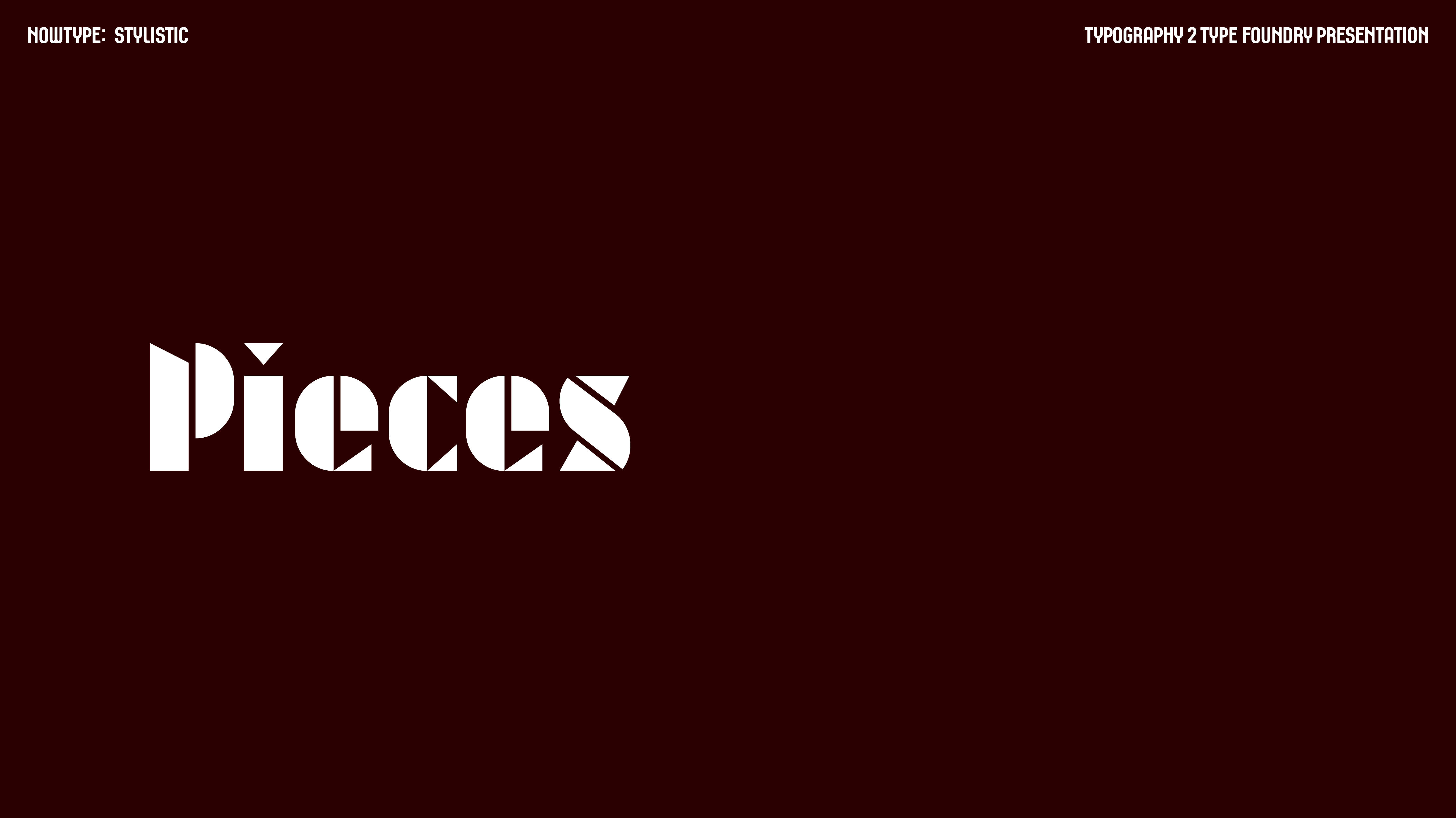
This was a presentation designed about research on a chosen type foundry. It summarizes the different styles of typefaces the foundry designs, and personal analysis on the key characteristics of each chosen typeface.
160p0×90p0, 29 pages.
This was a presentation designed about research on a chosen type foundry. It summarizes the different styles of typefaces the foundry designs, and personal analysis on the key characteristics of each chosen typeface.


MSG INFOGRAPHIC
11x13.4in.
This was an infographic on MSG, monosodium glutamate. It was a great learning experience for understanding composition of image and text and utilizing a design system.
The design system was composed of the two typefaces, four colors, and squiggle forms.
As it was an infographic on the history of MSG, the colors were chosen to be reminiscent of retro colors: bold but not necessarily bright. The chosen colors were not to be reflective of food, instead were selected to represent something more ‘fake’ and unnatural, to serve as a reminder of how MSG was completely processed and man-made.
Additionally, the design element was a squiggly line, to represent ramen noodles, a common instant food known to contain MSG.
This was additionally an exploration in using a mix and match of serif and sans serif typefaces. The serif typeface was another factor used to serve as an indicator of history, while the small bodies of text were sans serif to allow better legibility digitally. The two typefaces created pleasing contrast, that allowed the serif typeface to also feel like a part of the graphic instead of part of the text, and worked in cadence with the design-based theme of the infographic.
KKOT ALBUM COVER
12.375x12.375 in
This is a conceptual album cover, designed to represent a person in our life. This was a representation of my sister, a combination of a chick and an orchid.
12.375x12.375 in
This is a conceptual album cover, designed to represent a person in our life. This was a representation of my sister, a combination of a chick and an orchid.
YEARBOOK SPREADS: SCRAPBOOK
297x420mm (A3).
297x420mm (A3).
- Mock Trial/FBLA
- Dreams Feature
- Time Travel Feature
- Name Meaning Feature
- HS Orchestra
- Varsity Boys’ Swimming


